
Michael Anderson
Former journalist turned tech writer with a passion for helping professionals enhance productivity through AI.
Introduction
Did you know that the same program you use for school or work presentations—Microsoft PowerPoint—is also a fantastic tool for making eye-catching posters? It’s true! PowerPoint is easy to use, and most people already have it. You don’t need expensive or complicated design software. This guide is for anyone who needs a great poster fast: students creating academic research posters, teachers making classroom displays, or marketers designing event flyers. We’ll show you how to turn a blank slide into a professional poster, step by simple step.

Step-by-Step Guide: Making Your Poster
Creating a poster in PowerPoint is much easier than you might think. Just follow these steps:
Step 1: Set the Right Poster Size
The first and most important step is to change your slide size to match your final poster size. PowerPoint is a presentation tool, so it starts with a small screen size. You need to tell it you are making a large poster!
-
Go to the Design tab on the ribbon.
-
Click on Slide Size (usually on the far right).

-
Select Custom Slide Size…

In the new window, change the width and height to your required poster dimensions.
Tip: PowerPoint has a maximum slide size of 56 inches by 56 inches . If your poster is larger (like a very large A0), you can design it at half-size (50%) or quarter-size (25%). The print shop can then scale it up for you.
| Common Poster Sizes | Width (in) | Height (in) | Use Case |
| A4 | 8.27 | 11.69 | Small flyers, handouts |
| A3 | 11.69 | 16.54 | Small announcements |
| Standard Conference | 36 | 48 | Academic research |
| Custom | Varies | Varies | Events, business ads |
Step 2: Choose Your Layout and Grid
A good poster needs a clear structure. Think of your poster as having columns, like a newspaper. Most academic posters use three or four columns .
-
Use the View tab and check the boxes for Ruler, Gridlines, and Guides. This will help you line things up perfectly.
-
Use the vertical guides to mark out your columns. This creates a simple, clean grid.

-
Pro Tip: Use the Align tool (under the Home tab, in the Drawing group) to quickly line up all your text boxes and images. This makes your poster look neat and professional.
Step 3: Add Your Visuals and Text
Now it’s time to add your content. Remember, a poster is a visual tool, so use more images and less text!
-
Text: Use simple text boxes for your title, headings, and body text. Keep paragraphs short.
-
Images: Go to Insert > Pictures. Make sure your images are high-quality (at least 150 DPI at the final print size) so they don’t look blurry .
-
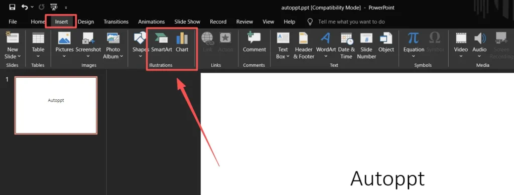
Charts and Data: Use Insert > Chart or Insert > SmartArt to present data visually. SmartArt is great for flowcharts and lists.
Step 4: Apply Color and Font Schemes
Your color and font choices affect how readable and professional your poster looks.
-
Fonts: Use a sans-serif font (like Arial, Calibri, or Helvetica) for the main body text because it is easier to read from a distance . Use a slightly bolder or serif font for the main title. Stick to 2 or 3 fonts maximum.
-
Color: Use a light background (white or light gray) and dark text for the best contrast. Use your brand or event colors for headings and accents, but don’t use too many colors—three or four is usually enough.
Step 5: Review and Export
Before you send your poster to the printer, you must check everything.
-
Proofread: Check for spelling and grammar mistakes.
-
Zoom Out: Look at the poster from a distance (zoom out to 25% or 33%) to see how it will look when printed. Is the text readable?
-
Export: Go to File > Save As or Export. Save your poster as a PDF or PNG file. This locks the design and prevents any changes when it is opened on a different computer.
Examples Section
PowerPoint is flexible enough for many poster types. Here are three common examples:
-
Academic Research Poster
-
Layout: Three or four clear columns.
-
Color: Simple, professional colors (e.g., white background, blue or green accents).
-
Font: Large, clear sans-serif fonts for readability (e.g., Arial or Helvetica).
-
Focus: Clear sections for Introduction, Methods, Results (with charts), and Conclusion.
-
Event Promotion Poster
-
Layout: More flexible, often a single, bold visual area.
-
Color: Bright, high-contrast colors to grab attention (e.g., yellow and black).
-
Font: A fun, decorative font for the main title, but a simple font for the event details.
-
Focus: A single, strong image, the event name, date, time, and a QR code.
-
Classroom Poster
-
Layout: Simple, often two columns or a central theme.
-
Color: Bright, engaging colors that are easy on the eyes.
-
Font: Large, friendly, and very easy-to-read fonts (e.g., Comic Sans or Century Gothic).
-
Focus: Clear learning objectives, simple diagrams, and fun visuals.
Design Tips Section
Want your poster to look truly professional? Follow these simple design rules:
-
Use White Space: Don’t fill every corner! Empty space (or “white space”) makes your poster look clean and helps the reader focus on the important parts.
-
Align Everything: Use the guides and the Align tool to make sure all your text boxes and images line up perfectly. Misaligned elements look messy.
-
Stick to 2–3 Fonts: Too many fonts make your poster look chaotic. Choose one for the title, one for headings, and one for the body text.
-
Use High Contrast: Dark text on a light background is always best. Avoid colors that are too similar (like light blue text on a white background).
-
Keep Text Readable: The smallest text on your poster should be at least 24pt, but for a large poster, aim for 36pt or higher for the body text.
-
Use Quality Images: Never use a small, blurry image. If it looks bad on your screen, it will look terrible when printed large.
-
Group Objects: Select multiple objects, right-click, and choose Group. This lets you move and resize them all together without messing up your layout.
Common Mistakes to Avoid
-
Too Much Text: A poster is not a research paper. Use bullet points and short sentences.
-
Pixelated Images: Using low-resolution images that look blurry when enlarged.
-
Poor Contrast: Using colors that are too similar, making the text hard to read.
-
Unbalanced Layout: Put all your content on one side, leaving the other side empty.
-
Inconsistent Formatting: Changing font sizes, colors, or spacing between sections.
How AI Tools Can Help
The newest versions of PowerPoint include powerful AI features that can speed up your poster design.
Microsoft Copilot can help you start your poster by:
-
Creating a draft presentation from a simple text prompt .
-
Suggesting professional design layouts and color palettes.
-
Generating images and icons that match your content.
For even faster results, tools like Autoppt help you design stunning posters faster by using AI templates that match your content. These tools can automatically resize elements and suggest layouts, taking the hard work out of the design process.
Exporting & Printing
Getting your poster from your screen to the printer requires a few final checks.
-
File Format: Always export as a PDF (Portable Document Format). This is the standard for print shops because it locks your fonts and layout. A high-resolution PNG is also a good option if you need a digital image file.
-
DPI (Dots Per Inch): This is image quality. For large posters, a print resolution of 150 DPI at the final size is usually the minimum recommended for a sharp print . PowerPoint handles this automatically when you export a high-resolution file.
-
Print Bleed: If your design has color or images that go right to the edge of the paper, you need a “bleed.” This means the color extends slightly past the cut line so you don’t get white edges. Check with your print shop for their specific bleed requirements.
FAQ Section
Q: What is the best size for a PowerPoint poster?
A: The most common size for academic posters is 36 inches by 48 inches, but always check the requirements of your conference or event.
Q: Can I print directly from PowerPoint?
A: It is better to export your poster as a high-resolution PDF and send that file to the print shop. This avoids any issues with fonts or layout changing on their computer.
Q: Why does my text look blurry when I zoom in?
A: This is normal because PowerPoint is designed for screen viewing. As long as your final export is a high-resolution PDF, the printed poster will be sharp.
Q: How do I make sure my colors look right when printed?
A: Use the standard color palette in PowerPoint and avoid very bright, neon colors, as they can look different when printed on paper.
Q: What is the maximum size PowerPoint can handle?
A: PowerPoint has a maximum slide size of 56 inches by 56 inches .
Conclusion
PowerPoint is a powerful, accessible, and easy-to-use tool for creating professional posters. By following a few simple steps—setting the correct size, using a clear layout, and choosing high-contrast colors—you can create a poster that looks fantastic and clearly communicates your message. Give it a try! You might be surprised at the quality you can achieve, especially with a little help from AI tools like Autoppt to speed up your design process.
Create worry-free presentations with AutoPPT . Turn your ideas into slides quickly—while keeping them 100% yours!
About AutoPPT: An easy use AI tool for students and professionals. Generate editable slides, customize designs, and focus on what matters—your unique ideas.

Autoppt: Generate presentations in 1 minute!
Start Free Trail Now