


Maggie Tsui
Co-founder, CEO of Autoppt. An office software enthusiast committed to improving workplace productivity. I love sharing tips and tools that make daily tasks easier and faster.
Introduction
PowerPoint is not a professional design app, but for many everyday flyer projects, it is more than enough. If you need to create a school announcement, a local event flyer, a small business promotion, a workshop handout, or a simple printable notice, PowerPoint gives you the basic tools you need without a steep learning curve.
You can control the page size, place images, add shapes, arrange text, use icons, and export the finished design as a PDF or image file. That makes it a practical choice for people who do not use advanced design software but still want a clean, professional result.
The important thing is to avoid designing the flyer like a regular presentation slide. A flyer has to communicate quickly. Someone should be able to glance at it and understand what is happening, why it matters, and what they should do next. That means using a clear headline, readable text, enough spacing, and one main call-to-action.
This guide will show you how to create a flyer in PowerPoint step by step, with practical PowerPoint flyer design tips you can use right away.
What Kind of Flyers Can You Make in PowerPoint?
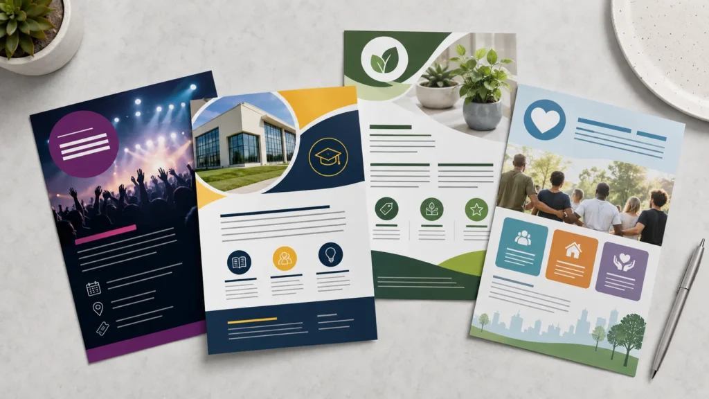
PowerPoint works well for many simple flyer projects. You can use it to make event flyers, business flyers, school flyers, promotional flyers, announcement flyers, club notices, workshop handouts, and community posters.
For example, a small business might create a flyer for a weekend sale. A teacher might design a classroom event notice. A student group might promote a campus activity. An event organizer might need a printable flyer in PowerPoint for a local seminar or fundraiser.
The format can also change depending on where the flyer will be used. A printed flyer usually works best in portrait orientation, while a digital flyer for email or social media might be square, vertical, or landscape. Deciding this before you start will save you from resizing everything later.
Step 1: Set the Correct Flyer Size
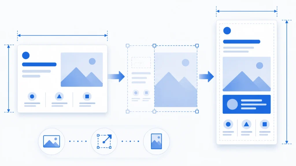
Before adding text or images, set up the slide size. This is one of the most important steps because PowerPoint starts with a presentation slide, not a print flyer.
Go to Design > Slide Size > Custom Slide Size.
For a standard printed flyer, use one of these sizes:
-
US Letter: 8.5 × 11 inches
-
A4: 8.27 × 11.69 inches
Choose Portrait if you want a traditional flyer layout. Portrait is usually best for handouts, posters, school notices, and business flyers. Landscape can work for menus, digital announcements, or screen-based designs, but it is less common for a printed flyer.
If you are creating a digital flyer for social media, choose dimensions that match the platform instead of using a print size. The main point is simple: set the final format first, then design around it.
Step 2: Turn On Guides and Leave Safe Margins
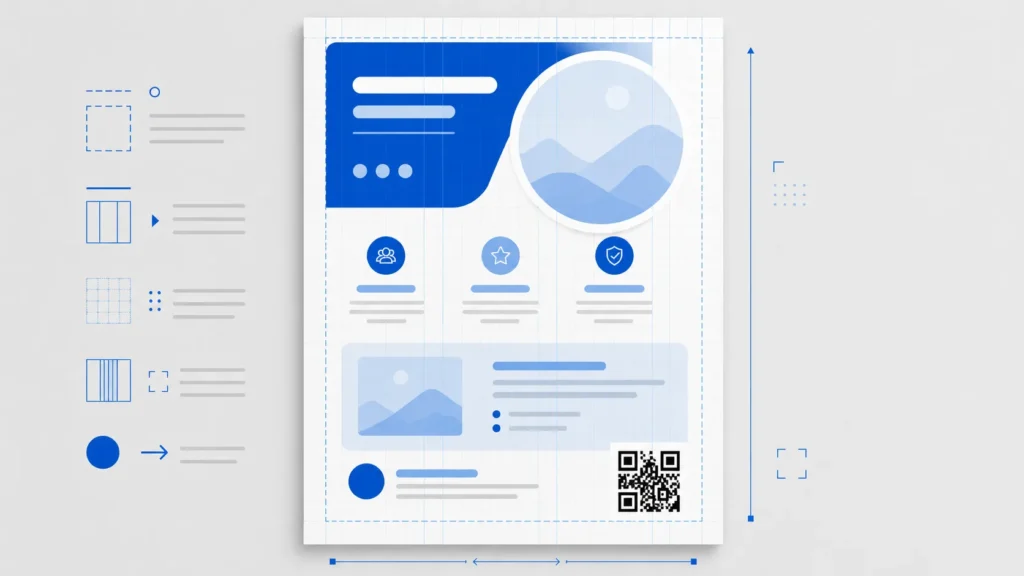
A flyer can look amateur if text or logos sit too close to the edge. Even worse, important details may get trimmed during printing.
In PowerPoint, go to View and turn on Ruler, Guides, and, if helpful, Gridlines. These tools make it easier to align objects and keep spacing consistent.
Leave a safe margin around the flyer. For most home or office printing, keep important text at least 0.25 to 0.5 inches away from the edge. If you plan to use a professional printer, ask whether they require bleed. PowerPoint is not a full print-production tool, so it is especially important to confirm the printer’s requirements before sending the final file.
Also, do not place a QR code too close to the edge. It needs breathing room around it so phones can scan it easily.
Step 3: Choose a Simple Layout
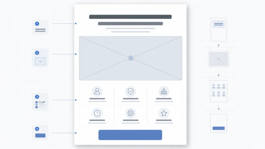
For most beginners, a simple top-to-bottom layout is the safest choice: headline first, then one strong image or visual area, followed by key details and a clear call-to-action.
A more advanced layout, such as a split design with text on one side and an image on the other, can also work well. Just be careful not to make the reader jump around too much. A flyer is not a brochure. It should not ask people to study it for a long time.
A useful way to think about layout is this: what should someone notice in the first three seconds? If the headline, date, offer, or main action is hard to find, the layout needs more work.
For a business flyer in PowerPoint, you might use a bold headline at the top, a product or service image in the center, and a call-to-action near the bottom. For event flyer design, the event name, date, time, and location should be easy to spot without searching.
Step 4: Write a Headline That Says Something
Your headline is not just decoration. It should tell people what the flyer is about.
Instead of a vague headline like “Special Event,” write something specific:
-
“Free Yoga Class This Saturday”
-
“Spring Art Workshop”
-
“Grand Opening Sale”
-
“Parent Information Night”
The headline should be short enough to read quickly and large enough to stand out. In many flyer designs, the headline is the largest text on the page. That does not mean it has to be loud or oversized, but it should clearly lead the design.
A good flyer needs a clear order: what people should notice first, what they should read next, and what they should do after that.
Step 5: Add Images, Shapes, and Icons Carefully
Images can make a flyer feel more polished, but only when they are sharp, relevant, and well placed. A blurry image will make the whole design feel less credible.
Use Insert > Pictures to add your own images. Use Insert > Icons if you need simple symbols for location, phone, email, time, or social media. Shapes are useful for creating banners, background blocks, dividers, buttons, and callout areas.
The crop tool is especially helpful. Instead of stretching an image to fit a space, crop it so the subject looks intentional. Stretching a photo out of proportion is one of the fastest ways to make a flyer look homemade.
If you place text over an image, check the contrast carefully. Text over a busy photo is often hard to read. A simple fix is to add a semi-transparent rectangle behind the text or darken the image slightly. Do not rely on text shadows to solve every readability problem; they can make the design look messy if overused.
Step 6: Build a Clear Visual Hierarchy
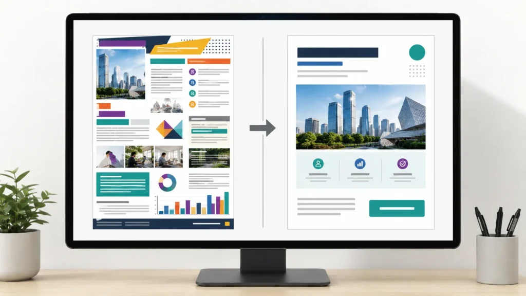
Visual hierarchy simply means arranging information so the reader knows where to look first.
A flyer usually needs this order:
-
Main headline
-
Short supporting message
-
Key details, such as date, time, location, or offer
-
Call-to-action
-
Contact information, website, social media handle, or QR code
You do not need to make every detail big. In fact, making everything bold or oversized weakens the design because nothing feels important anymore.
Use size, weight, spacing, and placement to guide the reader. The headline might be large and bold. The date or offer might be medium-sized. The address, phone number, and social handle can be smaller as long as they remain readable.
A useful test is to zoom out until the flyer looks small on your screen. If you can still spot the headline, the key details, and the main action, your hierarchy is probably working.
Step 7: Choose Fonts That Are Easy to Read

For a clean PowerPoint flyer design, use one or two fonts. A simple sans-serif font usually works well for business flyers, school flyers, and promotional designs. Decorative fonts can be fine for themed events, but they should be used sparingly.
A practical approach is to use one font for the headline and another simple font for the details. You can also use one font family and create contrast with bold, regular, and different sizes.
Avoid mixing too many styles. Multiple fonts, outlines, shadows, italics, and all-caps text can quickly make the flyer feel crowded. Readability matters more than showing off every formatting option in PowerPoint.
Step 8: Pick Colors with a Purpose
A strong flyer does not need many colors. Two or three main colors are usually enough.
If you are designing a flyer for a business, start with brand colors. If you are making a school, event, or community flyer, choose colors that match the tone. A children’s activity flyer can be brighter. A corporate training flyer should probably be calmer and more restrained.
Contrast is more important than creativity here. Dark text on a light background is usually easy to read. Light text on a dark background can work too, but it needs enough contrast. Pale gray text on a white background may look stylish on your screen, but it often prints poorly and becomes difficult to read.
Step 9: Include the Right Information
A good flyer answers the reader’s basic questions without overwhelming them.
For most flyers, include the headline, event or offer details, date, time, location, contact information, website, social media handle, QR code, and a call-to-action. But do not include all of these just because you can. Choose what the reader actually needs.
For an event flyer, the date, time, location, and registration details are essential. For a promotional flyer, the offer, deadline, benefit, and contact method may matter more. For a school announcement, clarity and trust are more important than flashy design.
If you need to explain too much, the flyer is probably trying to do too many jobs. Put longer information on a website or landing page, then use a QR code to send people there.
Step 10: Align Everything Cleanly
Alignment is one of the easiest ways to make a flyer look more professional.
Select objects and use Shape Format > Align to line them up. You can align items left, right, center, top, or middle. You can also distribute objects evenly when arranging icons, text boxes, or information blocks.
Try not to place elements randomly. Even a simple flyer feels more polished when the headline, image, details, and call-to-action follow a clear alignment pattern.
If the design feels slightly “off” but you cannot tell why, it is often an alignment or spacing issue.
Common Flyer Design Mistakes to Avoid
One common mistake is overcrowding the page. Beginners often try to include every detail, every image, and every selling point. The result is a flyer that no one wants to read. Keep the message focused and move extra details elsewhere.
Another mistake is using too many fonts. A flyer with four or five different typefaces rarely looks professional. Use fewer fonts and create variety through size, spacing, and weight.
Low-quality images are also a problem, especially for print. A photo that looks acceptable on screen may appear blurry on paper. Use the highest-quality image available and avoid enlarging small images too much.
Poor contrast can ruin an otherwise good design. If people have to squint to read the text, the design is not working. This matters even more when the flyer is printed, posted on a wall, or viewed on a phone.
Finally, do not hide the call-to-action. “Register Now,” “Scan to Order,” “Visit Us This Weekend,” or “Call to Book” should be easy to find. The flyer should make the next step obvious.
How to Prepare Your Flyer for Printing
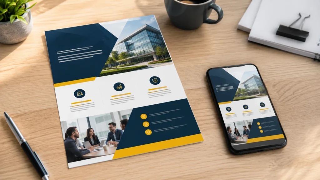
When your flyer is finished, check it before exporting. Look for typos, uneven spacing, blurry images, missing contact details, and anything too close to the edge.
Then print one test copy. This small step can save you from wasting paper, ink, or money. Check whether the text is large enough, the colors look right, and the QR code scans properly. What looks clean on a bright screen may look darker or smaller on paper.
For printing, export the flyer as a PDF. Go to File > Save As or File > Export, then choose PDF. A PDF helps preserve the layout and is usually easier to send to a print shop than an editable PowerPoint file.
If you are using a professional printer, ask about bleed, crop marks, image resolution, and preferred PDF settings. PowerPoint can create printable flyers, but print shops may have specific requirements.
How to Save a Flyer for Digital Sharing
For digital use, you can export your flyer as a PNG, JPEG, or PDF.
Use PNG when the flyer includes text, icons, or graphics that need to stay crisp. JPEG is fine for image-heavy flyers, though it may slightly compress the design. PDF works well when people need to download, forward, or print the flyer themselves.
Before sharing, preview the flyer on a phone. Many people will see it on a small screen, especially if you are posting it on social media or sending it by email. If the headline and CTA are not readable on mobile, simplify the design or increase the text size.
Should You Use a PowerPoint Flyer Template?
A PowerPoint flyer template can be a useful starting point, especially if you are short on time. Templates can help with structure, spacing, and basic design balance.
But do not treat a template as finished design. Replace the placeholder text with specific, useful copy. Change the colors if they do not match your brand or event. Swap generic images for visuals that actually fit your message. Remove decorative elements that do not serve a purpose.
A template should support your flyer, not make it look like everyone else’s.
Conclusion
You do not need advanced design software to make a useful flyer. In many cases, PowerPoint is enough, as long as you make deliberate choices.
Set the right page size, keep the layout simple, use readable fonts, leave enough space, and make the call-to-action easy to find. Strong PowerPoint flyer design is not about filling the page with effects. It is about helping people understand the message quickly.
Once you know how to create a flyer in PowerPoint, you can use the same process for business promotions, event flyer design, school announcements, printable handouts, and digital notices. Start with the purpose, build a clear hierarchy, and check the final design in the format people will actually see it.
FAQ
Can I create a professional flyer in PowerPoint?
Yes. PowerPoint has enough text, image, shape, layout, and export tools to create a professional-looking flyer. The final quality depends on your layout, spacing, font choices, image quality, and overall clarity.
What size should I use for a flyer in PowerPoint?
For a standard printed flyer, use 8.5 × 11 inches for US Letter or 8.27 × 11.69 inches for A4. Set the size under Design > Slide Size > Custom Slide Size before you begin designing.
Is PowerPoint good for printable flyers?
PowerPoint can work well for printable flyers if you set the correct page size, use high-quality images, leave safe margins, and export the final design as a PDF. Always print one test copy before printing many copies.
How do I make a PowerPoint flyer look less crowded?
Cut unnecessary text, use fewer fonts, group related information, and leave more empty space around important elements. If the flyer has too much information, move the extra details to a website or QR code.
What is the best file format for a PowerPoint flyer?
For printing, PDF is usually the best format. For digital sharing, PNG works well when the flyer has text or icons, while JPEG can work for image-heavy designs. PDF is also a good option when people need to download or print the flyer.
Create worry-free presentations with AutoPPT . Turn your ideas into slides quickly—while keeping them 100% yours!
About AutoPPT: An easy use AI tool for students and professionals. Generate editable slides, customize designs, and focus on what matters—your unique ideas.

Autoppt: Generate presentations in 1 minute!
Start Free Trail Now