
Maggie Tsui
Co-founder, CEO of Autoppt. An office software enthusiast committed to improving workplace productivity. I love sharing tips and tools that make daily tasks easier and faster.
Designing your own wallpaper is one of the easiest ways to make a screen feel more personal, useful, or professional. A good wallpaper can make your laptop feel cleaner, your phone feel more like yours, or your work setup feel a little less generic. It can also be useful for branding, mood boards, virtual meetings, study plans, or presentation backgrounds.
The good news is that you do not need to be a professional designer to create your own wallpaper. If you understand a few basic design choices, such as size, color, layout, and image quality, you can make something polished with tools you already know. PowerPoint, for example, works surprisingly well for wallpaper design because it gives you a simple canvas, easy shape tools, text control, image placement, and image export options.
This guide will show you how to design wallpaper on your own in a practical way. You will learn how to choose the right size, build a simple layout, avoid common mistakes, and create a wallpaper that actually looks good on a real screen.
What Makes a Good Wallpaper Design?
A wallpaper is not the same as a poster. A poster is meant to grab attention. A wallpaper has to live behind icons, widgets, windows, apps, and daily work. That means the best wallpaper design is often quieter than you might expect.
A good wallpaper usually has four qualities.
First, it should look good without becoming distracting. If every corner is filled with bright graphics, your screen may feel busy before you even open an app.
Second, it should fit the screen properly. A beautiful image can look awkward if it is stretched, cropped badly, or exported at the wrong size.
Third, it should leave enough empty space. This is especially important for desktop wallpaper, where icons usually sit on one side of the screen.
Finally, it should match the purpose. A study wallpaper, business wallpaper, phone lock screen, and creative mood board do not need the same style.
Step 1: Decide Where the Wallpaper Will Be Used
Before you start designing, decide where the wallpaper will appear. This choice affects the size, layout, and amount of detail you should include.
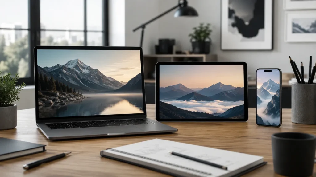
Desktop Wallpaper
Desktop wallpaper usually needs more horizontal space. Since app icons often sit on the left or right side, avoid placing important text or faces near the edges. A clean center or soft background pattern often works well.
Phone Wallpaper
Phone wallpaper is vertical, so the layout needs to be taller and simpler. Keep important details away from the top and bottom because clocks, notifications, app labels, and gesture areas may cover them.
Tablet Wallpaper
Tablet wallpaper can be used horizontally or vertically, depending on how the device is held. A flexible design with a centered subject and generous margins is usually safer.
Presentation or Meeting Background
If you are designing a wallpaper for presentations or video meetings, keep it professional. Avoid tiny text, cluttered graphics, or anything that competes with your face, slides, or screen content.
Step 2: Choose the Right Wallpaper Size
Size matters more than many beginners realize. If your wallpaper is too small, it can look blurry. If the aspect ratio is wrong, the device may crop or stretch it.
Common desktop wallpaper sizes include:
| Use Case | Suggested Size |
| Full HD desktop | 1920 × 1080 px |
| 2K desktop | 2560 × 1440 px |
| 4K desktop | 3840 × 2160 px |
| Phone wallpaper | 1080 × 1920 px or larger |
| Widescreen presentation background | 1920 × 1080 px |
If you are not sure what size to use, start with 1920 × 1080 pixels for desktop wallpaper. For phone wallpaper, use a vertical size such as 1080 × 1920 pixels.
The key idea is simple: design in the same shape as the screen. A wide wallpaper works best for computers. A tall wallpaper works best for phones.
Step 3: Pick a Visual Style
Your wallpaper will feel more intentional if you choose a style before adding elements. Without a style direction, it is easy to mix too many colors, fonts, and images.
Minimalist Wallpaper
Minimalist wallpaper uses simple colors, light textures, clean shapes, and plenty of open space. It works well for work computers because it does not fight with desktop icons.
Photo-Based Wallpaper
A photo-based wallpaper uses one strong image as the main background. This could be a landscape, city scene, desk setup, product shot, travel memory, or personal photo. Use high-resolution images so the final wallpaper stays sharp.
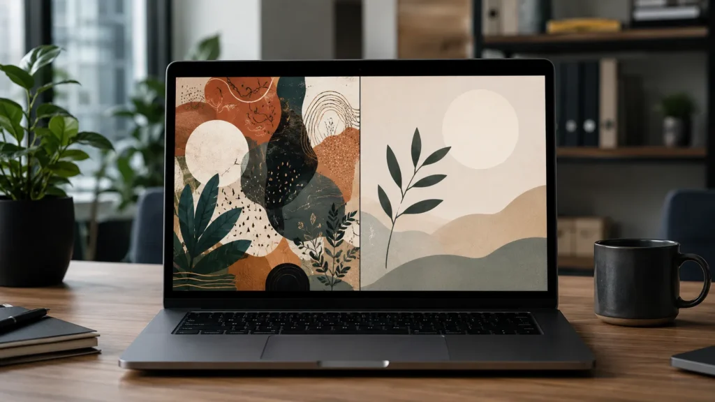
Abstract Wallpaper
Abstract wallpaper can use gradients, soft shapes, patterns, or geometric forms. This style is useful when you want visual interest without a literal image.
Motivational Wallpaper
A motivational wallpaper can include a short quote, goal, word, or reminder. Keep the text brief. One strong sentence is usually better than a full paragraph.
Brand or Business Wallpaper
A branded wallpaper might include company colors, a logo, or a simple tagline. Keep it subtle. A giant logo in the center can feel heavy if you stare at it all day.
Step 4: Build a Simple Color Palette
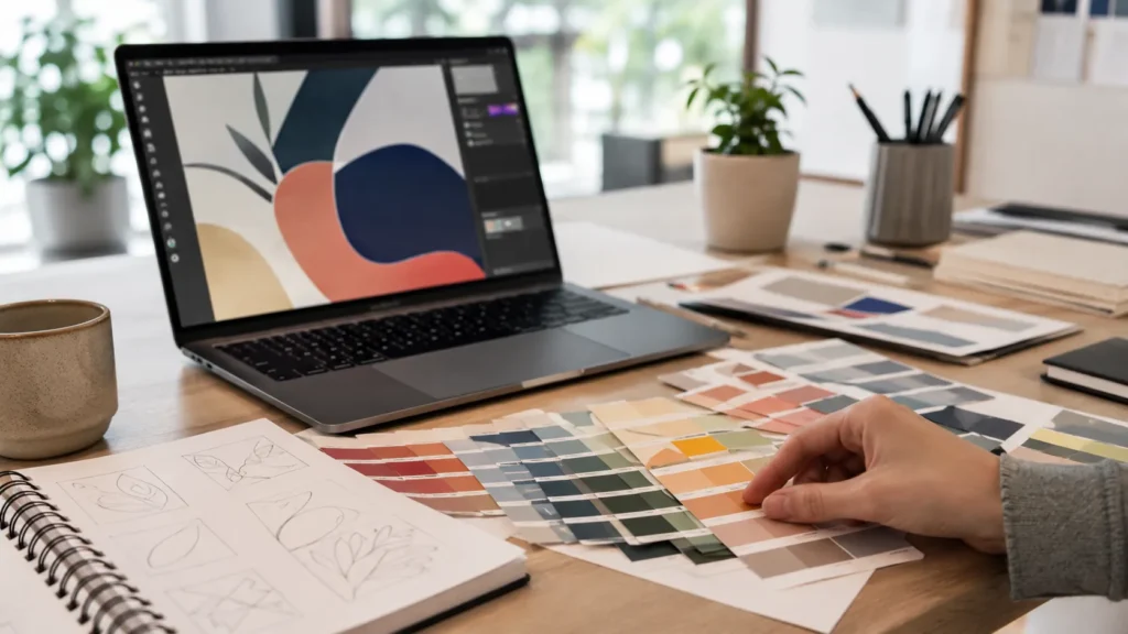
Color can make or break a wallpaper design. A common beginner mistake is using too many colors at once. For most wallpapers, two to four colors are enough.
Start with one main background color. Then choose one or two accent colors for shapes, lines, or text. If you are using a photo, pull colors from the image so the design feels connected.
For desktop wallpaper, be careful with very bright colors behind icons. White icons can disappear on pale backgrounds, while dark icons can disappear on deep backgrounds. If your screen feels hard to read after applying the wallpaper, the design may need softer contrast or more empty space.
A practical rule: if the wallpaper looks exciting for five seconds but tiring after ten minutes, simplify it.
Step 5: Add Images, Shapes, or Text
Once you have the size and style, begin adding the actual design elements.
Use one strong visual focus. This might be a photo, a large shape, a soft pattern, or a short phrase. Avoid making every part of the wallpaper equally important.
If you add text, keep it short and readable. A wallpaper is not the best place for long instructions or detailed notes. A simple phrase like “Focus,” “Create,” or “Q3 Goals” is easier to live with than a crowded block of text.
Also think about where icons and widgets will sit. On a computer desktop, leave clean space along the left side if that is where your files usually appear. On a phone, avoid putting important text at the top where the clock may cover it.
Step 6: Design Your Wallpaper in PowerPoint

PowerPoint is not only for slides. It can also be a useful wallpaper design tool because it gives you a blank canvas and simple visual controls.
Set the Slide Size
Open PowerPoint and create a blank presentation. Go to the slide size settings and choose a custom size that matches your wallpaper.
For a desktop wallpaper, use a 16:9 layout such as 1920 × 1080 pixels. For a phone wallpaper, use a vertical layout such as 1080 × 1920 pixels.
Add a Background
You can use a solid color, gradient, image, or subtle texture. If you use a photo, make sure it is high quality and fills the entire canvas without awkward stretching.
Arrange Your Design Elements
Add shapes, lines, icons, photos, or text. Use alignment tools to keep everything neat. If you are creating a clean productivity wallpaper, place the main design away from your icon area.
For example, you might place a soft abstract shape on the right side and leave the left side mostly empty for desktop files.
Export the Wallpaper
When the design is finished, export the slide as an image. Use PNG for crisp graphics and text. JPG is fine for photo-heavy wallpapers, especially if you want a smaller file size.
After exporting, set the image as your wallpaper and check it on the real screen. This final check is important. A design can look great in PowerPoint but feel too bright, too busy, or poorly cropped once applied.
Common Wallpaper Design Mistakes
Using Too Much Text
Long quotes, task lists, and paragraphs rarely work well as wallpaper. They become visual noise. If you want a text-based design, choose a short phrase and give it room to breathe.
Using Low-Resolution Images
A blurry photo will make the whole wallpaper look unfinished. Always start with an image larger than your final wallpaper size when possible.
Ignoring Icons and Widgets
Your wallpaper is not viewed alone. It sits behind desktop icons, app shortcuts, widgets, clocks, and folders. Leave space for the things that live on your screen.
Putting Details Too Close to the Edge
Edges often get cropped on different devices. Keep important objects, faces, logos, and text away from the border.
Overdesigning the Background
If the wallpaper has too many shapes, colors, textures, and effects, it may distract from your actual work. A cleaner design usually ages better.
Practical Wallpaper Design Ideas
If you are not sure where to start, try one of these simple concepts.
Clean Productivity Wallpaper
Use a calm background color, a small motivational word, and empty space for desktop icons. This works well for students, office workers, and anyone who wants a less cluttered screen.
Personal Quote Wallpaper
Choose a short quote or personal reminder. Use one readable font and place the text in the center or lower third of the design.
Business Branded Wallpaper
Use your brand colors, a small logo, and a simple geometric pattern. This can work well for office computers, team laptops, webinars, or presentation backgrounds.
Photo Collage Wallpaper
Use a few personal or project-related photos, but keep the layout organized. Add consistent spacing between images so it feels designed rather than random.
Mood-Based Wallpaper
Create a wallpaper around a feeling: calm, focused, creative, energetic, or elegant. Let the colors and images support that mood.
Wallpaper Design Tips for a More Professional Look
Use fewer fonts. One or two fonts are enough for most wallpaper designs.
Align objects carefully. Slightly misaligned text or shapes can make a design feel amateur even if the colors are good.
Use contrast with intention. Text should be readable, but it does not always need to be loud.
Preview the wallpaper with real icons. This helps you see whether the design works in daily use.
Create versions. Try a light version, dark version, and no-text version. Sometimes the simplest version is the one you will keep.
Conclusion
Learning how to design wallpaper on your own is less about advanced design software and more about making smart visual choices. Choose the right size, keep the layout clean, use high-quality images, and leave enough space for the screen elements you use every day.
Whether you are creating a desktop background, phone wallpaper, branded visual, or simple productivity design, the same principle applies: the wallpaper should support the way you use your screen, not compete with it.
With a tool like PowerPoint, you can create your own wallpaper quickly by setting the right canvas size, arranging images and text, and exporting the design as a high-quality image. Start simple, test it on your actual screen, then refine from there.
A good wallpaper does not have to be complicated. It just has to feel intentional, clear, and comfortable to look at every day.
FAQ
What is the best size for desktop wallpaper?
For most desktop screens, 1920 × 1080 pixels is a good starting point. If you use a higher-resolution monitor, try 2560 × 1440 or 3840 × 2160 pixels.
Can I design wallpaper in PowerPoint?
Yes. PowerPoint works well for simple wallpaper design. You can set a custom slide size, add images and shapes, arrange text, and export the final design as a PNG or JPG.
What makes a wallpaper look professional?
A professional wallpaper usually has a clear layout, high-resolution images, balanced colors, readable text, and enough empty space for icons or widgets.
Should wallpaper include text?
It can, but keep the text short. A word, phrase, date, or short quote works better than a long paragraph.
Why does my wallpaper look blurry?
Your image may be too small for the screen, or it may have been stretched. Use a higher-resolution design and export it at the correct size.
Create worry-free presentations with AutoPPT . Turn your ideas into slides quickly—while keeping them 100% yours!
About AutoPPT: An easy use AI tool for students and professionals. Generate editable slides, customize designs, and focus on what matters—your unique ideas.

Autoppt: Generate presentations in 1 minute!
Start Free Trail Now