
Michael Anderson
Former journalist turned tech writer with a passion for helping professionals enhance productivity through AI.
Executive Summary: The Architecture of Professional Presentations
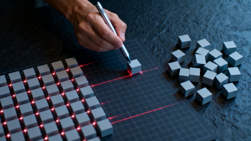
In the high-stakes arena of corporate and academic communication, the visual fidelity of a presentation functions as a silent yet powerful orator. A slide deck is never merely a vessel for raw data; it is a visual argument, a spatial narrative where the placement of every pixel contributes to the authority of the speaker. The difference between a presentation that persuades and one that merely informs—or worse, distracts—often lies in the invisible architecture of the slide: the precise arrangement, alignment, and distribution of its constituent elements. When objects are misaligned by even a fraction of an inch, or when the spacing between varied elements lacks mathematical consistency, the human eye, which is evolutionarily adapted to seek patterns and symmetry, registers a subtle, subconscious sense of disorder. This phenomenon, often termed “visual noise,” significantly increases the cognitive load on the audience. Instead of processing the strategic implications of a quarterly report, the viewer’s brain is inadvertently tasked with reconciling spatial inconsistencies, thereby diluting the impact of the message and eroding the presenter’s credibility.
Google Slides, while celebrated for its accessibility and cloud-native collaboration capabilities, operates with a distinct internal logic regarding object manipulation that differentiates it from legacy desktop software like Microsoft PowerPoint or Apple Keynote. Mastering the “Arrange” menu is not simply a technical proficiency; it is a fundamental design necessity for the modern knowledge worker. This comprehensive research report serves as an exhaustive, expert-level guide to the mechanics of layout within the Google Workspace ecosystem. It will explore the granular details of layering (the Z-axis), the mathematical precision of alignment (the X and Y axes), and the workflow optimizations that transform a chaotic scattering of text boxes, images, and shapes into a cohesive, professional narrative.
Furthermore, as the landscape of presentation design undergoes a seismic shift driven by automation, the intersection of manual control and artificial intelligence becomes increasingly relevant. While pixel-perfect manual alignment remains a critical skill for bespoke customization and complex diagramming, emerging tools like AutoPPT are redefining the economic equation of slide creation by automating the structural foundations of design. This report will navigate the entire spectrum of production, from the tactile precision of manual “nudging” to the algorithmic efficiency of AI-assisted generation, providing a holistic and future-proof view of modern presentation construction.
Part 1: The Philosophy of Spatial Design and Object Selection
Before one can effectively arrange or align objects, one must first understand the fundamental nature of the digital canvas and the objects that inhabit it. In Google Slides, the slide is not just a background image; it is a coordinate system where every element—whether a text box, geometric shape, bitmap image, or embedded video—exists as a distinct object with specific properties, behaviors, and limitations. The user’s ability to interact with these objects dictates the speed, accuracy, and ultimate quality of the design process.
The Cognitive Science of Alignment
Why does alignment matter? It is not merely an aesthetic preference but a cognitive imperative. Research into visual perception suggests that the brain processes aligned information faster than unaligned data. Alignment creates a “visual path” for the eye to follow, reducing the energy required to scan a slide.
-
The F-Pattern and Z-Pattern: In Western cultures, readers naturally scan screens in an F-pattern (top-left, across, down) or a Z-pattern. Proper alignment facilitates this scanning behavior. When objects are scattered or misaligned, the eye moves erratically, leading to “scan fatigue.”
-
Proximity and Grouping: According to Gestalt psychology principles, objects that are close together or aligned on a similar axis are perceived as related. Therefore, a misalignment is not just “messy”; it is a data error. It suggests a lack of relationship where one should exist, or conversely, creates a false relationship between unrelated items.
The Selection Hierarchy and Marquee Logic
Efficient layout management begins with precise selection techniques. A common inefficiency in presentation design is the “selection struggle,” where users inadvertently move background elements or fail to select intended targets. Google Slides employs a specific logic for selection that users must master.
-
Single Selection vs. Edit Mode: Clicking an object once generally selects it, creating a bounding box. However, text boxes present a unique challenge. A single click inside a text box often activates “Edit Mode” (indicated by a blinking cursor) rather than “Object Mode” (indicated by a solid blue border). To align the box itself rather than the text inside it, the user must click the border of the object. This distinction is critical; alignment tools are often grayed out or behave differently if the software thinks the user is editing text content rather than manipulating the container.
-
The Marquee Selection (The Drag Method): Clicking and dragging the cursor across a slide creates a rectangular selection zone, known as a marquee. Any object completely or partially enclosed within this zone becomes selected.
-
The “Touch” Nuance: Unlike some vector design tools (like Adobe Illustrator) where an object must sometimes be fully enclosed to be selected, Google Slides typically selects any object touched by the marquee. This behavior requires careful cursor placement. Users often accidentally select the slide title or a background shape when trying to select a specific cluster of icons.
-
Strategies for Precision: To avoid “ghost selections,” users should begin their drag from the “gutter” (the gray area outside the slide canvas) if the objects are near the edge.
-
-
Multi-Selection Logic (The Shift Modifier): Holding the
Shiftkey allows for the additive selection of objects. Clicking Object A, holdingShift, and then clicking Object B results in both being selected. This is the prerequisite for all relative alignment commands.-
Subtractive Selection: A lesser-known but vital workflow is the subtractive selection. If a user drags a marquee and accidentally selects a background image along with ten icons, they do not need to restart. Holding
Shiftand clicking the background image deselects it while keeping the icons active. This “select-all-then-subtract” method is often faster than individually clicking ten icons.
-
The Anatomy of the Bounding Box
Every selected object or group of objects is defined by a “bounding box”—the blue perimeter line with small squares (handles) at the corners and cardinal sides. Understanding this box is crucial because alignment tools calculate positions based on the mathematical center of this box, not the visual content.
-
The Visual vs. Mathematical Center: If a user inserts a PNG image of a circle, but the image file contains significant transparent whitespace on the left side, the bounding box will be wider than the visible circle. When the user clicks “Center Align,” Google Slides will center the box, making the visible circle appear off-center to the right.
-
Implication: Users must rigorously crop images to the edge of the subject using the crop tool (
Double Clickon image) to ensure that mathematical alignment commands result in visual symmetry.
-
-
Rotation and the Bounding Box: The circular handle extending from the top of the bounding box controls rotation. A critical insight for advanced users is that rotating an object changes the orientation of its axes. However, alignment commands typically align to the slide’s vertical/horizontal axes, not the object’s rotated axes. This can lead to unexpected results when trying to align rotated shapes.
Precision Nudging: The Last Mile of Design
While the mouse is efficient for broad movements, it is a coarse tool for pixel-perfect layout, often limited by screen resolution and hand stability. Google Slides provides keyboard controls for fine-tuning, known as “nudging.”
-
Standard Nudge: Pressing the Arrow keys moves the selected object by a small, fixed increment. This increment is dynamic; it scales based on the current zoom level of the canvas. Zooming in makes the nudge smaller (finer), while zooming out makes it larger (coarser).
-
The Pixel-Perfect Shift: A significant update to the interface has refined this behavior. In many contexts, the arrow keys now nudge by smaller increments than in legacy versions. However, for absolute precision, holding
Shift+ Arrow keys (or just Arrow keys depending on the specific OS and keyboard configuration) allows for specific micro-adjustments. -
Analysis of Workflow: The ability to “nudge” is the final step in any professional design workflow. Automatic alignment tools get the object 99% of the way there; the nudge handles the optical corrections required by the human eye, particularly when aligning round objects with square ones, where mathematical alignment often looks visually “light” or “heavy.”
Part 2: Deep Dive into the “Arrange” Menu Architecture
The “Arrange” menu is the command center for all layout tasks in Google Slides. Located in the primary menu bar, it contains the logic for Order (Z-axis), Align (X/Y axes), Distribute (Spacing), Center (Slide relative), and Group (Unit management). While these tools seem simple, their interactions can be complex.
Access Methods and Workflow Speed
There are three primary ways to access these features, each serving a different workflow speed and user persona:
-
The Menu Bar (The Novice Route): Clicking
Arrangeat the top of the screen. This is the most descriptive route but the slowest, requiring significant mouse travel distance and multiple clicks to drill down into sub-menus. -
The Context Menu (The Intermediate Route): Right-clicking (or two-finger clicking on a trackpad) on a selected object reveals the context menu, which contains the “Align” and “Order” sub-menus. This drastically reduces mouse travel distance, keeping the user’s focus on the object being manipulated.
-
The Keyboard Shortcuts (The Expert Route): The hallmark of a power user. Mastering shortcuts for critical actions like “Group” (
Ctrl+Alt+GorCmd+Opt+G) and “Ungroup” (Ctrl+Alt+Shift+GorCmd+Opt+Shift+G) separates the professional from the casual user.
The “Order” Sub-menu: Mastering the Z-Axis
Slides are 2D surfaces, but they function conceptually in 3D space using layers (the Z-index). Every object sits on a specific layer. When objects overlap, the layer order dictates visibility. This is not just about seeing objects; it is about managing “touch targets” and editing capability. An object buried under a transparent layer cannot be easily clicked.
-
Bring to Front (
Ctrl+Shift+Up/Cmd+Shift+Up): Moves the object to the absolute top layer of the slide stack. It will obscure all other objects it overlaps with. This is often used for “Call to Action” buttons or crucial overlay text. -
Bring Forward (
Ctrl+Up/Cmd+Up): Moves the object up exactly one layer in the stack. If ten objects are stacked, this command must be executed nine times to get an object from the bottom to the top. This is useful for weaving elements together, such as placing a text box between a background shape and a foreground image. -
Send Backward (
Ctrl+Down/Cmd+Down): Moves the object down one layer. -
Send to Back (
Ctrl+Shift+Down/Cmd+Shift+Down): Moves the object to the absolute bottom layer, just above the slide background. This is essential for background images or watermark logos. -
Strategic Use in Composition: In complex diagrams or collages , the Z-axis is used to hide “messy edges.” For example, if a user wants a photo to appear inside a circle but lacks advanced masking skills, they can place a “donut” shape with a transparent center over the square photo. The
Bring to Frontcommand on the donut shape effectively masks the corners of the photo, creating a seamless, professional look without destructive editing.
Grouping: Creating Logical Design Units
Grouping (
Ctrl+Alt+G or Cmd+Opt+G) combines multiple objects into a single actionable unit. The Group function is the foundation of scalable design.-
The Preservation of Spacing: The primary utility of grouping is to “lock” the relative spacing between objects. Once a complex icon constructed of three shapes and a text label is grouped, it can be moved across the slide without the risk of leaving the text label behind.
-
Scaling Behaviors: When a group is resized, Google Slides mathematically scales all constituent objects and the whitespace between them. This allows users to design a complex diagram at a large scale (for ease of editing) and then shrink it down to fit a corner of the slide, maintaining perfect relative proportions.
-
Nested Groups: Google Slides supports groups within groups (nesting). A user can group a chart title and the chart itself, and then group that unit with a sidebar summary. This hierarchical structure mirrors HTML/CSS logic and allows for sophisticated layout management.
-
Isolation Mode (Editing Within Groups): A common inefficiency is “Ungrouping to Edit.” Users often Ungroup objects just to change the color of one shape, then struggle to regroup them correctly. This is unnecessary. A “double-click” (or sometimes a slow triple-click) on a specific element within a group enters a temporary “isolation mode,” where that single element can be modified without breaking the group structure.
-
Troubleshooting Grayed-Out Options: A frequent source of user frustration occurs when grouping options are disabled (grayed out) in the menu.
-
The Video Constraint: Embedded YouTube videos often cannot be grouped with standard shapes or text boxes due to the way the iframe player is rendered on the canvas layer.
-
The Placeholder Constraint: Elements that originate from the “Master Slide” (Theme Layout), such as the default “Click to add title” boxes, sometimes behave differently than standard text boxes and may resist grouping with user-created shapes unless they are first detached or the grouping is done within the Theme Builder itself.
-
Part 3: The Mechanics of Alignment and the Anchor Paradox
Alignment is the mathematical positioning of objects relative to a specific reference point. Google Slides offers two distinct alignment behaviors: aligning objects relative to the slide (the canvas) and aligning objects relative to each other (the selection set). Understanding which mode is active is critical, as mistakes here often require multiple “Undo” actions to correct.
Center on Page (Slide-Relative Alignment)
This set of commands positions the object based on the total dimensions of the canvas (usually a 16:9 aspect ratio, typically 10 x 5.63 inches).
-
Horizontally: Places the object’s center point exactly at the horizontal midpoint (X-axis) of the slide.
-
Vertically: Places the object’s center point exactly at the vertical midpoint (Y-axis).
-
Use Case: This is the first step in creating title slides, centering a quote, or ensuring a main image is the focal point. It is accessed via
Arrange > Center on page.-
Shortcuts: While there is no default single-key shortcut for this in all browsers, power users often utilize
Ctrl+Shift+E(Center Align Text) which serves a similar visual function for text within a box, though not the box itself. True object centering often requires the menu or custom key bindings.
-
Aligning Objects to Each Other
When multiple objects are selected, the “Align” menu transforms. It no longer references the slide edges but rather the edges of the selection group. This is where Google Slides behaves differently than some other professional design software, leading to what can be termed the “Anchor Object Paradox“.
-
The Logic of “Extremes”:
-
Align Left: Aligns the left edges of all selected objects to the leftmost edge of the left-most object in the selection. The object that is already furthest to the left acts as the anchor; it stays put, and all other objects move to meet it.
-
Align Right: Aligns all right edges to the rightmost edge of the selection.
-
Align Top: The highest object acts as the anchor/ceiling.
-
Align Bottom: The lowest object acts as the anchor/floor.
-
Align Center/Middle: This calculates the mathematical average center of the entire selection area and moves all objects (including the visual anchor) to that mean line.
-
-
The Missing Feature (Key Object): In Adobe Illustrator or modern PowerPoint, a user can click an object a second time to designate it as the “Key Object,” forcing all others to align to it, regardless of position. Google Slides does not currently support this feature natively.
-
Workaround: To align a group of icons to a specific central icon (that isn’t the extreme left or right), the user must first manually drag that target icon to an extreme position, or use a temporary “guide object” (like a vertical line) placed exactly where alignment is desired, align everything to that line, and then delete the line.
-
Strategic Alignment Scenarios
-
The “Bullet Point” Fix: Often, users manually create text boxes for custom lists to avoid the rigid formatting of standard bullet points. These inevitably become jagged. By selecting all boxes and choosing
Arrange > Align > Left, the user creates an instant, clean margin, simulating a professional typeset look. -
The “Icon Row”: When placing social media icons (LinkedIn, Twitter, Website), the user should place the first icon and the last icon in their desired absolute positions on the slide. Then, select all intermediate icons. Using
Arrange > Align > Middleensures they sit on the same horizontal plane, correcting any vertical drift that occurred during placement.
Part 4: Distribution and Spacing Dynamics
Alignment ensures objects share an axis; Distribution ensures they share precise intervals of space. A row of icons can be perfectly aligned to the top but will still look amateurish if the gaps between them are uneven.
Distribute Horizontally
This command operates on a specific algorithm: it takes the leftmost object and the rightmost object as fixed anchors. It then mathematically calculates the available whitespace between them and arranges the intermediate objects so that the distances between their center points (or typically their bounding boxes) are identical.
-
Prerequisite: You must have three or more objects selected. With only two objects, distribution is mathematically irrelevant (as the distance is simply the distance).
-
Grayed Out Issues: If “Distribute” is grayed out, the user likely has fewer than three objects selected, or the objects are grouped into a single unit (which Slides views as one object). It can also happen if the objects are technically touching or overlapping in a way that leaves no calculation space, though this is rare.
Distribute Vertically
This functions identically to horizontal distribution but uses the top and bottom objects as the fixed anchors.
-
Use Case: This is essential for creating manual tables, agendas, or lists where separate text boxes must be spaced evenly down the slide to maximize readability and use of whitespace.
The “Gap” vs. “Center” Distribution Logic
A nuanced issue often encountered by designers is that standard distribution tools may distribute based on the center points of objects rather than the visible gaps between them.
-
The Problem: If objects are of different sizes (e.g., a wide rectangle next to a narrow circle next to a square), distributing them may result in uneven visual gaps between their edges, even if their centers are mathematically equidistant. This can make the layout look “clunky.”
-
The Manual Workaround: To achieve equal visual gaps between shapes of varying widths, users often have to use “spacer blocks.” A user creates a temporary rectangle of a specific width (e.g., 0.5 inches), duplicates it, and places these spacers between the content objects. They then align the content objects to the edges of these spacers and finally delete the spacers. This is a tedious but effective method for high-end design work in Slides.
Part 5: Advanced Positioning Tools: Grids, Guides, and Rulers
While the “Arrange” menu helps correct positions after placement, the View tools (Rulers, Guides, Grids) are designed to aid in accurate placement during the creation process. These are the tools that move a user from “eyeballing it” to “engineering it”.
The Ruler and Guide System
Visible via
View > Show ruler, the ruler provides a measurement scale (typically inches or centimeters based on locale).-
Creating Guides: By right-clicking on the ruler (or simply clicking and dragging from the ruler onto the slide), users can pull “Guides” onto the canvas. These are non-printing cyan lines that act as magnetic rails.
-
Managing Guides: Users can add specific vertical guides (e.g., at 1.0 inch and 9.0 inches) to define the “safe zone” or margins for content. This ensures that no text falls off the edge during projection on screens with overscan issues.
-
Color Coding: A powerful but often overlooked feature is the ability to color-code guides. By right-clicking a guide, a user can change it to Red, Yellow, etc. This allows for complex grid systems—for example, using Red guides for the primary slide margins and Blue guides for internal column dividers.
-
The “Snap” Factor: When
View > Snap to > Guidesis enabled, dragging an object near a guide causes it to “snap” or physically jump to align with the line. This provides tactile feedback, confirming alignment without the need to zoom in or check coordinates.
Snap to Grid vs. Snap to Guides: The Conflict
Google Slides offers two magnetic behaviors that can sometimes conflict with one another.
-
Snap to Guides (The Default Smart Mode): This is the “intelligent” alignment system. As an object moves, red lines appear dynamically, showing alignment relationships with adjacent objects (e.g., “This box is now centered with the image below it”). This is generally preferred for standard presentation layouts involving text and photos.
-
Snap to Grid (The Technical Mode): This ignores object relationships and forces every movement to align with an invisible background grid (usually set to 1/12th of an inch or similar subdivisions).
-
When to use Grid: This is superior when drawing technical diagrams, organizational charts, or flowcharts where geometric precision is paramount and relationship lines (connectors) need to be perfectly straight.
-
When to use Guides: For almost all other design tasks. Using “Snap to Grid” for a photo collage often results in gaps that are too wide or too narrow because the grid doesn’t account for the image’s specific dimensions.
-
The “Smart Guide” Phenomenon
The “Smart Guides” (the dynamic red lines) are powerful but can be distracting. If a slide has hundreds of objects (like a complex map with many pins), the smart guides may try to align the active object to everything it passes, causing the cursor to stutter or the object to jitter.
-
The Override: In such cases, temporarily holding the
Altkey (Windows) orCmdkey (Mac) while dragging an object disables all snapping behaviors. This allows for smooth, fluid movement, essential for making micro-adjustments that defy the grid logic.
Part 6: The Master Slide (Theme Builder) – The “Locking” Mechanism
A persistent limitation in the standard Google Slides interface is the absence of a simple “Lock Object” button, a feature standard in many other design tools. This makes it easy to accidentally drag a logo or background header while trying to edit the text on top of it. The solution lies in the Theme Builder (formerly known as the Master Slide).
The Logic of the Master Layer
The Theme Builder (
View > Theme builder) reveals the underlying DNA of the presentation. Objects placed here exist on a layer behind the standard slide layer and, crucially, cannot be selected or moved from the normal slide view.-
Creating “Locked” Elements: To lock a company logo in the top right corner of every slide:
-
Open
View > Theme builder. -
Select the top “Theme” slide (to apply to all layouts) or a specific layout slide (e.g., “Title and Body”).
-
Paste and position the logo.
-
Return to the standard view. The logo will now appear on all slides but will be completely unselectable, effectively locked.
-
-
Alignment on the Master: All the Arrange and Align tools discussed previously function within the Theme Builder. Aligning a header text placeholder on the Master Slide ensures that the title is in the exact same pixel position on Slide 5 as it is on Slide 50. This prevents the jarring “title jump” effect seen when clicking through a deck where titles slightly shift position from slide to slide.
Background Image Locking
For users who want to lock a background image for a specific slide without altering the Master Theme (which would affect other slides), the “Change Background” feature is the functional equivalent of locking.
-
Workflow: Instead of pasting an image and sending it to the back:
-
Go to
Slide > Change Background. -
Choose Image.
-
Upload the desired visual.
-
-
Result: The image becomes part of the canvas. It cannot be dragged, resized, or misaligned by accident, providing a stable foundation for placing foreground text and data.
Part 7: Mobile vs. Desktop Workflows
While this guide primarily addresses the desktop interface (where heavy design work typically occurs), the reality of modern work involves mobile editing. The “Arrange” capabilities on Android and iOS versions of Google Slides are robust but hidden behind different UI paradigms.
The Touch Interface Nuances
On mobile devices, the precision of a mouse is replaced by the ambiguity of a finger tap.
-
Selection: Tapping an object selects it. To select multiple objects (the prerequisite for alignment), the user typically must long-press an object or tap a specific “multi-select” mode icon, depending on the app version.
-
The “Arrange” Location: Unlike the prominent desktop menu, mobile arrangement tools are often tucked inside the “Format” menu (the
Aicon with lines) or a dedicated object menu. -
Drag-to-Align: Mobile versions lean heavily on “Smart Guides.” As a user drags an object with their finger, the red alignment lines appear vividly to help guide the touch placement.
-
Limitations: Advanced features like “Distribute” or precise X/Y coordinate entry are often absent or severely buried in mobile interfaces. The mobile app is best suited for minor tweaks (e.g., fixing a typo or swapping an image) rather than structural layout design. Complex alignment tasks should be reserved for the desktop environment.
Part 8: The Efficiency Paradox and the Role of AutoPPT
While mastering the intricacies of alignment, distribution, and grouping is essential for any designer, a critical question arises regarding workflow efficiency. The time investment required to manually align dozens of text boxes, resize images to matching dimensions, and distribute icons evenly is substantial. In the corporate world, this is often referred to as the “formatting tax”—the non-value-added time spent making a presentation look good rather than refining the content itself.
It is in this context that AI-driven solutions like AutoPPT function not just as alternatives, but as evolutionary successors to manual formatting for many high-volume use cases.
The Limitations of Manual Arrangement
Even with mastery of shortcuts, manual arrangement has inherent bottlenecks:
-
Iterative Re-work: If a user aligns a perfect grid of 6 items and then decides to add a 7th, the entire alignment and distribution process must be repeated. The spacing logic must be recalculated, and objects shifted.
-
Template Rigidity: Standard templates provide a background, but they do not enforce alignment on new content added by the user. If a user pastes a chart from Sheets, it lands arbitrarily, requiring manual alignment.
-
Consistency Drift: In long presentations (50+ slides), maintaining the exact same margin alignment manually across all slides is prone to human error. A text box on Slide 10 might be 10 pixels lower than on Slide 9, creating a subtle visual disconnect.
The AutoPPT Advantage: From Creation to Curation
AutoPPT addresses these structural inefficiencies by fundamentally changing the creation mechanism. It shifts the user’s role from “bricklayer” to “architect.”
-
Generative Layouts: Rather than placing an object and then aligning it, AutoPPT generates the slide with the layout pre-calculated. The AI understands spatial relationships, ensuring that text blocks, headers, and images are aligned and distributed according to design best practices upon generation. This solves “Blank Page Paralysis” , where users waste time just deciding where to put the first box.
-
Doc-to-Deck Transformation: A standout feature is the ability to upload a document (Word, PDF) and have the AI transmute it into a deck. The AI analyzes the document’s structure and automatically maps it to slide layouts. This means the “alignment” of the narrative structure happens algorithmically, not just the visual alignment of boxes.
-
Professional Template Integration: AutoPPT provides a massive library of high-quality PPT templates. Unlike standard themes that merely color the background, these templates often come with pre-configured “smart placeholders.” When content is poured into these placeholders via the AI, it inherits the correct alignment properties automatically.
-
Brand Consistency: For organizations, AutoPPT can help enforce brand guidelines. By automating the selection of fonts, colors, and layouts, it prevents the common issue of employees “going rogue” with alignment and creating messy, off-brand presentations.
-
Efficiency Metrics: By offloading the spatial mathematics to AutoPPT’s AI, users save significant time and improve work efficiency. The cognitive load shifts from “How do I center this?” to “Does this text convey the right message?”
-
Integration and Hybrid Workflow: The soft integration of such tools suggests a hybrid workflow. A user might utilize AutoPPT to generate the “First Draft” or the complex layouts—ensuring a perfect baseline alignment—and then use the manual Google Slides skills detailed in this report for final, specific tweaks or to customize a specific diagram that requires a unique touch.
Part 9: Practical Step-by-Step Scenarios
To solidify the theoretical knowledge, this section details three common workflows that require a synthesis of all arrangement tools to solve real-world design problems.
Scenario A: Creating a Perfectly Spaced Photo Collage
Goal: Arrange four photos in a single horizontal row with equal spacing, aligned tops, and consistent sizing.
-
Import: Insert the four images onto the slide. They will likely be of different sizes, aspect ratios, and scattered positions.
-
Standardize (The Crop): Before aligning, you must standardize dimensions. Select an image, click the “Crop” tool, and choose “Aspect Ratio > Square (1:1).” Repeat for all images. This ensures the visual weight is equal.
-
Resize: Select all images (
Shift + Click). Drag a corner handle to resize them roughly. For precision, go toFormat Options > Size & Rotationand type a specific height (e.g., 3 inches). -
Rough Placement: Drag the first image to the far left margin (snap to a Red Guide). Drag the last image to the far right margin. Place the middle two arbitrarily between them.
-
Vertical Alignment: Select all four images. Go to
Arrange > Align > Top. Now their top edges form a perfect straight line. -
Distribution: With all four still selected, go to
Arrange > Distribute > Horizontally. The two middle images will snap into place, creating mathematically perfect gaps between all items. -
Grouping: Press
Ctrl+Alt+Gto group them. Now you can center the entire “Gallery” block on the slide usingArrange > Center on page > Horizontally.
Scenario B: Aligning an Organization Chart (The Hierarchy Problem)
Goal: A CEO box at the top, connected to three VP boxes below.
-
Create Hierarchy: Place the CEO box at the top center.
-
Create VPs: Create the three VP boxes.
-
Align VPs: Select the three VP boxes.
Arrange > Align > Topto level them. -
Distribute VPs:
Arrange > Distribute > Horizontallyto space them evenly. -
Group VPs: Critical Step: Group the three VP boxes (
Ctrl+Alt+G). -
Center Alignment: Select the CEO box AND the “VP Group.” Go to
Arrange > Align > Center.-
Analysis: By grouping the VPs first, the software treats them as one wide object. If you didn’t group them, aligning “Center” would smash all three VP boxes into a pile directly on top of the CEO box (or behind it). This demonstrates the vital interplay between Grouping and Alignment logic.
-
Scenario C: The “Text Box Overflow” Fix (The Resume/Agenda Slide)
Goal: A slide has 5 detailed bullet points that were created as separate text boxes (for animation purposes) and look messy.
-
Select: Marquee selects all 5 text boxes.
-
Left Align:
Arrange > Align > Left. (Now the start of the sentences are lined up). -
Vertical Spacing:
Arrange > Distribute > Vertically. (Now the space between lines is even). -
Nudge: Use the arrow keys to move the entire selection to the desired location relative to the slide title.
-
Check Margins: Ensure the right side of the text boxes does not run off the slide. If they are too wide, resize one while all are selected; they will all resize proportionally (unless grouped, in which case the text scales; if ungrouped, the wrapping reflows).
Part 10: Troubleshooting and Edge Cases
Even expert users encounter scenarios where the tools do not behave as expected. This “Diagnostic” section addresses common anomalies.
“Why Can’t I Group This?”
If the
Group option is grayed out, the user has likely selected a “Placeholder” from the Master Layout (Theme) alongside a normal object. Placeholders (the boxes that say “Click to add title”) have restricted behaviors compared to standard text boxes because they are linked to the Theme code.-
Solution: The user cannot group a Layout Placeholder with a standard object. They must either create a new standard text box to replace the placeholder or modify the grouping on the Master Slide (
Slide > Edit Theme).
The “Jumping” Object
Sometimes, when a user tries to move an object slightly, it “jumps” back to a previous position or snaps aggressively to a place they don’t want.
-
Cause: This is usually “Snap to Grid” being active while the user is trying to align to an object that isn‘t on the grid.
-
Solution: Go to
View > Snap toand uncheckGrid. Alternatively, checkingGuideswill prioritize alignment with other objects over the arbitrary grid background.
Objects Disappearing Behind Backgrounds
A common error involves importing a large image to use as a background, which immediately covers all text because new objects are added to the top layer (Front).
-
Solution: Select the large image. Use
Arrange > Order > Send to Back. -
Prevention: As noted in Section 6, utilizing the
Change Backgroundfeature prevents this Z-index conflict entirely.
The New Sidebar (2025 Update)
Recent updates to Google Slides have introduced a new sidebar with design elements. This sidebar changes the alignment workflow by offering “Building Blocks”—pre-grouped collections of text and shapes (like agendas or timelines).
-
Impact: Users should be aware that these building blocks come pre-aligned. However, if you
Ungroupthem to customize heavily, you lose the smart constraints, and standard alignment tools must be used to repair the layout.
Part 11: Comprehensive Keyboard Shortcut Reference
Speed in arrangement comes from bypassing the menu system. A professional designer’s left hand should rarely leave the keyboard. The following table consolidates the essential shortcuts for layout efficiency, distinguishing between standard operations and the nuanced “Pixel Nudge”.
| Action | Windows / Chrome OS Shortcut | Mac Shortcut | Context / Note |
| Group | Ctrl + Alt + G | Cmd + Opt + G | Essential for locking spacing. |
| Ungroup | Ctrl + Alt + Shift + G | Cmd + Opt + Shift + G | Use sparingly; prefer double-click to edit. |
| Bring to Front | Ctrl + Shift + Up Arrow | Cmd + Shift + Up Arrow | Moves to absolute top layer. |
| Bring Forward | Ctrl + Up Arrow | Cmd + Up Arrow | Moves up one layer index. |
| Send Backward | Ctrl + Down Arrow | Cmd + Down Arrow | Moves down one layer index. |
| Send to Back | Ctrl + Shift + Down Arrow | Cmd + Shift + Down Arrow | Moves to absolute bottom layer. |
| Select Multiple | Shift + Click | Shift + Click | Basis for all alignment. |
| Duplicate Object | Ctrl + D | Cmd + D | Faster than Copy/Paste. |
| Nudge (Pixel) | Shift + Arrow Keys | Shift + Arrow Keys | For micro-adjustments (1px). |
| Rotate 15° | Alt + Right/Left Arrow | Opt + Right/Left Arrow | Snaps rotation to standard angles. |
| Rotate 1° | Alt + Shift + Right/Left | Opt + Shift + Right/Left | For precise horizon correction. |
| Resize from Center | Ctrl + Drag Handle | Opt + Drag Handle | Keeps center point fixed. |
| Constrain Proportions | Shift + Drag Handle | Shift + Drag Handle | Prevents stretching/squashing. |
Conclusion
The mastery of arranging and aligning objects in Google Slides is the dividing line between amateur drafts and professional presentations. It requires a blend of technical knowledge—understanding the behavior of bounding boxes, Z-layers, and distribution algorithms—and visual intuition. By utilizing the “Arrange” menu, leveraging the power of Guides and Grids, and employing efficient grouping strategies, a user can impose order on chaos, ensuring that the audience focuses on the message rather than the medium.
However, the landscape of presentation design is shifting. While the manual skills detailed in this report are indispensable for fine-tuning and customization, the emergence of AI tools signifies a new era of efficiency. Platforms like AutoPPT provide a powerful alternative, allowing users to bypass the tedious mechanics of alignment through intelligent generation and high-quality templates. Whether through pixel-perfect manual control or AI-assisted workflow, the goal remains constant: clear, impactful, and visually coherent communication. By combining the deep technical understanding of Google Slides’ native tools with the time-saving capabilities of modern AI, users can achieve a level of productivity and polish that was previously the domain of dedicated graphic designers.
Create worry-free presentations with AutoPPT . Turn your ideas into slides quickly—while keeping them 100% yours!
About AutoPPT: An easy use AI tool for students and professionals. Generate editable slides, customize designs, and focus on what matters—your unique ideas.

Autoppt: Generate presentations in 1 minute!
Start Free Trail Now