
Maggie Tsui
Co-founder, CEO of Autoppt. An office software enthusiast committed to improving workplace productivity. I love sharing tips and tools that make daily tasks easier and faster.
Introduction
You’ve got a strong idea. Solid data. A story that deserves attention.
Then you open PowerPoint, and a blank slide appears.
For many professionals, that’s the moment where confidence dips. Turning complex information into a clear, visually engaging presentation is harder than it looks.
In modern workplaces, presentations are everywhere — strategy meetings, marketing reports, classroom lectures, investor pitches, and team updates. Knowing how to design PowerPoint slides effectively can make the difference between a presentation people remember and one they forget five minutes later.
The good news is that strong slide design doesn’t require a graphic design degree. Once you understand a few core PowerPoint presentation design tips, creating polished, professional slides becomes much easier.
In this guide, we’ll explore the most practical slide design best practices used by experienced presenters. These strategies will help you design slides that communicate ideas clearly, keep audiences engaged, and reinforce your credibility as a presenter.
Why PowerPoint Presentation Design Matters
Many people think presentation design is simply about making slides look attractive.
In reality, design directly affects how audiences process information.
When slides are well structured, viewers immediately understand what they should focus on. The presentation feels organized, and the speaker appears more confident and professional.
On the other hand, cluttered slides filled with text, inconsistent layouts, or low-contrast visuals force audiences to work harder to understand the message. When that happens, people stop listening.
A well-designed professional PowerPoint presentation accomplishes three important things:
-
Clarity – the main idea becomes immediately visible
-
Focus – the audience knows where to look first
-
Credibility – polished slides build trust in the presenter
Good slide design doesn’t just make presentations look better. It makes communication more effective.
PowerPoint Design Principles Professionals Follow
Before diving into specific techniques, it helps to understand the principles that guide strong presentation slides design.
Professional presenters typically follow four core rules.
Clarity
Every slide should communicate its message within a few seconds. If the audience needs to read an entire paragraph to understand the point, the slide is too complex.
Simplicity
Removing unnecessary elements makes information easier to absorb. Minimal slides often communicate ideas more effectively than crowded ones.
Visual Hierarchy
People naturally focus on the largest or most visually prominent elements first. Effective slides use size, contrast, and positioning to guide attention.
Consistency
Consistent fonts, colors, and layouts create visual harmony. When slides follow a predictable structure, audiences can focus on the content rather than adjusting to changing styles.
These slide design best practices form the foundation of every effective presentation.

The Psychology Behind Good Slide Design
Human brains process visuals far faster than written text.
That’s why a single chart or image can often communicate an idea more quickly than several sentences.
When slides are cluttered with text and graphics, the brain must divide attention between reading, listening, and interpreting visuals. This increases cognitive load and makes information harder to retain.
Good presentation slides design reduces this cognitive effort.
Whitespace provides visual breathing room. Strong contrast improves readability. Consistent layouts allow viewers to predict where information will appear.
When slides align with how people naturally process information, presentations become easier to follow and far more memorable.

15 Practical PowerPoint Presentation Design Tips
The following PowerPoint presentation design tips are used by professionals across business, education, marketing, and startups.
-
Focus on One Idea Per Slide
Each slide should communicate a single clear idea.
If a slide tries to explain multiple concepts at once, audiences struggle to identify the main message.
For example, instead of presenting three strategic goals on one crowded slide, create three separate slides that each highlight one goal clearly.
A common mistake is treating slides like document pages. Remember: slides are visual aids, not written reports.
-
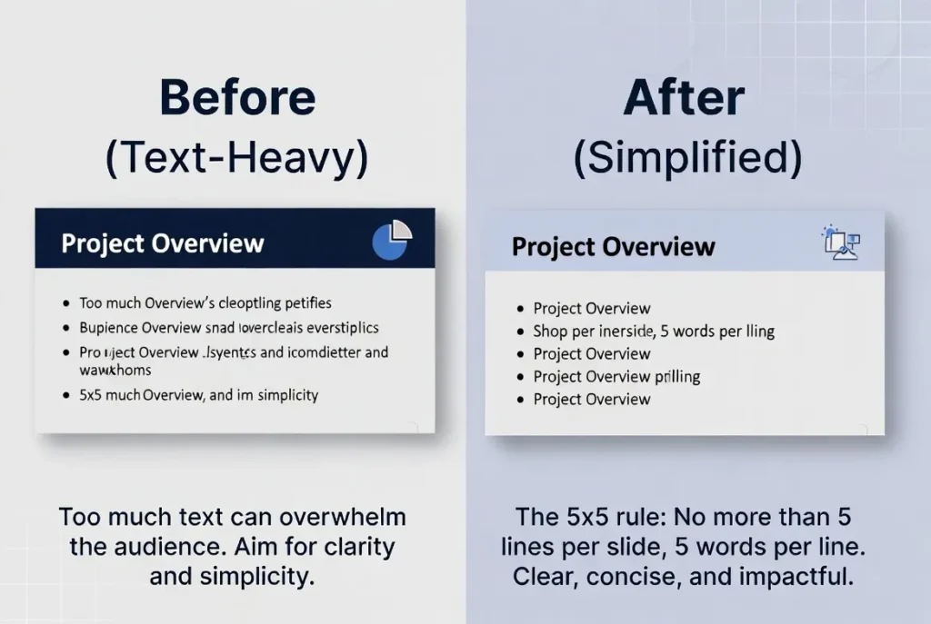
Use the 5×5 Rule
Limit the amount of text on each slide.
A helpful guideline is five lines of text with roughly five words per line. Short headlines paired with visuals are far easier to absorb than long paragraphs.
If you catch yourself writing full sentences on slides, consider moving that information into your spoken explanation instead.
-
Create Strong Visual Hierarchy
The most important information should stand out immediately.
Use larger fonts, bold colors, or positioning to highlight key ideas. Supporting information can remain smaller or lighter.
When every element on a slide looks the same, the audience doesn’t know where to focus.

-
Limit Fonts to Two
Too many fonts make presentations feel inconsistent and unprofessional.
Most effective slides use one font for headings and one for body text.
Clean, readable fonts such as Calibri, Arial, Montserrat, or Open Sans are reliable choices.
-
Use a Simple Color Palette
Professional presentations typically use three to five colors.
This often includes:
-
one primary color
-
one accent color
-
neutral tones
Limiting colors improves visual consistency and helps reinforce branding.
-
Choose High-Quality Images
Low-resolution or distorted images instantly reduce credibility.
Use high-quality visuals that align with your message and maintain a consistent style across slides.
Resources like Unsplash and Pexels offer professional images suitable for presentations.
-
Use Whitespace Strategically
Whitespace isn’t wasted space.
It helps guide attention and prevents slides from feeling overwhelming.
Slides with generous spacing often appear more confident and professional than slides packed with content.
[Suggested image: Before vs After slide comparison showing cluttered vs whitespace design]
-
Keep Animations Subtle
Animations should support pacing, not distract from the message.
Simple fade-in effects are usually enough. Dramatic transitions or spinning text effects often make slides feel outdated.
When in doubt, use fewer animations.
-
Design for the Back Row
Always design slides so they remain readable from a distance.
Recommended sizes:
-
body text: 24pt minimum
-
titles: 40–44pt or larger
If text looks small on your laptop screen, it will be even harder to read on a projector.
-
Align Everything Precisely
Small alignment errors can make slides look messy.
Use PowerPoint’s alignment tools to keep text, icons, and images perfectly positioned.
Consistent alignment immediately improves the perceived quality of a presentation.
-
Replace Bullet Lists with Visuals
Bullet points are useful, but visuals communicate ideas faster.
Icons, diagrams, or simple process graphics often make information easier to understand.
For example, instead of listing steps in a bullet list, show them visually using arrows or icons.
-
Create a Custom Theme
Reusable slide templates save time and ensure consistency.
A custom theme includes your brand fonts, colors, and layout styles. Once created, every new slide automatically follows the same design rules.
Many teams now generate the initial slide structure using tools like Autoppt, then refine the theme directly in PowerPoint to match their brand identity.
-
Simplify Charts
Charts should highlight insights rather than overwhelm viewers.
Remove unnecessary gridlines, labels, or decorative elements so the main trend becomes obvious.
If the audience cannot understand the key takeaway within a few seconds, the chart is too complex.
-
Use Strong Contrast
High contrast improves readability.
Dark text on light backgrounds or white text on dark backgrounds typically works best.
Avoid light gray text on white slides — it may look subtle on your screen but becomes unreadable in large rooms.
-
Always Test Your Slides
Before presenting, test your slides in real conditions.
Check how they appear on projectors, large screens, or video calls.
Small issues like contrast, alignment, or font size often become obvious during rehearsal.
Common PowerPoint Design Mistakes
Even experienced presenters sometimes fall into these traps:
-
overcrowded slides filled with text
-
inconsistent fonts and colors
-
excessive animations or transitions
-
generic templates with no visual identity
-
low contrast that reduces readability
Avoiding these mistakes alone can significantly improve the quality of your presentation.
Tools That Help Improve PowerPoint Design
Several tools can make presentation design faster and easier.
PowerPoint itself includes Designer and Copilot, which suggest layouts and visual improvements automatically.
Platforms like Canva offer modern templates that export well to PowerPoint.
For teams that require detailed layout control, design tools such as Figma are also popular.
AI-powered presentation tools are also becoming increasingly common. Platforms like Autoppt can generate structured slide outlines from simple prompts, helping users build a presentation framework in minutes instead of hours.
This allows presenters to spend less time formatting slides and more time refining their message.

Real-World Use Cases
Business Presentations
Executives often review dozens of presentations each week. Clear, well-structured slides show respect for their time and improve decision-making.
Marketing Reports
Simplified charts and visual storytelling help stakeholders quickly understand campaign performance.
Educational Presentations
Students retain information better when lectures rely on visuals and structured slides rather than dense text.
Startup Pitch Decks
Investors review pitch decks quickly. Slides with bold visuals and minimal text communicate ideas far more effectively.
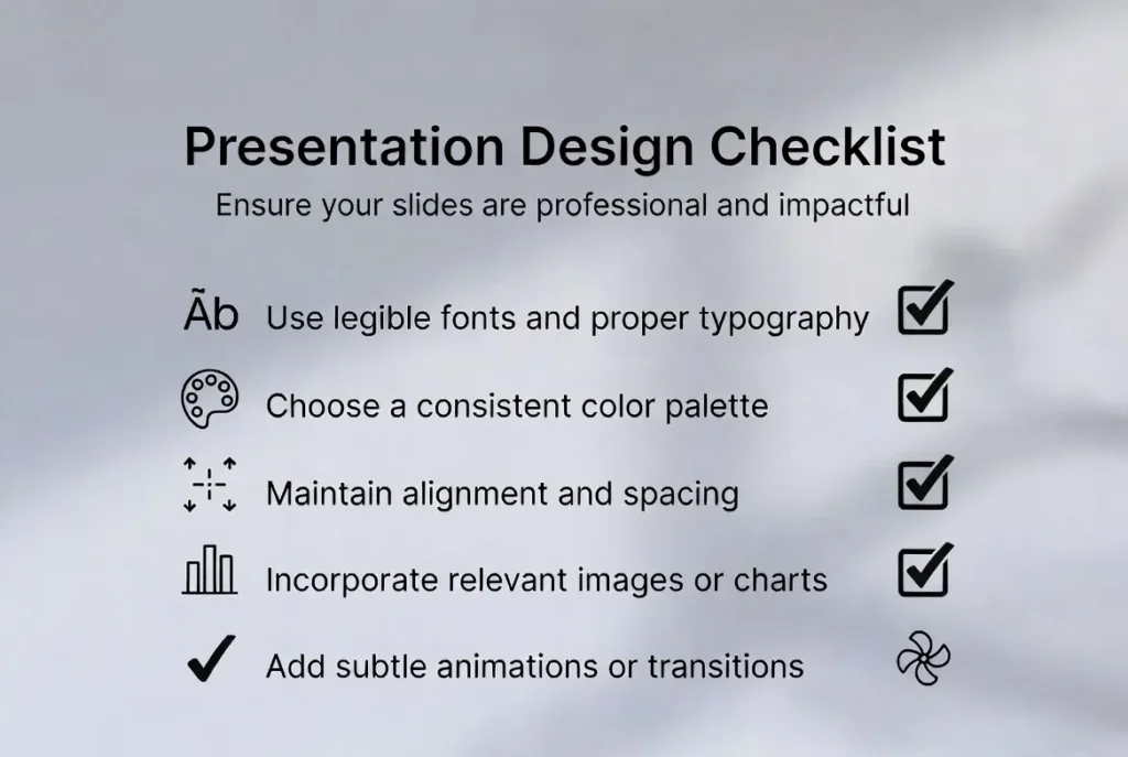
PowerPoint Design Checklist
Before presenting, review this checklist:
-
Does each slide communicate one clear idea?
-
Is the text readable from a distance?
-
Are fonts and colors consistent?
-
Are images high quality?
-
Is there enough whitespace?
-
Are elements aligned properly?
-
Are animations minimal and purposeful?
If most answers are yes, your presentation is ready.
Conclusion
Great PowerPoint presentations aren’t defined by flashy graphics or complicated layouts.
They succeed because they communicate ideas clearly.
When slides follow simple design principles — clarity, hierarchy, and consistency — audiences understand your message faster and remember it longer.
Start applying even a few of these PowerPoint presentation design tips, and you’ll quickly notice a difference in both audience engagement and presentation confidence.
Your slides are part of your story.
Design them intentionally, and your ideas will have the impact they deserve.
FAQ
What are the best PowerPoint presentation design tips for beginners?
Start by focusing on one idea per slide, using large readable fonts, and limiting text. These simple changes immediately improve clarity and make slides look more professional.
How do I make my PowerPoint presentation look more professional?
Use consistent fonts, a limited color palette, high-quality images, and strong visual hierarchy. Professional slides prioritize simplicity and readability.
What font size should be used for PowerPoint slides?
Body text should typically be at least 24 points, while titles should be around 40–44 points or larger.
How many slides should a 10-minute presentation have?
A good rule is about one slide per minute of speaking time, meaning 8–12 slides for a 10-minute presentation.
What is the biggest mistake in PowerPoint slide design?
The most common mistake is overcrowding slides with too much text. Slides should support the speaker, not replace them.
Should PowerPoint slides contain bullet points?
Bullet points can be used sparingly, but visuals such as icons, diagrams, and charts usually communicate ideas more effectively.
What are the most important presentation design principles?
The most important principles include clarity, simplicity, visual hierarchy, and consistency.
Can AI tools help create PowerPoint presentations faster?
Yes. AI tools like Autoppt can generate slide structures and layouts from simple prompts, helping users build presentations much faster.
Create worry-free presentations with AutoPPT . Turn your ideas into slides quickly—while keeping them 100% yours!
About AutoPPT: An easy use AI tool for students and professionals. Generate editable slides, customize designs, and focus on what matters—your unique ideas.

Autoppt: Generate presentations in 1 minute!
Start Free Trail Now