


Maggie Tsui
Co-founder, CEO of Autoppt. An office software enthusiast committed to improving workplace productivity. I love sharing tips and tools that make daily tasks easier and faster.
Introduction
Written by a presentation design specialist with 10+ years in corporate slide design — who has helped Fortune 500 teams create 1,000+ decks. Last reviewed: March 2026. WCAG accessibility standards referenced from W3C guidelines.
Disclaimer: This article discusses presentation design tools including Autoppt. All recommendations reflect professional design experience and accessibility standards.
We’ve all been in that meeting. The lights dim. The presenter clicks to their first slide. And there it is: neon green bullet points on a blurry beach photo, the text fighting the palm trees for attention. You can’t read the quarterly numbers. Nobody can. That slide destroyed the presentation before the speaker said a single word.
This guide explores the best presentation background ideas to help you create slides that are clear, professional, and easy to read in any room. We’ll cover what separates a great background from a disaster, seven styles that work in any setting, and exactly how to choose the right one for your room.
What Makes a Good Presentation Background?
In 2026, accessibility isn’t optional — it’s a professional standard. WCAG AA compliance (minimum 4.5:1 contrast ratio) is widely adopted in corporate environments, though it originates as a web standard.
Three things matter more than anything: high contrast, controlled simplicity, and tone match.
High contrast. Dark text on light, or white text on deep charcoal — one of these two, always. Use the WebAIM contrast checker before you present.
Controlled simplicity. One accent. One gradient. One blurred photo. More than that and you’re fighting your own content for the audience’s attention.
Tone match. A teal-on-dark tech pitch signals “cutting edge.” The same palette at a charity fundraiser signals “we didn’t pick this.” Background is mood management.
If you want to quickly generate presentation background ideas that hit all three marks, tools like AI slide generators can automatically apply contrast checks and layout suggestions based on your content type — saving you the trial-and-error.
Minimalist Presentation Background Ideas
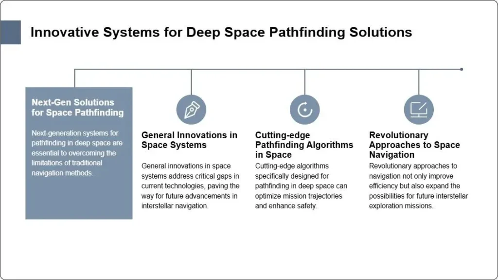
Minimalist slides are trust builders. They work everywhere — boardrooms, classrooms, conference halls — because they get out of the way and let your content do the talking.
The classic move: pure white surface, dark text, one thin accent color along the bottom edge. That’s it. Finance teams love this because charts and numbers pop against white. Healthcare presenters love it because it’s clean and credible.
Here’s what nobody talks about: minimalist gets boring fast without variation. After slide three, the audience goes numb if every layout is identical.
Pro tip: Alternate between layouts. Two-column text on slide four. A full-width pull quote on slide five. Keep the background consistent — change the energy through layout, not through background swaps.
In 2026, soft geometric shapes are showing up in minimalist boardroom decks across tech companies. Accessibility-first design reduces eye fatigue during long sessions — this trend is as functional as it is fashionable.
Gradient and Color Background Ideas
Gradients went from “90s PowerPoint cliché” to “2026 design essential” when Glassmorphism became mainstream. A smooth blend from deep navy to soft teal — or warm terracotta to pale peach — adds depth without drama.
Color jumps must be between related shades. Navy to sage green? Elegant. Navy to orange? Assault on the eyes. Always check contrast on the actual slide, not just the thumbnail.
Solid color backgrounds deserve a comeback too. Muted sage, warm terracotta, soft charcoal — these work beautifully as title slides and section breaks. They’re quiet. They create breathing room between dense content slides.
Real example: A colleague spent three hours picking a “perfect” gradient for a product launch deck. His audience noticed the gradient. They also couldn’t read the product name on the title slide — mid-tone text over a mid-tone background creates visual confusion, not depth. The gradient won. The message lost.
If you’re building color slides at scale, modern AI color-matching tools apply WCAG AA contrast standards automatically so you get a palette that looks intentional and reads clearly.

Image-Based Background Ideas
Images make presentations memorable. The room remembers the mountain vista, the community photo, the product shot. But images that compete with text create the exact meeting nightmare we opened with.
The solution: always darken, always blur. A semi-transparent dark overlay on any photograph solves 90% of readability problems instantly. Blur the background so the image adds atmosphere without fighting your words for space.
Real example: A nonprofit wanted to show impact data alongside community photos. We took their photo, applied a dark overlay, and placed white text over it. The photo added emotional weight. The data stayed readable. Funders stayed engaged.
Many free template libraries now include pre-blurred, pre-overlaid image backgrounds — you drop in your photo and the design is done without touching Photoshop.
Dark Background Ideas for Modern Slides
Dark slides have taken over tech and creative presentations for good reasons. They look dramatic. They reduce glare in bright conference rooms. And they make colored accent text and charts absolutely pop.
But here’s the trap that kills dark slides: text that’s too white. Pure white on deep charcoal creates a halo effect under fluorescent lights. The fix: 90% off-white — not cream, not gray, but the slightly dimmed version of white.
This is a solved problem in modern dark mode AI design tools — when you select a dark palette, the best tools check contrast ratios against real projection environments and auto-adjust text luminance automatically.
Creative and Abstract Background Ideas
Not every presentation needs a tie. Creative agencies, workshop facilitators, educators, and keynote speakers can all get away with more visual expression — and should.
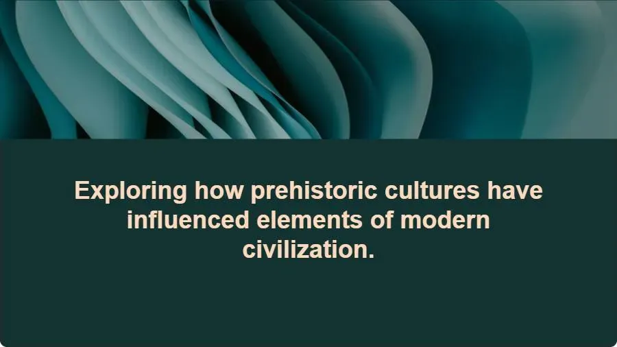
In 2026, soft curves and minimal-maximal illustration mixes are trending. Think: a single bold geometric shape anchoring one corner, with the rest of the slide clean. Or watercolor-style fills in brand colors that feel human and approachable.
The failure mode: visual noise. Highly detailed abstract patterns, competing bright colors, busy textures — these create chaos, not energy. One accent. One bold element. Then stop.
The best free template libraries include professionally balanced abstract options that stay expressive yet clean — built for teams that want distinctive slides without the design expertise.
How to Choose the Right Background for Your Presentation
Three questions. Answer them honestly and the choice is obvious.
Who is your audience? C-suite executives want clean confidence. Creative teams appreciate expression. Healthcare and legal audiences expect conservative professionalism. Match the room.
What is the content? Dense data needs light backgrounds — numbers and charts need maximum contrast. Storytelling slides can carry slightly more visual interest. Section dividers give you the most freedom.
How long is the presentation? Ten-minute pitch? You can push bolder choices. Hour-long training? Start conservative. Visual fatigue compounds over time.
When in doubt: light minimalist base, one accent element, high contrast throughout.
Common Background Mistakes to Avoid
|
Mistake
|
What goes wrong
|
Quick fix
|
|
Heavy texture (wood, stone, fabric)
|
Text becomes unreadable when projected
|
Strip all texture, go solid
|
|
Full brand color as background
|
Most brand colors aren’t designed for full-screen; causes eye strain
|
Tint brand colors to 20-30% saturation
|
|
Mixing background styles mid-deck
|
Feels chaotic; audience loses visual anchor
|
Pick one approach, commit
|
|
Skipping the projection test
|
Dark slides wash out; light slides project more reliably
|
Test on actual projector before presenting
|
Quick Comparison: Good vs. Bad Backgrounds
|
Good
|
Bad
|
|
Off-white text on charcoal, 4.5:1 contrast
|
Pure white text on pure black — too harsh
|
|
Soft gradient, navy to teal
|
Red to blue gradient — jarring
|
|
Blurred photo with dark overlay
|
Sharp bright photo with text over the busiest area
|
|
Single teal accent shape
|
Five competing accent colors
|
|
Minimalist white, one bottom accent bar
|
White background with logo, watermark, tagline, AND a stock photo
|
Pro Checklist: 5-Second Background Test
Before you finalize any slide, run this quick check:
-
Can I read the headline from the back of the room? If not, contrast is too low.
-
Does the background distract from the text? If yes, strip it.
-
Is this the same style as the last three slides? If yes, vary the layout.
-
Would this work on a projector at full brightness? Test before you present.
-
Does this match my audience’s expectations? Corporate? Go clean. Creative? Go bold.
Screenshot this checklist. Keep it handy.
FAQs About Presentation Backgrounds
What is the best background for a presentation? The best background is the one your audience can read clearly from every seat in the room. High contrast (minimum 4.5:1 ratio — widely adopted in corporate settings), minimal visual clutter, and a tone that matches your audience. For most corporate settings, clean white or soft light-gray with dark text is the safest and most reliable choice.
Should presentation backgrounds be dark or light? It depends on the room and the content. Dark backgrounds look dramatic and modern — great for tech pitches and creative keynotes. Light backgrounds project more reliably in bright rooms and are easier on eyes during long data-heavy sessions. If you’re unsure, start light.
How do I make a PPT background look professional? Three rules: keep contrast high (4.5:1 minimum), add only one design element, and vary your layouts across slides. AI slide generators check contrast ratios and suggest layouts automatically so you get professional results without manual design work.
What backgrounds work best for business presentations? Clean minimalist white or soft gray backgrounds work best for business settings — they signal professionalism and keep data readable. If you want more energy, use a muted gradient from navy to teal with off-white text.
How do I test if my background will work in the presentation room? Always test on the actual projector if possible. Dark backgrounds can wash out under bright lights. Light backgrounds are more forgiving across different projection environments.
What are the 2026 presentation background trends? Glassmorphism, soft geometric shapes, teal accents on dark backgrounds, mesh gradients, and accessibility-first design are all trending in 2026. WCAG AA contrast compliance is now widely adopted in corporate environments. Tools that apply these standards automatically keep your slides current without manual updates.
How do I choose the right background for a long presentation? For hour-long presentations, start conservative — light minimalist backgrounds reduce visual fatigue. Short presentations (under 15 minutes) can afford bolder background choices to capture attention fast.
Can I use free templates and still have a unique look? Absolutely. Free templates give you a professional starting point; what makes your presentation unique is how you customize the content, vary the layouts, and layer in your own accent colors. Modern template tools let you customize instantly while keeping a completely unique brand look.
Conclusion
Great backgrounds are invisible. They support without announcing themselves. They make text readable in the back row and drama visible in the thumbnail.
Pick for your audience. Test in your room. Keep contrast high and accents minimal.
And if design time is short — tools like Autoppt let you generate polished, contrast-checked, professionally laid out slides in minutes, so your ideas get the stage they deserve.
Ready to create contrast-perfect slides in seconds? Try Autoppt free templates →
Free Presentation Background Templates
If you’re looking for ready-made presentation background ideas you can use right now, here’s a practical starting point across the three most useful categories.
Minimalist templates: Clean white backgrounds with dark text. One thin accent color along the bottom edge. Best for finance, healthcare, consulting, and any data-heavy presentation where readability is the priority. The key is variation in layout — keep the background consistent, change the energy through your text arrangements.
Dark mode templates: Deep charcoal or navy backgrounds with off-white or teal accents. Best for tech pitches, creative keynotes, and product showcases where drama and impact matter. Always use 90% off-white text, not pure white — it reads better under projector light.
Gradient templates: Soft transitions from navy to teal or terracotta to peach. Works well for title slides and section breaks where you want to signal modern, forward-thinking design. Keep gradients between related color families — unrelated jumps feel jarring.
For all three categories, the free template library gives you a professionally designed starting point. You can customize colors, swap in your own images, and generate a complete slide deck in minutes. No design experience required.
Create worry-free presentations with AutoPPT . Turn your ideas into slides quickly—while keeping them 100% yours!
About AutoPPT: An easy use AI tool for students and professionals. Generate editable slides, customize designs, and focus on what matters—your unique ideas.

Autoppt: Generate presentations in 1 minute!
Start Free Trail Now