


Michael Anderson
Former journalist turned tech writer with a passion for helping professionals enhance productivity through AI.
Introduction
We’ve all been there. You need to quickly compare two concepts for a presentation. You have the idea, but you need to show it, not just tell it. The Venn diagram is the perfect tool—a classic for a reason. But when you open Google Slides, making one look clean, professional, and not-at-all-lopsided can be surprisingly tricky.
A Venn diagram is a powerful and simple visual tool that uses overlapping circles to illustrate the relationships, commonalities, and differences between different groups or sets. The areas where the circles overlap show what the groups have in common, while the non-overlapping areas show what makes them unique.
In this complete guide, we’ll walk you through the two easiest methods to create a clean-looking Venn diagram directly in Google Slides. We’ll cover the ‘from-scratch’ manual method for full control and the ‘quick-and-easy’ automatic method for speed. We’ll also share pro-tips, the common pitfalls to avoid, and a much faster, smarter alternative for creating stunning diagrams for your presentations.

What Is a Venn Diagram (And Why Use One in Your Presentation)?
At its core, a Venn diagram is a visual representation of logical relationships. It was popularized by John Venn in 1880 and is used to teach elementary set theory, as well as illustrate relationships in fields like statistics, logic, and computer science.
Its components are simple:
-
Circles (or Sets): Each circle represents a distinct group, concept, or set of data.
-
Intersection: The overlapping area where two or more circles meet. This space represents the traits or elements that the groups share.
-
Differences: The parts of the circles that do not overlap. These areas represent the traits or elements that are unique to each individual group.
You might also hear of “Euler diagrams,” which are similar. The key difference? A Venn diagram must show all possible intersections, even if that overlap is empty. An Euler diagram, on the other hand, only shows intersections that actually exist, which can sometimes make them less clear for direct comparisons.
For presentations, Venn diagrams are invaluable because they transform a complex comparison into a simple visual that your audience can grasp in seconds.
Common Use Cases for Venn Diagrams
For Business & Marketing:
-
Competitor Analysis: Visually compare your product’s features against a competitor’s. The unique areas show your distinct advantages, while the overlap shows features that are table stakes.
-
Market Segmentation: Understand the overlapping interests, behaviors, or demographics of different customer groups. This helps identify target audiences and “sweet spot” opportunities.
-
Strategic Planning: Map out the pros and cons of different strategic options to find the path with the most benefits and fewest trade-offs.
For Education:
-
Compare & Contrast: This is the classic use. Educators use Venn diagrams to help students compare two characters in a novel, two historical events, or two scientific concepts.
-
Teaching Set Theory: In mathematics, Venn diagrams are the primary tool for visually explaining concepts like “union,” “intersection,” and “complements” in set theory.
-
Reading Comprehension: Teachers can use Venn diagrams to help students organize and visualize information from a text, improving retention and understanding.
Method 1: The “Full Control” Manual Method Using Shapes
This is the classic, ‘from-scratch’ method. It gives you the absolute most control over size, color, and placement. It takes a few more clicks, but the result is fully customized.
Let’s build a 2-circle diagram.
Step 1: Insert Your Circles
-
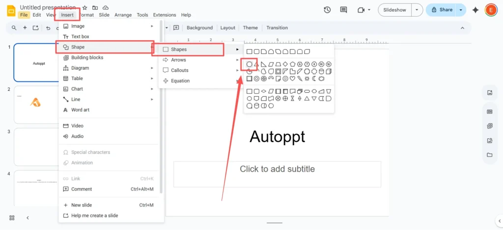
In the top menu, navigate to
Insert>Shape>Shapes>Oval.
-
Click and drag on your slide to draw the shape.
-
Pro-Tip: As you drag, hold the
Shiftkey. This will lock the shape’s proportions and create a perfect circle, not a stretched oval.
Step 2: Position and Duplicate Your Circles
-
Drag your first circle to where you want it on the slide.
-
Select the circle, then use
Ctrl+C(orCmd+Con a Mac) to copy it, andCtrl+V(orCmd+V) to paste it.

-
Position this second circle so it overlaps with the first one, creating that central intersection area. For a standard 2-circle Venn diagram, you’ll overlap them by about 30-40%.
Step 3: The Secret: Set Custom Transparency
This is the most important step for making your diagram readable. If your circles have solid colors, you can’t see the overlap.
-
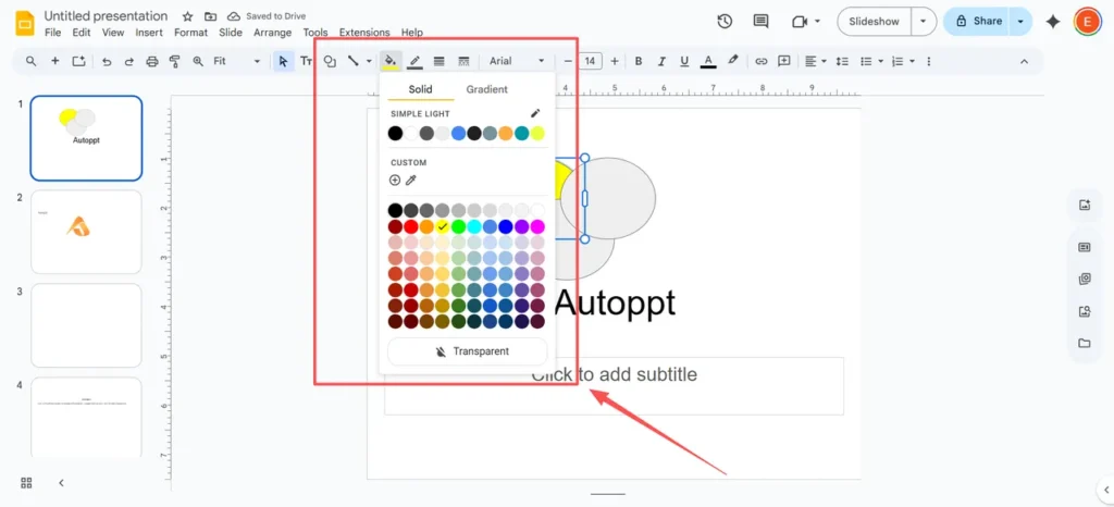
Select your first circle. In the toolbar, find and click the “Fill color” icon (it looks like a paint bucket).
-
Choose a color from the palette.
-
Now, with the “Fill color” menu still open, click the “Custom” button at the bottom (it has a
+sign). -
A new menu will pop up. At the bottom, you’ll see a “Transparency” slider. Slide it to the left to make the color semi-transparent. A good starting point is around 50-70%. Click “OK.”

-
Repeat this exact process for your second circle, but choose a different color.
You will now clearly see the overlapping section, which will have a new, blended color. This is the visual magic of a Venn diagram.
Step 4: Add Your Labels
Your diagram is useless without labels. You can’t type directly into a shape, so you’ll need to use text boxes.
-
Go to
Insert>Text Box.

-
Click and drag to create a text box on your slide, then type your text.
-
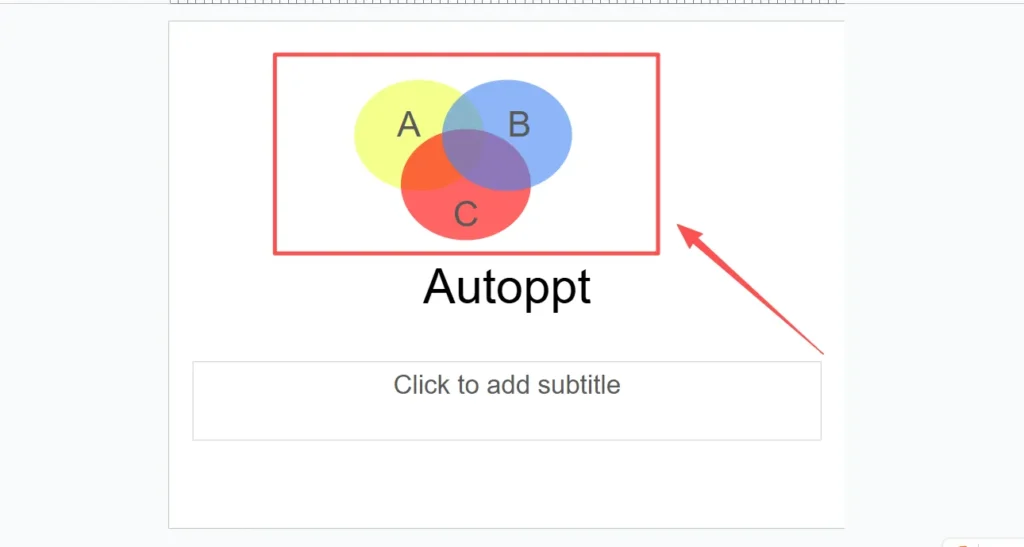
Create separate text boxes for each of the three key areas:
-
One for the unique section of Circle A.
-
One for the unique section of Circle B.
-
One for the common “intersection” area in the middle.
-
-
Drag your text boxes into position.
For a 3-circle Venn diagram, you simply repeat the process: add a third circle, give it a unique transparent color, and position it to overlap the other two.
Method 2: The “Quick & Easy” Automatic Diagram Method
If the manual method feels like too much clicking and you just need something fast, Google Slides has a built-in (but limited) tool for this.
Step 1: Insert the Diagram
-
On a blank slide, go to the top menu and click
Insert>Diagram. -
A new sidebar will open on the right side of your screen.
-
From the list of diagram types, click on the “Relationship” category.

Step 2: Choose Your Venn Diagram
-
Scroll down through the “Relationship” layouts, and you will see several Venn diagram options.
-
Above the visual templates, you can select the number of circles (or “Areas”) you need, from 2 up to 4.

-
You can also select a color scheme from the swatches provided.
-
Click on the Venn diagram template you want.

Step 3: Edit Your Diagram
Google Slides will instantly insert the diagram onto your slide, complete with pre-made text boxes. You can now click directly into the text boxes to add your labels. You can also select the individual circles to change their colors using the “Fill color” tool, just as we did in Method 1.
The Catch: This method is fast, but it’s very rigid. You have almost no control over the positioning or size of the overlaps, and the designs are extremely basic. It’s good for a quick internal draft, but it doesn’t look very polished for a high-stakes presentation.
Pro-Tips for a Professional-Looking Diagram
Creating the diagram is half the battle. Making it look good is the other half. Here are a few expert tips.
-
Choose Your Colors Wisely
-
Avoid the default, harsh colors. Pick colors that match the overall theme of your presentation. Use contrasting, lighter colors for the circles (e.g., a light blue and a light yellow) so the overlapping section (which would become green) is distinct and easy to read.
-
Make Your Text Legible
-
This is the most common mistake: text that is too small or hard to read.6 Stick to a simple, basic font that matches your presentation. Ensure your font color has high contrast with the circle’s background color. Black or white is usually your safest bet.
-
Use Icons, Not Just Text
-
Want to make your diagram more visual and engaging? Instead of just text, add small icons. Go to Insert > Image > Search the web. You can search for simple icons like “dog” or “cat” for a pet comparison diagram. This makes the concept even easier to grasp at a glance.
-
Focus on the Key Takeaway
-
Don’t clutter your diagram with dozens of bullet points. A Venn diagram should, at a glance, tell a story. Ask yourself: “What is the one thing I want my audience to understand from this?” Make that the most prominent part of your diagram.
The “Gotcha”: Common Mistakes and Limitations of Google Slides
If you’ve followed the steps above and still feel like your diagram looks a bit “off” or “unprofessional,” you’re not alone. You’ve just hit the “frustration gap”—the built-in limitations of using a presentation tool for graphic design.
-
Mistake 1: The “Muddy” Overlap
-
The transparency method (Method 1) is the standard way, but design professionals know it’s a workaround.Why? The overlapping area isn’t its own shape. It’s just two transparent colors blending. This means you can’t animate it separately, you can’t give it its own unique color (it’s just a “muddy” blend), and it can be difficult to manage.
-
The Core Problem: It’s All Manual and Tedious
-
As you just saw, creating even a simple 2-circle diagram requires a lot of clicking, dragging, formatting, and manual text-box alignment.This process is “tedious and prone to errors”.If you need a more complex diagram with 4 or 5 circles, the task becomes “challenging” and can result in a confusing, cluttered mess. There’s no way to link your diagram to data, and every single edit is a finicky, manual adjustment.
The Smart Alternative: Create Perfect Diagrams in Seconds with Autoppt
What if you could skip all that manual “fiddling” and still get a beautiful, professional, and editable presentation? That’s where Autoppt comes in.
Autoppt is an AI Presentation Maker that solves the very frustrations Google Slides creates.
-
Problem: It’s tedious and manual.
-
Autoppt Solution: You don’t make slides; you generate them. Just input your topic (e.g., “Competitor analysis of Product A vs. Product B”), and our AI crafts a full presentation for you in minutes. This includes all the text, visuals, and professional diagrams you need, generated intelligently.
-
-
Problem: Limited, ugly templates.
-
Autoppt Solution: Instead of Google’s 3-4 basic diagram layouts, Autoppt gives you a library of 1,000+ professionally designed templates. Your presentations will look polished, branded, and unique every time.
-
-
Problem: You have to type everything manually.
-
Autoppt Solution: This is our magic feature. You can upload an existing document (PDF, DOCX, TXT), and Autoppt will read it, understand the key concepts, and automatically convert it into a stunning slide deck. All your research, data, and key points are formatted for you.
-
Best of all, Autoppt is fully compatible with Google Slides. After our AI builds your perfect presentation, you simply export it as a PPTX file. Then, just upload it to Google Slides—everything, from the text to the diagrams, remains 100% editable.
At-a-Glance Comparison: Google Slides vs. Autoppt
| Feature | Google Slides (Manual Shapes) | Google Slides (Automatic Diagram) | Autoppt (AI) |
| Generation Speed | Slow (High-effort) | Fast (Low-effort) | Instant (AI-powered) |
| Design Quality | Depends on your skill | Basic & Limited | Professional (1,000+ Templates) |
| Customization | Full (but tedious) | Very Limited | Full (on a professional draft) |
| Data Input | 100% Manual Text Boxes | 100% Manual Text Boxes | AI-from-Text or Doc/PDF Upload |
| Best For | Simple 2-circle diagrams | Quick, informal drafts | Professional, complex, & data-driven presentations |
Final Thoughts
While Google Slides gives you the basic tools to build a Venn diagram from scratch, it’s a manual process that’s time-consuming and difficult to perfect. You can get the job done with the steps above, and for a simple 2-circle comparison, it’s a great skill to have.
But when your time is valuable and professionalism matters, a smart tool is the better choice. Stop “making” slides and start generating them.
Create worry-free presentations with AutoPPT . Turn your ideas into slides quickly—while keeping them 100% yours!
About AutoPPT: An easy use AI tool for students and professionals. Generate editable slides, customize designs, and focus on what matters—your unique ideas.

Autoppt: Generate presentations in 1 minute!
Start Free Trail Now