


Michael Anderson
Former journalist turned tech writer with a passion for helping professionals enhance productivity through AI.
Part 1: Deconstructing the Incumbent: ‘The PowerPoint Problem’ as a Core Market Opportunity
1.1 Introduction: The “Frustration Chasm” in Presentation Design
The global presentation software market, dominated by Microsoft PowerPoint, is built upon a fundamental friction point: the “Frustration Chasm.” This analysis posits that the incumbent’s solution for creating visual assets—such as the commonly required Venn diagram—is deeply flawed. It offers users two primary paths, both of which are suboptimal, creating a significant, addressable market opportunity for solution-oriented competitors. This chasm results in a “Productivity Tax”. This tax is not merely measured in minutes, but in a cascade of user frustration, cognitive overload, and a tangible loss of professional credibility when “good enough” visuals are presented.
A high-intent, high-friction user query, such as “how to create a Venn diagram in PowerPoint,” is a precision tool for identifying users who are actively trapped within this chasm. The content strategy targeting this specific query is not just marketing; it is a direct intervention at the user’s precise moment of need, a moment that defines the market opportunity.

1.2 Analysis of User Friction: The “Two-Path Problem”
An analysis of the user-experience workflow in the latest versions of Microsoft PowerPoint (Office 365 / 2026) reveals that the “Frustration Chasm” is caused by a “Two-Path Problem”.
Path 1: The “Easy” Path (SmartArt) – A Trap for Novices
PowerPoint’s primary offering for diagram creation is the SmartArt tool. Users are directed to follow the seemingly simple path:
Insert → SmartArt → Relationship → Venn Diagram.
This path, however, is a dead end for effective customization. The most significant and well-documented user complaint is the failure to easily add text to the overlapping, or intersectional, areas of the diagram. Users are forced to revert to a clunky workaround: manually adding and positioning floating text boxes. This workaround breaks the diagram’s alignment, is difficult to manage, and looks unprofessional. As noted in user complaints and expert reviews, the default settings for fonts, placement, and alignment in SmartArt are “messy” and “sloppy”. Furthermore, users on free or web-based versions of PowerPoint report even more severe limitations, such as the complete inability to control shape transparency.
Path 2: The “Pro” Path (Shape Fragment) – A Hidden “Secret” for Experts
The “correct” manual method for creating a clean, customizable Venn diagram in PowerPoint is non-intuitive and hidden from the average user. This “pro” path requires users to first draw individual circles using
Insert → Shape. The crucial, non-obvious step is to then select all the shapes and use a vector-editing tool: Shape Format → Merge Shapes → Fragment.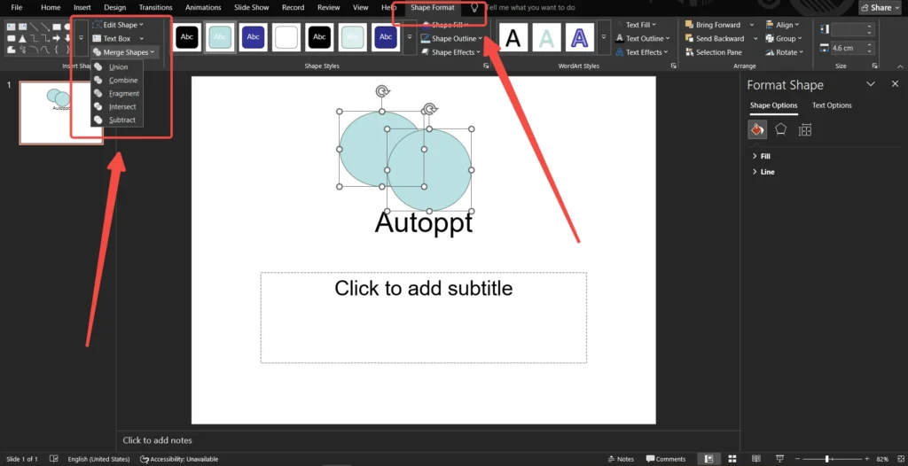
The
Fragment tool explodes the overlapping circles into distinct, separate shapes—including the intersections—which can then be individually colored and labeled. This method is a feature borrowed from advanced graphic design programs, not a standard productivity function. A beginner or intermediate user who is already frustrated will almost certainly not discover this tool on their own, cementing the “knowledge barrier.”This “Two-Path Problem” is the central opportunity. The “easy” path (SmartArt) fails to deliver quality, and the “quality” path (Fragment) fails to be easy. This systemic failure forces users to violate established best practices for visual design—which call for simplicity, clarity, and legible labels. By forcing users into creating “Frankenstein slides” with misaligned text and messy overlaps, PowerPoint’s native tools actively contribute to the user’s loss of professional credibility.
1.3 Quantifying the “Productivity Tax”
This user friction can be quantified as a tangible business loss, or a “Productivity Tax.” This tax is composed of three primary costs:
-
Time Cost: The manual effort of aligning shapes, adjusting transparency, and formatting text boxes is a direct drain on productivity. Benchmarks from 2025 already show that AI-powered presentation software can reduce the time spent on slide creation by as much as 80%. This is the time competitors are already claiming back for the user.
-
Cognitive Load: Traditional presentation tools bog users down in “design minutiae”. This mental energy, which should be allocated to refining the core message and story of the presentation, is instead wasted on the low-level mechanics of “aligning text boxes”.
-
Credibility Cost: The “Hidden Costs of ‘Good Enough’ Design” are the most severe. Research shows that sloppy, disorganized, or inconsistent visuals—the direct result of fighting with SmartArt—cause a presenter to appear “unprofessional and inexperienced.” This, in turn, “erodes the audience’s trust”.
The proposed blog post strategy functions as a “tax calculator.” It strategically walks the user through the manual process, making them acutely aware of the time and cognitive load they are expending, thereby priming them for a solution that eliminates this tax.
Part 2: The 2026 Competitive Ecosystem: Challengers to the Presentation Throne
2.1 Introduction: The Three Fronts of the Presentation War
While PowerPoint remains the passive incumbent, the active competitive landscape for a tool like AutoPPT is fragmented across three distinct fronts: the “Old Guard” (Google), the “Design Studios” (Canva), and the “Technical Whiteboards” (Miro, Lucidchart). AutoPPT’s strategy must be to position itself as the “Productivity Bridge” that spans the gaps between all three.
2.2 The Old Guard (Microsoft & Google)
As established, Microsoft PowerPoint is the market leader defined by its “Frustration Chasm.” Its primary competitor, Google Slides, mirrors this weakness almost perfectly.
Google Slides also presents users with a “Two-Path Problem”:
-
Path 1: The
Insert→Diagram→Relationshiptool is Google’s version of SmartArt, suffering from similar customization and labeling limitations. -
Path 2: The
Insert→Shapemethod forces users to manually adjust transparency for each circle and add separate, floating text boxes.
The fact that the two largest players in the market share the exact same fundamental friction point demonstrates that the problem is systemic to the “manual-first” software model. This leaves the market wide open for an “AI-first” or “productivity-first” alternative to solve this universal pain point.
2.3 The Design Studios (Canva)
Canva’s market position is defined by its visual-first, template-driven ecosystem and exceptional ease of use. Its strengths are a vast library of Venn diagram templates , a simple drag-and-drop interface, and AI-powered tools like
Magic Design.However, Canva is optimized for visuals, not information. Its core competency lies in social media graphics, posters, and simple, brand-heavy presentations. It is less suited for data-heavy, analytical business content, such as comparing the complex, overlapping innovations of Apple, Google, and Microsoft. AutoPPT’s strategic angle against Canva is to be the business-savvy alternative. While Canva makes visuals pretty, AutoPPT’s AI can make them smart and logical.
2.4 The Technical Whiteboards (Miro & Lucidchart)
This category includes powerful, data-driven, and collaborative diagramming platforms. Their strengths are in advanced diagramming capabilities, data linking , extensive libraries of technical shapes , and robust AI for generating complex flowcharts and system architecture maps.
These tools, however, create a “Complexity Gap.” They are “too much tool” for the average business professional who simply needs one clear Venn diagram for a single slide. Their complexity requires training, and they are priced as separate, specialized platforms.
The success of Miro and Lucidchart is not a threat; it is a validation. Their market growth proves that professionals are willing to leave PowerPoint to find superior diagramming tools. AutoPPT’s “AI Mind Map” feature acts as a “Productivity Bridge”: it offers a powerful, AI-driven diagramming feature that is vastly superior to PowerPoint’s but is seamlessly integrated into a presentation-first workflow, saving the user from the cost and complexity of a separate tool like Miro.
2.5 Key Strategic Asset: The Competitive Landscape Table
The entire competitive analysis can be distilled into a single, high-impact battle card. This table visually confirms the “gap” in the market that AutoPPT is positioned to fill, demonstrating that no other tool effectively combines AI-first creation with a presentation-native, productivity-focused workflow.
Table 1: Comparative Analysis of Diagramming Tools in the 2026 Presentation Landscape
| Metric | PowerPoint | Google Slides | Canva | Miro / Lucidchart | AutoPPT |
| Primary Use Case | General Presentation | General Presentation | Visual-First Design | Technical Diagramming | AI-First Presentation |
| Venn Diagram Method | Manual (Clunky) | Manual (Clunky) | Template-Driven | AI-First (Complex) | AI-First (Simple) |
| Identified Friction | “The Frustration Chasm” | “The Frustration Chasm” | “Logic-Lite” | “The Complexity Gap” | N/A (Solution) |
| AI Integration | Bolt-on (Copilot) | Bolt-on | Feature (Magic Design) | Native (Workflow AI) | AI-Native |
| Workflow | Native | Native | Native | Export-Required | Native (Web-based) |
| Strategic Position | Incumbent | Incumbent | Design Studio | Technical Whiteboard | Productivity Bridge |
Part 3: Strategic Positioning: AutoPPT’s “Product-Led Content” Strategy
3.1 The “Trojan Horse”: Content Marketing as a Product Demo
The proposed blog post is a “Trojan Horse” strategy, a classic example of product-led content. It functions as a five-step sales funnel:
-
Intercept (Pain): The user, in a state of high-friction, searches “how to create Venn diagram in PowerPoint”.
-
Build Trust (Value): The article intercepts them and provides the best possible manual answer, including the “secret”
Fragmentmethod , establishing its authority and expertise. -
Pivot (Friction): Having just taught the complex manual path, the article weaponizes the user’s own experience of that friction (“Notice how long that took?“).
-
Introduce Solution (The Hook): It then introduces AutoPPT’s “AI mind map and diagram creator” as the one-click, “smarter” alternative.
-
Upsell (The Ecosystem): Finally, it expands the aperture, positioning the diagram tool as just one small feature of AutoPPT’s full “AI presentation generator” , which solves the entire Productivity Tax, not just the diagram tax.
This strategy is superior to a direct “AutoPPT vs. PowerPoint” advertisement because it captures the user at their exact moment of pain, provides genuine value, and then presents the product as the logical, evolutionary “next step” in their workflow.
3.2 Deconstructing AutoPPT’s “Productivity Bridge” Value Proposition
AutoPPT’s product features map directly to the market gaps identified in Part 2.
-
The Hook: AI Mind Map & Diagram Creator: This feature is the direct antidote to PowerPoint’s “Frustration Chasm.” It replaces the clunky SmartArt and the complex
Fragmenttool with “one-click mind map generation”. It simultaneously bridges the “Complexity Gap,” offering Miro-like AI diagramming capabilities without the complexity or cost of leaving the presentation workflow. -
The Upsell: AI Presentation Generator: This is the true product. The strategy is to draw users in with a “micro-solution” (diagrams) and upsell them to the “macro-solution” (full deck generation). This feature, which “builds a complete slide deck in seconds” from a simple text prompt , is the ultimate “Productivity Tax” eliminator.
-
The Foundation: Professional Template Library: This feature serves as the quality-control “safety net,” directly countering the “messy” defaults of SmartArt. AutoPPT’s templates are not rigid; they are built on a principle of “Intelligent Flexibility”. They resolve the “apparent paradox between consistency and flexibility” by providing a “rich library of pre-designed layouts” (e.g., title, divider, multi-column, charts) built on a “consistent color palette” and “typography system”. This is precisely what PowerPoint’s native tools fail to do.
3.3 The Core Narrative: Solving the “Productivity Tax”
AutoPPT’s core market narrative is not “we are an AI presentation tool.” It is “we give you back the time and credibility that manual formatting steals”. The narrative must lean heavily on the language of “bypassing the initial hurdles,” “focus on content,” and “handling the design heavy lifting”. As a stand-alone, platform-agnostic web app that exports to both PowerPoint and Google Slides , AutoPPT solidifies its status as the “Productivity Bridge” for the modern professional.
Part 4: Executing the Content Strategy: A Tactical Playbook
4.1 Phase 1: The “How-To” Tutorial (The Blog Post)
The proposed 8-part blog post outline is strategically sound. Each section serves a specific function in the “Trojan Horse” funnel:
-
Sections 1-2 (Introduction & Definition): These sections hook the user by acknowledging the “time-consuming” nature of manual design and establish authority by defining the topic.
-
Section 3 (How-To Guide): This is the core of the trust-building exercise. It must detail both manual methods: Method 1: SmartArt (the “easy but frustrating” way) and Method 2: Shapes & Fragment (the “pro but hidden” way). This section must use screenshots to visually contrast the sloppy result of SmartArt’s floating text boxes with the clean, precise result of the
Fragmenttool. -
Section 4 (Design Tips): This leverages best-practice research to set a “quality benchmark” that the SmartArt method clearly fails to meet.
-
Section 5 (AI Tools): This is the pivot. It skillfully transitions the user from the “manual” world to the “AI” world, citing the macro-trend of text-to-diagram tools.
-
Section 6-7 (AutoPPT Introduction & Comparison Table): This is the solution and the closer. This is where the AI Mind Map and AI Presentation Generator are explicitly introduced as the definitive answer. The “When to Use” table perfectly frames the choice for the user: “Manual, detailed customization” (PowerPoint) vs. “Fast, AI-powered creation” (AutoPPT).
-
Section 8 (Conclusion): A soft call-to-action that reinforces the core value proposition: “clear visuals are the key”.
4.2 Phase 2: The Comparative Content Hub
With the “how-to” article as the top of the funnel, the next logical step is to build a mid-funnel content hub to capture users who are actively comparing solutions. This requires dedicated, SEO-optimized landing pages for:
-
“AutoPPT vs. PowerPoint” (Narrative: Manual Friction vs. AI Speed)
-
“AutoPPT vs. Canva” (Narrative: Business Logic vs. Simple Design)
-
“AutoPPT vs. Miro” (Narrative: Presentation-First vs. Technical Whiteboard)
-
“Best AI Presentation Tools 2026” (Narrative: Capturing the entire category)
4.3 Phase 3: The “Future of Work” Thought Leadership
Finally, top-of-funnel, brand-building content must be created. This content leverages research on 2026 design trends and the role of AI in data visualization. This establishes AutoPPT not just as a tool, but as a thought leader. Example titles could include: “Beyond the ‘Data-Ink Ratio’: How AI is Redefining Data Visualization” and “The 80% Time-Saving: How AI is Eliminating the ‘Productivity Tax’ in Business”.
Part 5: Strategic Recommendations and Future Outlook
5.1 Anticipating the Incumbent’s Counter (Microsoft Copilot)
The primary long-term threat is not another startup, but Microsoft successfully integrating a “good enough” AI (Copilot) into PowerPoint, thereby patching its own “Frustration Chasm.”
AutoPPT’s defense against this must be specialization. The following strategic differentiators are recommended:
-
Differentiate on Focus: Market AutoPPT’s AI as an “expert-trained” model focused only on best-in-class presentation design and business logic , positioning Copilot as a “generalist” AI.
-
Differentiate on Speed: A-B test and optimize for generation speed. A lean, stand-alone web app will almost certainly be faster and less bloated than an AI feature integrated into a 30-year-old piece of software.
-
Differentiate on Agnosticism: Emphasize the “export to anything” (PPT, Google Slides) advantage. AutoPPT must be positioned as the “Switzerland” of presentations—an indispensable tool that works with any ecosystem.
5.2 Expanding the “Trojan Horse” Strategy (The “Friction-Point” Playbook)
This report’s most critical recommendation is that the “Venn diagram” strategy is not a one-off campaign; it is a scalable, repeatable playbook.
The following process should be implemented immediately:
-
Identify: Commission a “Friction Audit” of PowerPoint and Google Slides. Identify the top 20 most-searched “how-to” queries that correspond to high-friction, high-value tasks (e.g., “how to make a timeline,” “how to create a flowchart,” “how to design a product roadmap,” “how to format a GANTT chart”).
-
Build: Create a dedicated “AI Generator” micro-feature within AutoPPT for each of these identified friction points.
-
Intercept: Create a “Trojan Horse” blog post for every single one of these queries, following the exact 8-step content structure analyzed in Part 4.
This strategy aligns content marketing, product marketing, and product development into a single, cohesive growth engine. The content team’s SEO research becomes the product team’s feature-prioritization roadmap. This is how AutoPPT wins the market: by systematically identifying and solving every single “Productivity Tax” friction point the incumbents have ignored for decades.
5.3 Final Conclusion: Solidifying the Market Narrative
AutoPPT’s strategic position as the “Productivity Bridge” is clear and defensible. It is not just another SaaS tool; it is an intelligent partner for the 2026 professional. The core narrative is one of liberation: AutoPPT liberates professionals from the “tyranny of the blank page” , “design minutiae” , and “Frankenstein slides”. By automating the 80% of design work that is tedious and manual , it allows users to focus on the 20% that provides 100% of the value: their core message, their unique insights, and their ability to communicate with impact.
Create worry-free presentations with AutoPPT . Turn your ideas into slides quickly—while keeping them 100% yours!
About AutoPPT: An easy use AI tool for students and professionals. Generate editable slides, customize designs, and focus on what matters—your unique ideas.

Autoppt: Generate presentations in 1 minute!
Start Free Trail Now