
Michael Anderson
Former journalist turned tech writer with a passion for helping professionals enhance productivity through AI.
The Silent Speaker: Why Your Slide Design Matters More Than You Think
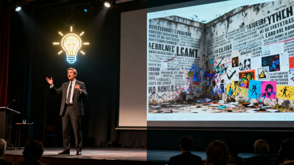
We’ve all been there: trapped in a dimly lit room, watching a presenter with brilliant ideas fail to connect. The culprit isn’t the message, but the medium. The slides are a chaotic collage of tiny fonts, jarring colors, and walls of text. The audience’s attention drifts, eyes glaze over, and a great idea dies a slow, painful “death by PowerPoint.” This scenario is all too common, and it highlights a critical truth: presentation design is not a decorative afterthought. It is a fundamental communication skill.
Presentation design is a specialized discipline that merges graphic design, communication theory, and even psychology. Its core purpose is to visualize information in a way that helps an audience comprehend it more quickly and remember it for longer. It is the art and science of transforming complex ideas, data, and narratives into a clear, engaging, and compelling visual story. When done right, the slides become a silent partner to the speaker, reinforcing the message and making it unforgettable.
The impact of professional presentation design is not merely anecdotal; it is quantifiable and has a direct effect on success in business and education.
-
The Business Imperative: In a corporate setting, the stakes are incredibly high. Research from Harvard Business School reveals that companies with professionally designed presentations are 67% more likely to secure funding and 43% more successful in closing major deals. This data reframes design from an aesthetic choice to a strategic business imperative. Conversely, poor design carries significant costs, contributing to 34% longer sales cycles and commanding 28% lower prices on average for deals.
-
Building Credibility and Trust: Beyond the numbers, design is a powerful signal of professionalism and competence. A thoughtful, visually intentional presentation tells your audience that you have done your homework, you respect their time, and you are clear in your thinking. It immediately signals attention to detail and an investment in quality, shaping how audiences perceive your organization’s capabilities from the very first slide. Poor design, on the other hand, can make even the most brilliant ideas appear unconvincing and unprofessional, creating a “credibility gap” where the quality of the message is unfairly judged by the quality of its visual delivery.
-
Enhancing Communication and Retention: At its heart, a presentation is a tool for conveying information. The human brain processes visual information 60,000 times faster than text. Well-designed visuals reduce the mental effort required for an audience to understand complex information, allowing them to focus on the core content rather than struggling with poor formatting. This visual reinforcement has a dramatic effect on memory. Studies show that people remember only 10% of information they hear, but that figure skyrockets to 65% when the information is paired with a relevant visual.
The Anatomy of a World-Class Presentation: Core Principles to Master
Transitioning from understanding why design matters to what makes design effective requires a grasp of its foundational principles. These are the universal rules that separate amateur, cluttered slides from professional, impactful ones. Any high-quality course or learning resource will be built upon this essential framework. Mastering these principles is not about becoming an artist; it is about becoming an architect of information, skillfully managing your audience’s cognitive load to make the journey of understanding effortless.
The Pillars of Effective Slide Design
-
Story and Structure First: Before a single shape is drawn, the core message and narrative must be defined. The visuals exist to support the story, not to be the story itself. A fundamental principle to enforce this clarity is “one idea per slide.” This forces the presenter to distill each concept to its essence, creating a focused and easy-to-follow flow.
-
Visual Hierarchy: This is the art of directing the audience’s attention. Through the strategic use of size, color, placement, and emphasis, a designer provides visual cues about the importance of each element. A slide’s title should be the most prominent text, followed by a slightly smaller subtitle, and then the body content. This creates a natural reading path and instantly signals to the brain what to focus on first.
-
Typography as a Voice: Fonts are not merely characters; they establish the tone and personality of a presentation. Best practices dictate using no more than two or three complementary fonts to avoid a chaotic look. A common and effective approach is to use a decorative or bold font for headings and a clean, highly readable sans-serif font for body text. Font size is also critical for accessibility; for presentations delivered to an audience, text should generally be between 24 and 28 points.
-
The Psychology of Color: Color is a powerful tool that can evoke emotion, guide the eye, and reinforce a brand’s identity. An effective presentation uses a consistent and limited color palette, often derived from corporate brand guidelines. High contrast between text and background (e.g., dark text on a light background, or vice versa) is non-negotiable for readability. Additionally, using a single, bold “focus color” sparingly can effectively highlight the most critical data points or calls to action on a slide.
-
The Power of Space: Clutter is the primary enemy of clarity. Professional design makes deliberate use of both white space (the empty areas of a slide) and negative space (using the background to create a shape or element). Ample space around text and images reduces cognitive load, making the content more scannable and giving the entire presentation a more polished, sophisticated feel.
-
Content and Text Optimization: Slides are visual aids, not a teleprompter. The goal is to present summarized information, using keywords and short phrases rather than full paragraphs. A helpful guideline is the 7×7 Rule, which suggests no more than seven lines of text per slide and no more than seven words per line. The speaker’s role is to elaborate on these concise points, providing the detail and context that the slide summarizes.
-
Consistency is Key: A cohesive visual style is the hallmark of a professional presentation. Fonts, colors, logo placement, and the styling of images should remain consistent from the first slide to the last. This ensures that the audience remains focused on the message, rather than being distracted by jarring inconsistencies in the design. Using and creating master slide layouts (templates) is an essential skill for achieving this consistency efficiently.
Your University of Free: Top-Tier Presentation Design Resources at No Cost
A decade ago, acquiring specialized design skills often required a significant financial investment. Today, a lack of funds is no longer a barrier to excellence. The internet is overflowing with high-quality resources that can take you from a complete novice to a competent designer. The key is knowing where to look. The learning journey often progresses naturally: it begins with passive inspiration to develop an aesthetic sense, moves to targeted tutorials for specific skills, advances to structured courses to build a coherent framework, and culminates in active creation with guided tools.
Structured Learning (Without the Tuition Fees): Free Online Courses
For those who thrive in a structured learning environment, several platforms offer university-level courses at no cost.
-
Coursera & Class Central: Many courses from top universities can be “audited” for free, granting access to all video lectures and reading materials. A standout example is the “Presentation skills: Designing Presentation Slides“ course from Tomsk State University, which provides a robust curriculum covering universal design principles, typography, color theory, and data visualization. Other courses focusing on the fundamentals of software like PowerPoint are also available.
-
Udemy: This massive online course marketplace includes a selection of entirely free, albeit typically shorter, courses that serve as excellent introductions. For instance, “Powerpoint Presentation – design powerpoint slides” is a highly-rated beginner course that covers the basics of slide design within the software.
-
Alison: This platform offers a free, CPD-accredited course titled “Designing Animated PowerPoint Slides.” It’s a comprehensive beginner-level program that teaches slide design, template creation, sourcing high-quality photos, applying animations and transitions, and exporting the final product.
-
Specialized Providers: Design agencies and training companies often provide free resources as a gateway to their paid offerings. BrightCarbon, a presentation design agency, offers a free, four-week email course that teaches users how to visualize bullet points and use animation to tell a story, complete with video lessons and practice files.
The Visual Classroom: Essential YouTube Channels for Every Skill Level
YouTube is an unparalleled resource for visual learners, offering step-by-step tutorials on virtually any design technique imaginable. The sheer volume of content can be overwhelming, so a curated list is essential.
| Channel Name | Primary Focus | Ideal For |
| SlideSkills | Advanced animations, modern slide makeovers, and creative transitions like Morph. | Users who want to create visually stunning, dynamic, and modern-looking presentations. |
| PowerPoint School | Clear and concise tutorials on a wide range of design and animation techniques. | Beginners and intermediate users looking for accessible, practical, real-world examples. |
| Nuts & Bolts Speed Training | Efficiency hacks, keyboard shortcuts, and workflow optimization to save time. | Busy professionals in fields like consulting and finance who need to create decks quickly. |
| PowerPoint Spice | Creative and fun animation tricks, special effects, and innovative design approaches. | Presenters who want to add a unique, memorable flair to their slides and stand out from the crowd. |
| Presentation Process | Comprehensive, in-depth tutorials on fundamentals, from slide masters to complex diagrams. | Anyone seeking a deep, foundational understanding of PowerPoint’s capabilities for business slides. |
| Lea Pica | Data visualization, data storytelling, and turning complex data into compelling visuals. | Analysts, marketers, and anyone who needs to present data in a clear, persuasive, and actionable way. |
The Inspiration Library: Blogs & Communities to Fuel Your Creativity
Developing a “good eye” for design requires consistent exposure to high-quality work. The following platforms are invaluable for training your aesthetic sensibilities.
-
Visual Discovery Platforms: Sites like Dribbble, Behance, and Pinterest are more than just digital mood boards; they are active learning tools. By searching for terms like “presentation design,” “slide deck,” or “pitch deck,” you can see what the world’s top designers are creating. Actively analyze their work: How do they use color and hierarchy? What font pairings did they choose? How did they visualize a complex process? This practice builds your visual vocabulary.
-
Curated Design Blogs: While not exclusively focused on presentations, leading design blogs teach the universal principles that are directly applicable to slide design. Canva’s Design School , Visme’s Blog , Adobe’s Creative Cloud Blog , Creative Bloq , and Smashing Magazine are essential reading for anyone serious about visual communication. They offer in-depth articles on typography, color theory, layout, and design trends.
Learning by Doing: Design Tools with Built-in Lessons
Some of the best learning environments are disguised as productivity tools. Modern design platforms have evolved into educational resources in their own right.
-
Platforms like Canva , Adobe Express , and Visme offer vast libraries containing thousands of professionally designed templates. By selecting a template and deconstructing it—examining its font choices, color palette, and layout structure—users can reverse-engineer the principles of good design.
-
Many of these tools also incorporate AI-powered features, such as Canva’s Magic Design, which automatically suggests layouts and styles based on your content. This provides a guided creative process, implicitly teaching design best practices as you work.
Investing in Excellence: Premier Paid Courses for Serious Learners
For those ready to move beyond the fundamentals and make a dedicated investment in their professional development, a wealth of paid courses offers deeper, more structured learning experiences. This is not an expense but an investment in career growth, with a clear return demonstrated by the enhanced credibility, influence, and success that comes with powerful communication skills. The choice of platform often depends on one’s learning style, budget, and career goals—whether the aim is immediate skill acquisition, long-term professional development, or a complete transformation in one’s approach to communication.
Deep Dives on Major Platforms
The largest e-learning platforms provide a diverse range of high-quality courses, each with a distinct approach to learning.
| Platform | Best For | Typical Cost Structure | Learning Format | Key Differentiator |
| Coursera | Academic rigor and structured learning with university credentials. | Subscription (Coursera Plus) or per-course/Specialization fee. | Video lectures, readings, graded assignments, peer reviews. | University-backed Specializations that offer a deep, theoretical foundation and a shareable certificate. |
| Skillshare | Creative, project-based learning and practical skill application. | Annual or monthly subscription for unlimited access. | Short video lessons focused on completing a hands-on project. | Learning Paths that curate multiple classes into a comprehensive curriculum on a specific skill, like visual communication. |
| Udemy | A vast marketplace of individual courses on highly specific topics. | Per-course purchases, often with significant discounts. | Video-based lectures with downloadable resources. | A massive library with “Bestseller” courses that have thousands of reviews, offering deep dives into software like PowerPoint. |
| LinkedIn Learning | Corporate professionals seeking career-focused, practical skills. | Monthly or annual subscription, often included with LinkedIn Premium. | Professional, bite-sized video tutorials organized into Learning Paths. | Integration with the LinkedIn platform, allowing users to showcase completed courses and skills directly on their professional profile. |
-
Coursera: For learners seeking a comprehensive, university-level curriculum, Coursera’s Specializations are ideal. The “Effective Communication: Writing, Design, and Presentation” specialization from the University of Colorado Boulder, for example, includes a full course on Graphic Design that covers structure, color, typography, and layout principles.
-
Skillshare: This platform excels with its hands-on, project-based model. Highly-rated classes like “Mastering Presentation Design” by Lara Evens and “Presentation Design for Smart People” by MJ Truong guide learners through creating a complete presentation from scratch, emphasizing practical application. Skillshare also offers curated Learning Paths, such as “Visual Communication: Design PowerPoint Presentations,” which combines seven distinct classes into a multi-hour curriculum covering everything from images and infographics to advanced animation.
-
Udemy: As a massive course marketplace, Udemy offers unparalleled variety. “Bestseller” courses like the “Complete Powerpoint Masterclass” by Andrew Pach and 365 Careers’ “Beginner to Pro in PowerPoint” are popular for their depth, covering dozens of hours of content and providing a comprehensive education on the software for a one-time fee.
Professional Polish on LinkedIn Learning
Tailored for the corporate world, LinkedIn Learning offers courses taught by industry veterans that focus on practical, job-relevant skills.
-
Learning Paths like “Develop Your Presentation Skills” provide a holistic curriculum, combining courses on public speaking, credibility, and design into one package. This path includes modules on fundamental design principles, creating compelling visuals, and even “PowerPoint: Silicon Valley Presentation Secrets”.
-
Individual courses such as “Design a Compelling Presentation” and “PowerPoint Slide Design Makeover” are excellent for professionals who need to quickly upgrade their skills and apply them to their next project.
Learning from the Legends: Boutique Agency Training
For those who want to learn from the absolute best in the industry, several world-renowned presentation design agencies offer their own training programs.
-
Duarte, Inc.: Founded by Nancy Duarte, the agency behind Al Gore’s iconic presentation for An Inconvenient Truth, Duarte is a leader in the field. Their online courses, such as “Slide Design,” teach their proprietary methodologies like the S.P.A.C.E. Method™. This premium training offers expert-level instruction on visual storytelling, grid systems, custom iconography, and advanced PowerPoint techniques, representing the pinnacle of presentation design education.
The Designer’s Co-Pilot: How AI is Reshaping Presentation Design
The rise of artificial intelligence is transforming the creative landscape, and presentation design is no exception. Rather than making design skills obsolete, AI is emerging as a powerful “co-pilot,” augmenting human creativity and automating the most tedious aspects of the design process. Understanding how to leverage these tools is becoming a critical skill in itself.
The Role of AI in the Modern Workflow
AI-powered tools are fundamentally changing how presentations are made by tackling the most time-consuming tasks.
-
Automation and Efficiency: AI excels at automating repetitive work like formatting slides, suggesting optimal layouts, generating consistent color palettes, and aligning elements, freeing up the user to focus on higher-level thinking.
-
Overcoming the Blank Slate: One of the biggest hurdles in any creative process is starting. AI tools act as a powerful brainstorming partner, generating a complete first draft with an outline, content, and visuals from a simple text prompt.
-
Data Visualization, Simplified: AI is revolutionizing how data is presented. These tools can analyze raw data from a spreadsheet and automatically generate clear, accurate, and visually engaging charts and graphs, even highlighting key trends and insights that a user might have missed.
The Human Element: Where Creativity Still Reigns Supreme
Despite these advancements, AI has its limits. While it can assemble visually competent slides, it lacks the uniquely human skills required for truly great presentations.
-
Storytelling and Persuasion: Crafting a compelling narrative, understanding an audience’s emotional triggers, and building a persuasive argument require a level of nuance, empathy, and strategic thinking that AI cannot yet replicate.
-
Brand and Identity: Infusing a presentation with a unique branded voice, personality, and strategic messaging is a human endeavor. AI can follow rules, but it cannot create an authentic connection or a differentiated brand identity from scratch.
The Hybrid Future and the Power of AutoPPT
The future of presentation design is not a battle between humans and machines, but a partnership. The most effective workflow will be a hybrid one: leveraging AI for speed and efficiency while applying human expertise for strategy, storytelling, and refinement.
This is precisely where a tool like AutoPPT shines. It is a prime example of the AI co-pilot in action, designed to accelerate the creation process so you can focus on what matters most—your message.
-
From Idea to Draft in Seconds: AutoPPT can generate a comprehensive, multi-slide presentation from a single text prompt or by analyzing an uploaded document, such as a PDF, Word file, or even an image. This eliminates hours of initial setup.
-
Design Flexibility: With a library of over 1,000 professionally designed templates, users can instantly apply and switch between different visual styles with a single click, finding the perfect look for their content.
-
Seamless Integration: The generated presentation can be exported as a fully editable PowerPoint file, allowing for the final human touch. This enables users to take the AI-generated foundation and apply the nuanced design principles, storytelling techniques, and custom branding that only a human can provide.
By making professional-looking design accessible to everyone, AI tools like AutoPPT raise the bar. When anyone can create a beautiful slide deck, the true differentiator is no longer basic design competence. Instead, the focus shifts to the higher-order skills of strategic communication and persuasive storytelling—the very areas where human insight is irreplaceable. AI frees you from the mechanics of design so you can master the art of communication.
Conclusion: From Novice to Virtuoso, Your Design Journey Starts Now
The ability to create clear, engaging, and persuasive presentations is no longer a niche skill reserved for graphic designers—it is a core competency for any modern professional. As we have seen, the impact of effective design is tangible, influencing everything from funding and sales to personal credibility and knowledge retention.
The path to mastering this skill is more accessible than ever. An entire universe of learning resources is available online, catering to every budget, learning style, and ambition. Whether you start by training your eye on Dribbble, mastering a new animation on YouTube, enrolling in a free, structured course on Alison, or investing in a career-transforming specialization on Coursera, the tools for success are at your fingertips.
This journey is now accelerated by the power of AI. Tools like AutoPPT act as a creative partner, handling the heavy lifting of initial drafting and design so you can focus on crafting a message that resonates. The future belongs to those who can blend the efficiency of technology with the irreplaceable art of human storytelling.
Your journey from novice to virtuoso starts with a single step. Explore one of the channels recommended in this guide. Sign up for a free course. Or, better yet, take your next great idea and let AutoPPT generate your first draft. The power to captivate, persuade, and inspire is waiting.
Create worry-free presentations with AutoPPT . Turn your ideas into slides quickly—while keeping them 100% yours!
About AutoPPT: An easy use AI tool for students and professionals. Generate editable slides, customize designs, and focus on what matters—your unique ideas.

Autoppt: Generate presentations in 1 minute!
Start Free Trail Now