
Michael Anderson
Former journalist turned tech writer with a passion for helping professionals enhance productivity through AI.
Introduction
Making a chart can be frustrating. You have to clean your data, fight with menus, and try to make it look good. This wastes a lot of time, especially when you need a chart for a meeting now.
In fact, one study found that 40% of users are unhappy with their current dashboards, and 72% just export the data to Excel anyway when the dashboard fails.
This article is for analysts, product teams, marketers, and students who are tired of manual chart building. We will show you the 15 best AI graph maker tools for 2026. These tools let you create amazing charts, diagrams, and flowcharts just by asking.

What to Look for in 2026 (Buyer’s Guide)
The AI visualization market is growing fast. Enterprise adoption of AI data tools is growing at over 27% per year. As you look for a tool, focus on these key features:
-
Natural Language Input: The best tools let you type what you want, like “Show me last quarter’s sales by region.” This is much faster than clicking menus.
-
Smart Data Connectors: The tool should easily connect to your data. Look for support for CSV, Excel, and Google Sheets. Top tools also connect to databases (like SQL) or live APIs.
-
Helpful Export Options: A chart is useless if you can’t share it. Look for exports to high-quality PNG, SVG (for websites), and especially PPTX for presentations.
-
Insight Generation: New tools don’t just make charts; they explain them. They can find hidden trends, spot anomalies, and write a summary of what the data means.
-
Interactive Embeds: Static images are boring. The best AI graph makers let you create interactive charts that you can embed in a website or dashboard, complete with filters and drill-downs.
-
Data Privacy: This is the most important one. When you upload your data, where does it go? Look for tools with clear privacy policies that promise not to train their AI models on your sensitive company data.
The 15 Best AI Graph Maker Tools
I tested these tools to see which ones are easiest to use, create the best visuals, and respect your privacy.
-
Julius AI — Best for Quick Conversational Analysis

Julius AI is a powerful “AI data analyst” that you talk to in a chat window. You upload a file (like a CSV or Excel sheet) and just ask questions. It’s incredibly fast at cleaning data, doing complex math, and creating charts all at once.
Features:
-
Creates charts, tables, and dashboards from text prompts.
-
Upload files like CSV, Excel, and Google Sheets.
-
Can perform statistical analysis, like regressions, before charting.
-
Shows you the Python code it used, so you can check its work.
-
Generates animations to show how data changes over time.
Pricing: Includes a free tier for basic projects. Paid plans (Pro) add more complex analysis features.
Pros
-
Amazingly fast. Go from a messy CSV to a clean chart in seconds.
-
Handles complex, multi-step requests like “clean the data, then find the average, then make a bar chart.”
Cons
-
Chart customization is limited. You get what AI gives you.
-
Exports are mainly static images (PNG, SVG, PDF) or data (CSV). Not great for presentations.
Quick tip: Be specific. Ask “Create a bar chart of average sales by product, sorted highest to lowest” to get a better result.
Privacy note: Uploads data: Yes. The site says it uses “SOC 2 Type II Compliance”.
-
Powerdrill Bloom — Best for Presentation-Ready Insights

Powerdrill Bloom is different. Instead of just making one chart, it analyzes your entire dataset and creates an interactive mind map of insights. It’s built to find hidden trends and explain them clearly. Its best feature is the ability to export its findings directly to a PowerPoint (PPT) file.
Features:
-
Upload Excel or CSV for instant, no-code analysis.
-
Automatically builds an interactive mind map of your data.
-
Generates reports with key trends, distributions, and actionable KPIs.
-
One-click export of insights and charts directly into PPTs or reports.
Pros
-
The only AI-native tool focused on 1-click PPTX export.
-
Great for people who aren’t data experts but need to present data.
Cons
-
Less control over specific chart types than other tools.
-
Acts more like an automated report-builder than a chart-maker.
Quick tip: Use this tool when you have a new dataset and need to find “the story” for a presentation, fast.
Privacy note: Uploads data: Yes.
-
Excelmatic — Best for Working Inside Excel

If you live in spreadsheets, Excelmatic is for you. It’s an AI assistant built specifically for Excel and CSV files. You can upload your file and use natural language to ask for analysis, formulas, or charts. It understands business terms like “month-over-month growth” right out of the box.
Features:
-
AI Spreadsheet Assistant understands natural language commands.
-
Converts table data from images or PDFs into editable Excel files.
-
Intelligently recommends the best chart type (bar, pie, line) for your data.
-
Create charts and get insights instantly without writing formulas.
Pricing: Has a free tier (10 chat messages/mo). Paid plans start at $9.90/month.
Pros
-
Speaks the language of business and Excel.
-
Powerful PDF-to-Excel and Image-to-Excel features are very useful.
Cons
-
Only works with Excel and CSV files.
-
Free tier is very limited (5MB file limit).
Quick tip: Use the “AI PDF to Excel” feature to extract a table from a report, then immediately ask the AI to chart that data.
Privacy note: Uploads data: Yes. Offers bank-level encryption and on-premise deployment for businesses.
-
Microsoft Power BI + Copilot — Best for Enterprise Data

Power BI is Microsoft’s heavy-duty tool for business intelligence (BI). With Copilot, its new AI assistant, it’s much easier to use. You can now use natural language to build entire reports, ask questions about your data, and get AI-generated summaries of what your dashboards mean.
Features:
-
Copilot AI creates reports and dashboards from text prompts.
-
Generates text summaries that explain the insights on your dashboard.
-
Integrates deeply with Excel, Azure, and the entire Microsoft 365 ecosystem.
-
Can handle massive, petabyte-scale datasets.
Pricing: Has a free desktop app. Power BI Pro (for sharing) costs $14/user/month.
Pros
-
Incredibly powerful and scalable for large companies.
-
If your company runs on Microsoft, this is the native solution.
Cons
-
Steep learning curve. It’s a complex, professional tool.
-
AI features are an add-on, not the core product.
Quick tip: Use Copilot to write “DAX” (the complex formula language for Power BI) for you. Just describe the calculation you need.
Privacy note: Uploads data: Yes. Built with Microsoft’s enterprise-grade governance and security.
-
Tableau + Einstein AI — Best for Deep Analytics

Tableau (owned by Salesforce) is the other giant in the BI world. Its Einstein AI helps at every step. It suggests chart types, highlights anomalies in your data, and generates predictive trend lines. It’s a favorite of data scientists and analysts for its beautiful and highly customizable visuals.
Features:
-
AI recommends chart types and highlights anomalies.
-
Generates predictive trend lines to forecast future performance.
-
Integrates with Salesforce CRM data seamlessly.
-
Natural language queries let you “ask” your data questions.
Pricing: No free tier. Paid plans are subscription-based and start at $75/user/month (for the “Creator” role).
Pros
-
Produces some of the most beautiful and interactive charts available.
-
Excellent for deep, exploratory data analysis.
Cons
-
Very expensive.
-
Steep learning curve, similar to Power BI.
Quick tip: Use the “Explain Data” feature (powered by Einstein) to click on any data point and get an instant AI-powered explanation for why it’s high or low.
Privacy note: Uploads data: Yes. Uses the “Einstein Trust Layer” to manage data security.
-
Google Looker Studio + Gemini — Best for Web Data

Looker Studio (formerly Google Data Studio) is Google’s answer to Power BI. It’s great at pulling in data from Google sources like Google Analytics, Google Ads, and Google Sheets. With Gemini AI, it can now suggest charts, flag unusual data spikes, and help you create calculated fields using natural language.
Features:
-
Gemini AI suggests suitable chart types for your data.
-
Flags unusual spikes or dips in your visuals automatically.
-
Create new data fields (calculated fields) using plain English.
-
Over 800+ connectors to different data sources.
Pricing: Looker Studio is free. You can upgrade to Looker Studio Pro for enterprise features (starts at $9/user/project/month).
Pros
-
Fantastic integration with the Google ecosystem (Ads, Analytics, Sheets).
-
The base version is free and very powerful.
Cons
-
AI features are newer and less integrated than in Power BI or Tableau.
-
Can feel less polished than its paid competitors.
Quick tip: This is the best tool for building a free, live dashboard to track your website traffic from Google Analytics.
Privacy note: Uploads data: Yes. Governed by Google Cloud’s privacy and security policies.
-
Miro AI — Best for Team Brainstorming (Flowcharts)

Miro is a giant online whiteboard built for team collaboration. Its AI feature, Miro AI, is focused on diagramming. You can write a text prompt, and it will auto-generate flowcharts, mind maps, and UML sequence diagrams for you. It’s perfect for turning messy brainstorming ideas into clean diagrams.
Features:
-
Generates flowcharts, mind maps, and UML diagrams from text.
-
Can summarize complex diagrams and sticky notes into text.
-
Uses existing content on your board as a prompt to create new diagrams.
-
Excellent real-time, multi-user collaboration.
Pricing: Free plan includes 10 AI credits. Paid plans unlock more features and unlimited AI credits (as an add-on).
Pros
-
Best-in-class for team collaboration on diagrams.
-
Turns a chaotic board of ideas into a structured flowchart instantly.
Cons
-
Not for data-driven charts (bar, line, pie). It’s purely for diagrams.
-
AI features are limited by credits on the free plan.
Quick tip: After a team brainstorm, select all the digital sticky notes and ask Miro AI to “generate a mind map” to instantly organize all the ideas.
Privacy note: Uploads data: Yes. It is GDPR compliant and states data is not used to train external models.
-
Lucidchart AI — Best for Professional Diagrams

Lucidchart (part of Lucid) is a direct competitor to Miro, but more focused on professional, structured diagrams. Its AI features are similar: you can type a prompt to automatically generate flowcharts, sequence diagrams, and mind maps. It’s great for creating technical documents and “living blueprints” of your systems.
Features:
-
Auto-generates flowcharts, sequence diagrams, and class diagrams from text.
-
Can generate branching ideas and summaries for mind maps.
-
Integrates with ChatGPT, Microsoft 365, and Slack.
-
Exports to a wide range of formats, including PDF, SVG, and Visio.
Pricing: Free plan includes 3 editable documents and basic AI. Paid plans start at $9.00/user/month.
Pros
-
Excellent for technical diagrams (like UML or ERDs) and org charts.
-
Strong export options, including vector SVG.
Cons
-
Not a tool for data-driven charts from a CSV or spreadsheet.
-
AI features are limited on the free plan.
Quick tip: Use the “AI Prompt Flow” to visually map out and interact with large language models (LLMs) on the canvas.
Privacy note: Uploads data: Yes. Has a strong privacy policy: “Customer data is explicitly not used to train any generative AI models that are available to third parties.”
-
Whimsical AI — Best for Clean & Simple Mind Maps

Whimsical is known for its speed and simplicity. It’s less complex than Miro or Lucid. Its AI features focus on generating mind maps and flowcharts from text prompts. It’s a favorite for product managers and UX designers who need to create clean visuals quickly without a lot of fuss.
Features:
-
AI Mind Maps: Generate ideas or summarize information.
-
AI Flowcharts: Create user flows and process diagrams from prompts.
-
Integrates with GitHub, Notion, and Slack.
-
Generates AI diagrams inside ChatGPT.
Pricing: Free plan includes 100 AI actions (total). Paid plans start at $10/editor/month.
Pros
-
Incredibly fast and easy to use.
-
Generous free plan for AI actions (100 total).
Cons
-
Not for data-driven charts (bar, line, etc.).
-
Less powerful and fewer templates than Miro or Lucid.
Quick tip: Paste a list of steps from a document into Whimsical and click the AI button to instantly turn that list into a flowchart.
Privacy note: Uploads data: Yes. Whimsical is SOC2 Type II compliant and has a clear security policy.
-
Eraser (DiagramGPT) — Best for Engineering Diagrams

Eraser is built for a technical audience: software engineers and architects. It uses AI to generate technical diagrams like cloud architecture (AWS, Azure, GCP), entity-relationship diagrams (ERDs), and sequence diagrams. You can edit diagrams using a simple “diagram-as-code” syntax, which developers love.
Features:
-
Generates flowcharts, ERDs, and cloud architecture diagrams.
-
Natural language prompts create the first draft.
-
Edit diagrams using text-based “diagram-as-code”.
-
Integrates directly with GitHub, Notion, and VS Code.
Pricing: Free plan includes 5 AI diagrams. Paid plans start at $10/user/month.
Pros
-
The best tool for technical, code-based diagrams.
-
“Diagram-as-code” makes it easy to version-control your diagrams with your code.
Cons
-
Not for non-technical users or data charts.
-
The UI is very minimalist and text-focused.
Quick tip: Use the GitHub integration to add a diagram to your project’s README file and keep it updated as your code changes.
Privacy note: Uploads data: Yes. Has one of the best privacy policies: “Eraser will never use user data for training models, and neither will their LLM API provider, OpenAI.”
-
EdrawMax AI — Best All-in-One Diagram Tool

EdrawMax is like a Swiss Army knife. It aims to do everything. It supports over 210 diagram types, from flowcharts and org charts to floor plans and network diagrams. Its AI features help you generate these diagrams, create mind maps, write analysis, and even build AI infographics.
Features:
-
AI generation for flowcharts, mind maps, timelines, lists, and tables.
-
Supports importing data from Excel and CSV files to create org charts.
-
Huge library of 1500+ templates and 26,000+ symbols.
-
Available on Web, Windows, macOS, Linux, iOS, and Android.
Pricing: Has a free trial with free AI tokens. Paid plans are available as subscriptions.
Pros
-
Massive range of chart and diagram types.
-
Works on every platform, including a downloadable desktop app.
Cons
-
The sheer number of options can be overwhelming.
-
The interface can feel a bit dated compared to newer tools.
Quick tip: Use the “Import Data” feature to build a professional organizational chart automatically from a simple Excel file.
Privacy note: Uploads data: Yes. Wondershare (the parent company) has a detailed privacy policy, but it does not explicitly say it won’t train on user data.
-
Canva Magic Studio — Best for Marketing & Infographics
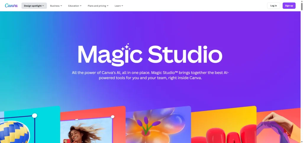
Canva is a design tool first and a chart tool second. Its “Magic Studio” AI features are perfect for making beautiful charts for social media, reports, or infographics. “Magic Charts” can instantly turn your data (from a CSV or even Statista) into a stunning visual. “Magic Insights” can even find and summarize trends for you.
Features:
-
“Magic Charts” transforms data (CSV, TSV, Statista) into visuals.
-
“Magic Insights” uncovers patterns and generates text summaries.
-
Huge library of templates for infographics, reports, and presentations.
-
Part of a full design suite (presentations, video, websites).
Pricing: Has a very generous free tier. Canva Pro (with more AI features) is affordable.
Pros
-
Creates the most beautiful, design-focused visuals.
-
All-in-one tool: make your chart and put it in a presentation without leaving the app.
Cons
-
Not for heavy-duty data analysis. It’s for visualization.
-
Chart types are focused on design, not complex statistics.
Quick tip: Upload your branded color palettes and fonts to the Brand Kit, and Magic Charts will automatically create charts that match your company’s style.
Privacy note: Uploads data: Yes. For paid Teams, the setting to “Allow your content to improve AI” is turned OFF by default, which is good.
-
Venngage AI Diagram Generator — Best for Infographic-Style Diagrams

Like Canva, Venngage is built for marketers and businesses that need to create infographics, reports, and diagrams. Its AI tool focuses on generating infographic-style diagrams, flowcharts, and mind maps. You can give it a text prompt, and it will create a beautiful, branded visual.
Features:
-
Generates infographic-style diagrams from text prompts.
-
AI-driven suggestions for flowchart and mind map layouts.
-
Strong focus on branded templates and infographic design.
-
Exports to PNG, PDF, and interactive HTML.
Pros
-
Excellent for turning boring process lists into engaging infographics.
-
Strong focus on brand consistency for business use.
Cons
-
Not for data-driven charts (bar, line, etc.). It’s a diagramming tool.
-
Less of an all-in-one design tool than Canva.
Quick tip: Use this tool to repurpose a blog post or report. Paste in the main points and let the AI generate an infographic to share on social media.
Privacy note: Uploads data: Yes.
-
Displayr — Best for Market Research

Displayr is a professional, high-end tool built for market researchers and consumer insights teams. Its AI “Research Agent” can take raw survey data and instantly turn it into a full, presentation-ready report. It handles complex statistical analysis (like segmentation and regression) and writes text summaries of the findings.
Features:
-
AI Research Agent turns raw survey data into AI-powered visualizations.
-
Built-in statistical engine for regression, segmentation, and more.
-
AI writes commentary and explains findings in plain English.
-
Exports directly to PowerPoint, with charts that update automatically.
Pricing: Has a free trial. This is an enterprise-grade tool with pricing to match.
Pros
-
A massive time-saver for anyone who works with survey data.
-
Combines statistical power with AI-driven reporting.
Cons
-
Overkill for simple charting needs.
-
Steep learning curve and high price.
Quick tip: Connect this to your survey platform (like Qualtrics or SurveyMonkey) to create a fully automated reporting pipeline.
Privacy note: Uploads data: Yes. It is SOC 2 certified and supports GDPR and CCPA.
-
Zoho Analytics + Zia — Best for Zoho Ecosystem Users

If your business already uses the Zoho suite (for CRM, email, etc.), then Zoho Analytics is the logical choice. Its AI assistant, Zia, works across the platform. You can ask Zia questions in natural language to get charts, get automated insights, and even forecast future trends.
Features:
-
“Ask Zia” conversational AI agent builds reports from questions.
-
Zia Insights provides automated text narratives about your data.
-
Connects to over 500+ data sources, not just Zoho apps.
-
Advanced predictive AI for forecasting.
Pricing: Has a 15-day free trial. Paid plans are available.
Pros
-
Perfect integration for companies already using Zoho CRM.
-
Very powerful AI features, including predictive modeling.
Cons
-
Works best within the Zoho ecosystem.
-
Can be complex to set up if you’re not a Zoho user.
Quick tip: Use the “Ask Zia Agent” to build entire data pipelines and dashboards with an interactive conversation.
Privacy note: Uploads data: Yes. The platform has enterprise-level security and governance, including on-premise options.
Comparison Table: Top AI Graph Makers
| Tool | Best For | Key AI Feature | Free? | Starting Price | Export Format |
| Julius AI | Quick Analysis | NL2Chart & Analysis | Yes | $20/mo | PNG, SVG, CSV |
| Powerdrill Bloom | Presentations | 1-Click PPTX Export | Yes | PPTX, Reports | |
| Excelmatic | Excel Users | NL2Chart for Excel | Yes | $9.90/mo | Excel, PNG |
| Power BI | Enterprise Data | Copilot Dashboards | Yes | $14/mo | PPTX, PDF, CSV |
| Tableau | Deep Analytics | Einstein Insights | No | $75/mo | PNG, PDF, PPTX |
| Lucidchart AI | Pro Diagrams | Text-to-Flowchart | Yes | $9/mo | SVG, PDF, Visio |
| Miro AI | Brainstorming | Text-to-Mind Map | Yes | $10/mo | PDF, JPG |
| Eraser | Engineers | Text-to-Architecture | Yes | $10/mo | SVG, PNG, PDF |
| Canva | Marketing | Magic Charts | Yes | $12.99/mo | PNG, JPG, PPTX |
How I tested these tools
To create this list, I spent a week in October 2025 researching and testing these tools. My process was simple and practical. I checked the official product documentation for all 15 tools to verify their AI claims. I signed up for a free trial or used the free tier for each one.
I tested them by uploading the same messy CSV file of sales data to see how they handled data cleaning and auto-charting. For the diagram tools, I used the same three text prompts (a user login flowchart, a simple org chart, and a “customer journey” mind map).
Finally, I tested their “last-mile” features by exporting my results to PNG, SVG, and PPTX (where available). I also read every tool’s privacy policy to check for the most important feature: whether they train their AI on user data.
Top Picks
-
Best overall: Julius AI. It has the best balance of power and simplicity. It’s a true “chat with your data” tool that feels like the future.
-
Best free: Canva Magic Studio. Canva’s free tier is incredibly generous and gives you access to powerful AI design and charting tools for marketing and social media.
-
Best for analysts: Microsoft Power BI + Copilot. For heavy-duty, enterprise-scale analysis, nothing beats the power of Power BI, and Copilot makes it much more accessible.
-
Best for presentations: Powerdrill Bloom. It’s the only tool designed from the ground up to solve one problem: turning raw data into a slide deck, fast.
3 Mini Tutorials
Here’s how quickly you can get results with these tools.
-
Turn a CSV into a Chart with Julius AI
-
Sign in to Julius AI and start a new chat.
-
Upload your CSV or Excel file (e.g.,
sales_data.csv). -
Type your prompt: “Show me the total sales by product category as a bar chart. Make sure to label the Y-axis as ‘Total Sales ($)’.”
-
Refine it: The AI will show you the chart. You can ask for changes, like “Now change it to a pie chart” or “Only show the top 5 products.”
-
Export: Right-click the chart to save it as a PNG, or ask Julius for a download link for the cleaned-up data as a CSV.
-
Generate a Flowchart from Text with Eraser
-
Go to Eraser and create a new file.
-
Type your prompt as a simple list. For example:
-
User visits homepage -
User clicks 'Login' -
If success, redirect to dashboard -
If fail, show 'Invalid password' message
-
-
Click the “Generate Diagram” AI button.
-
Watch as Eraser instantly draws the full flowchart for you.
-
Edit the diagram using the simple text syntax on the side or by dragging the boxes.
-
Export your diagram as a high-quality SVG or PNG to add to your documentation.
-
Create a 1-Click Presentation from an Excel File (Powerdrill Bloom)
-
Open Powerdrill Bloom and sign in.
-
Drag and drop your Excel or CSV file directly onto the dashboard.
-
Wait a few seconds. Bloom will automatically process the file and build an interactive mind map of insights, highlighting key metrics and trends.
-
Explore the mind map to see the AI-generated reports and KPIs.
-
Click the “Export to PPT” button.
-
Open the downloaded PowerPoint file, which now contains your data, charts, and AI-generated insights, ready to present.
Frequently Asked Questions (FAQ)
What is an AI graph maker?
It’s a tool that uses artificial intelligence to automatically create charts and diagrams. You can give it raw data (like a CSV) or a simple text prompt, and it builds the visual for you.
Can AI generate charts from an Excel file?
Yes. Tools like Julius AI, Excelmatic, and Powerdrill Bloom are built to work directly with Excel and CSV files. You can upload your file and just ask questions in plain English.
Is my data safe when I upload it?
It varies. This is a critical question. The most trustworthy tools, like Lucidchart and Eraser, explicitly state they do not train their AI models on your data. Always check the privacy policy.
Will AI replace data analysts?
No. AI is a co-pilot, not a replacement. It automates the tedious work (like cleaning data and making the chart), which frees up analysts to do the hard work: interpreting what the data means and making strategic decisions.
Can I make flowcharts and org charts with AI?
Yes. A whole category of tools, called “diagrammers,” is built for this. Tools like Miro, Lucidchart, and Eraser can generate complex flowcharts, mind maps, and org charts from a simple text prompt.
What is the best free AI chart maker?
Conclusion
AI graph makers are changing how we work with data. They are closing the gap between having a question and getting a visual answer. You noLogr have to be a spreadsheet expert to find insights.
The best tool for you depends on your job. An engineer will love Eraser, while a marketer will prefer Canva. An analyst will get the most from Julius AI or Power BI.
If you put charts into slides, Autoppt helps you turn charts into slide-ready templates using AI — fast and simple.
Create worry-free presentations with AutoPPT . Turn your ideas into slides quickly—while keeping them 100% yours!
About AutoPPT: An easy use AI tool for students and professionals. Generate editable slides, customize designs, and focus on what matters—your unique ideas.

Autoppt: Generate presentations in 1 minute!
Start Free Trail Now