
Michael Anderson
Former journalist turned tech writer with a passion for helping professionals enhance productivity through AI.
Introduction
Making charts used to be hard. You had to fight confusing menus in tools like Excel. But in 2026, that has all changed.
AI graph maker tools are here, and they are fast, smart, and easy to use. You can now type simple text, like “show me sales by region as a bar chart,” and the AI builds it for you.
These new tools make data easy for everyone to understand. In this post, we compare the 15 best AI chart and diagram tools (both free and paid) to help you pick the right one.

What to Look For in an AI Graph Maker (Buyer’s Guide)
When you are looking for an AI chart generator, not all tools are the same. Some are great for business reports, while others are better for school projects.
Here are the key things to look for in 2026:
-
Easy Data Input: The tool should let you upload your files (like Excel or CSV) or connect to Google Sheets. The best tools also have “text-to-chart,” letting you use plain English.
-
Smart Suggestions: A good AI tool does more than just make a chart. It should suggest the best chart type for your data (like a bar, line, or pie chart). It should also pick smart colors and add labels for you.
-
Export Options: Can you get your chart out? Look for tools that let you export to PNG, SVG, or PDF. For presentations, exporting to PowerPoint (PPTX) is a must-have.
-
Collaboration: Can you work with your team? Many new tools let you share a link, add comments, or work on a dashboard together.
-
Pricing: Does it have a good free plan? Many free plans have limits, like adding a watermark or only allowing a few charts. Check the price before you start.
-
Privacy: This is a big one. Some “free” AI tools use your data to train their models. For any business or private data, always choose a tool that has a “zero-train” policy.
Top 15 AI Graph Maker Tools
We tested dozens of tools to find the best for data, diagrams, and presentations. Here are our top 15 picks for 2026.
-
Autoppt — Best for Professional Presentations

This tool is a direct competitor to PowerPoint and Google Slides. Its “Smart Slides” automatically apply design rules, so your slides always look professional. It’s built to make presentations, not just charts.
Key Features:
-
AI “Smart Slides” auto-format your content.
-
Generates charts (pie, Gantt, Venn) from text prompts.
-
Focuses on making entire presentations, not single charts.
-
Great templates for business reports and pitches.
Pricing: from $19/month (Free trial).
Pros:
-
Makes beautiful, professional slides faster than any other tool.
-
Strong privacy policy for professional use.
Cons:
-
Free trial.
-
Locks you into its presentation style.
Quick Tip: Start with a text prompt for an 8-slide pitch deck, then edit the AI-generated slides.
Privacy: Excellent. Autoppt is SOC 2 compliant and states its AI sub-processors are “barred from using customer data for training”.
-
Julius AI — Best for Quick Conversational Analysis

Julius AI is like having a data analyst you can talk to. You upload a spreadsheet, and then you just ask questions. It is powerful and very popular with professionals who need to analyze data without writing code.
Key Features:
-
Chat with your data using natural language.
-
AI suggests analysis and finds insights for you.
-
Creates standard and statistical charts (like histograms and heatmaps).
-
Connects to Google Sheets, Excel, CSVs, and even SQL databases.
Pricing: from $20/month (Free plan available: Yes, but very limited to 15 messages).
Pros:
-
Incredibly powerful data analysis.
-
Excellent, clear privacy policy (SOC 2 compliant).
Cons:
-
The free plan is just a small trial.
-
Can be too complex if you just want a simple chart.
Quick Tip: Ask it “What are the most interesting trends in this data?” to get started.
Privacy: Excellent. Julius has a strict “zero-train” policy, meaning they never train AI on your private data.
-
Powerdrill Bloom — Best for Presentation-Ready Insights

Powerdrill Bloom calls its AI a “team of data agents”. It is great at turning raw data into clean reports and even PowerPoint slides, fast. It feels less like a science tool and more like a business tool.
Key Features:
-
One-click “Excel to PPT” feature.
-
AI Data Agents automatically find trends and build charts.
-
Upload Excel, CSV, or PDF files.
-
AI Infographic Generator for making quick visuals.
Pricing: from $3.90/month (Free plan available: Yes, 10 analysis jobs).
Pros:
-
Very affordable and a great value.
-
Strong focus on creating reports, not just charts.
Cons:
-
Fewer advanced chart types than other tools.
-
Newer tool, still building its reputation.
Quick Tip: Use the “AI Infographic Generator” to turn a boring data sheet into a shareable image.
Privacy: Excellent. Powerdrill also has a clear “zero-train” policy on its website.
-
Miro AI — Best for Team Brainstorming (Flowcharts)

Miro is a giant online whiteboard that millions of teams use for collaboration. Now, it has powerful AI features built-in. It is the best tool for turning a text prompt into a complex flowchart or mind map.
Key Features:
-
“Text-to-diagram” generates flowcharts from simple text.
-
Creates mind maps, UML diagrams, and flowcharts.
-
AI can summarize all the sticky notes on your board.
-
A massive library of templates and integrations.
Pricing: from $8/member/month (Free plan available: Yes, very generous).
Pros:
-
The best tool for team collaboration.
-
Generous free plan (unlimited members, 3 boards).
Cons:
-
AI features are limited by “credits” on the free plan.
-
Not a data chart tool. This is for diagrams and flows.
Quick Tip: Type a few steps of a process, select them, and ask Miro AI to turn it into a flowchart.
Privacy: Excellent for paid plans. Miro is a trusted enterprise tool with a “zero-train” policy.
-
Eraser.io (DiagramGPT) — Best for Engineering Diagrams

Eraser is a special tool built for engineers, developers, and architects. Its big idea is “diagram-as-code”. You write text, and Eraser’s AI (called DiagramGPT) creates the perfect technical diagram.
Key Features:
-
AI generates diagrams from plain English.
-
Creates cloud architecture diagrams (AWS, Azure), ERDs, and sequence diagrams.
-
“Diagram-as-code” syntax is easy to edit and version control (like code).
-
Integrates with GitHub.
Pricing: from $10/member/month (Free plan available: Yes, but limited to 3 files).
Pros:
-
The best AI tool for technical diagrams, period.
-
“Diagram-as-code” is a game-changer for developers.
Cons:
-
Very nice. Not for business charts or marketing.
-
Free plan is very limited.
Quick Tip: Paste a code snippet or a list of database tables and ask the AI to “generate an ERD.”
Privacy: Excellent. Eraser is built for developers, so it has a strict “No Training” policy.
-
Microsoft Power BI + Copilot — Best for Enterprise Data

If your company runs on Microsoft, this is your tool. Power BI is a
powerful business intelligence (BI) platform. With Copilot (its AI), you can now build entire reports and dashboards just by asking.44
Key Features:
-
Use natural language to ask Copilot to build a report.
-
Generates charts, dashboards, and even DAX (data code) queries.
-
Connects to hundreds of business data sources.
-
Backed by Microsoft’s strong security and privacy.
Pricing: from $14/user/month (Copilot features cost extra and require a “Fabric” subscription).
Pros:
-
The industry standard for large businesses.
-
Incredible power and connects to everything.
Cons:
-
Very expensive and complex pricing.
-
Steep learning curve. Not for beginners.
Quick Tip: Use Copilot to “summarize the key insights on this dashboard” before a meeting.
Privacy: Excellent. All your data stays inside your company’s secure Microsoft account. It is never used for training.
-
Canva — Best for Students and Marketing
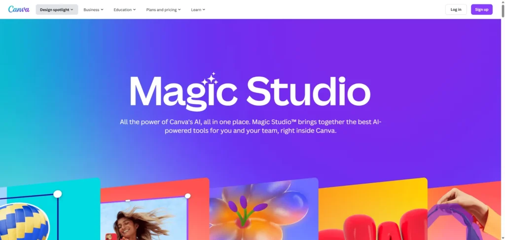
Canva is the all-in-one design tool that many people already use. Its “Magic Studio” brings AI to all its features, including charts. It’s great for making a chart look beautiful for a social media post or a school project.
Key Features:
-
“Magic Charts” helps you create basic charts quickly.
-
“Magic Insights” can summarize data you paste in.
-
Huge library of beautiful templates.
-
Part of a full design suite (for making presentations, social posts, etc.).
Pricing: from $120/year (Free plan available: Yes, very generous).
Pros:
-
Fantastic, easy-to-use free plan.
-
Best for making charts look beautiful and on-brand.
Cons:
-
Very basic data features. Not for serious analysis.
-
Critical Privacy Risk: By default, Canva may use your data to train its AI models. You must manually opt-out.
Quick Tip: Use Canva to make a chart “pretty” after you analyze it in another tool.
Privacy: High Risk for Business. Do not use Canva for any sensitive or private data. It is fine for public data or school projects.
-
Tableau + Einstein GPT — Best for Deep Analytics

Tableau is the other giant in the enterprise world, owned by Salesforce. Like Power BI, it has added a powerful AI layer called “Einstein GPT”. It’s a high-end tool for data scientists and large analytics teams.
Key Features:
-
“Einstein Trust Layer” ensures data privacy.
-
AI can automate data analysis and find insights.
-
Creates advanced, interactive dashboards.
-
Handles massive, complex datasets.
Pricing: from $75/user/month (This is a high-end, expensive tool).
Pros:
-
Extremely powerful for deep data visualization.
-
Top-tier security and privacy for enterprise use.
Cons:
-
Very expensive and requires expert skills.
-
Overkill for 99% of users.
Quick Tip: This tool is for professional data scientists. Business users should choose Power BI or Julius.
Privacy: Excellent. The “Einstein Trust Layer” guarantees zero data retention by AI models.
-
Lucidchart AI — Best for Professional Diagrams

Lucidchart is Miro’s biggest competitor. It is a professional tool for creating detailed diagrams, org charts, and process maps. Its AI features are very similar to Miro’s, letting you generate diagrams from text.
Key Features:
-
AI generates diagrams from text prompts.
-
Summarizes complex diagrams.
-
Excellent for org charts and technical diagrams.
-
Integrates with Microsoft, Google, and more.
Pricing: from $9/month (Free plan available: Yes, but limited to 3 documents).
Pros:
-
A solid, reliable tool for professional diagramming.
-
Slightly more “corporate” feel than Miro.
Cons:
-
Free plan is more restrictive than Miro’s.
-
Ambiguous privacy policy.
Quick Tip: Use the org chart builder to import a list of employees and auto-generate a company chart.
Privacy: Caution. Unlike its competitors, Lucid’s privacy policy is not as clear. It does not have a simple “zero-train” guarantee for all data, which makes it a riskier choice for sensitive plans.
-
Venngage — Best for Infographics (with a Warning)

Venngage is a popular tool for making infographics for blogs and marketing. It has an “AI Chart Generator” that can create branded visuals from your data.
Key Features:
-
AI generator for charts and infographics.
-
Applies your brand colors and logos with one click.
-
Good templates for marketing reports.
Pricing: from $10/month (Free plan available: Yes, but very limited).
Pros:
-
Good at creating on-brand infographics.
-
Easy to use for marketers.
Cons:
-
Critical Privacy Risk: Their policy explicitly states they share your data with third parties like “OpenAI” to make the feature work.
-
Free plan is too limited to be useful (only 5 designs).
Quick Tip: Only use this tool for data that is already public.
Privacy: High Risk. Never use this tool for private company data, sales numbers, or customer information.
-
Whimsical AI — Best for Clean & Simple Mind Maps

If Miro and Lucidchart feel too big and complex, Whimsical is for you. It’s a clean, fast, and minimal tool for flowcharts and mind maps. Its AI feature is simple: type your ideas, and it builds the diagram.
Key Features:
-
AI-powered text-to-flowchart.
-
AI-powered mind mapping.
-
Beautiful, simple interface.
-
Great for product teams and startups.
Pricing: from $10/member/month (Free plan available: Yes, with a limit of 100 AI actions).
-
Excelmatic — Best for Working Inside Excel

Excelmatic is an AI “companion” that lives inside your spreadsheet world. You can upload an Excel file and ask it questions in plain English, like “Create a pie chart for column G”.
Key Features:
-
Chat with your Excel or CSV data.
-
AI formula assistant helps you write complex formulas.
-
One-click chart generation for bar, line, and pie charts.
Pricing: from $29.90/month (Free plan available: Yes, 10 messages/month).
Privacy: High Risk. The privacy policy is very vague and does not promise not to train on your data. Be very careful uploading sensitive financial data.
-
Graphy — Best for Simple Data Storytelling

Graphy (Graphy.app) is built for simplicity and “data storytelling”. It focuses on making one beautiful, clear chart at a time. It’s not for complex dashboards, but for making a single, powerful point.
Key Features:
-
From messy data to a clean chart in one click.
-
AI helps find the “story” in your data.
-
Connects to Google Sheets, CSV, or Excel.
- Very simple and easy to use.
-
Google Looker Studio + Gemini — Best for Web Data

Google’s data tool (formerly Data Studio) is now part of Looker Studio. It is integrating Google’s Gemini AI to help you build reports. It is the best free tool for visualizing data from Google sources, like Google Analytics, Google Ads, and Google Sheets.
Key Features:
-
Gemini AI assistance for building reports.
-
Connects perfectly with all Google products.
-
Builds interactive, shareable dashboards.
-
Completely free.
Pricing: Free.
Pros:
-
Best tool for Google ecosystem data (Analytics, Ads, etc.).
-
Powerful and free.
Cons:
-
AI features are still rolling out.
-
Can have a steep learning curve.
Quick Tip: Use this to build a free, live dashboard for your website’s traffic.
Privacy: Your data is subject to Google’s standard data policies.
-
Visme — Best for Interactive Infographics

Visme is an all-in-one design tool, similar to Canva, but with a stronger focus on business presentations and interactive infographics. It also has AI features to help you generate designs and charts.
Key Features:
-
AI-powered templates for easy design.
-
Create interactive charts and infographics that respond to clicks.
-
Good for marketing and business presentations.
-
Lets you add your brand kit to keep charts consistent.
Comparison Table
| Tool | Best For | Text-to-Chart | Free Plan | Starting Price | Export Format |
| Autoppt | AI Presentations | Yes | Yes (Free trial) | $19/mo | PPTX, PDF, PNG |
| Julius AI | Conversational Analysis | Yes (Advanced) | Yes (15 messages) | $20/mo | PNG, SVG, PPTX |
| Powerdrill Bloom | Business Reports | Yes | Yes (10 jobs) | $3.90/mo | PPTX, PDF, PNG |
| Miro AI | Team Brainstorming | Yes (Diagrams) | Yes (3 boards) | $8/mo | PNG, SVG, PDF |
| Eraser.io | Engineering Diagrams | Yes (Diagrams) | Yes (3 files) | $10/mo | PNG, SVG, PDF |
| Microsoft Power BI | Enterprise BI | Yes (Copilot) | Yes (Desktop) | $14/mo + Fabric | PPTX, PDF |
| Canva | Students & Social Media | Yes (Basic) | Yes (Generous) | $120/yr | PNG, PDF, PPTX |
| Lucidchart AI | Professional Diagrams | Yes (Diagrams) | Yes (3 docs) | $9/mo | PNG, SVG, PDF |
| Venngage | Infographics | Yes | Yes (5 designs) | $10/mo | PNG, PDF, PPTX |
| Whimsical AI | Mind Maps | Yes (Diagrams) | Yes (100 AI actions) | $10/mo | PNG, SVG, PDF |
| Excelmatic | Excel Users | Yes | Yes (10 messages) | $29.90/mo | PNG, Excel |
| Google Looker | Google Web Data | Yes (Gemini) | Yes (Completely free) | PDF, Embed |
How I Tested These Tools
To make this list, I did not just read marketing pages. I spent time testing these tools. I used free plans and trials for each one. I uploaded the same sample data (a simple sales spreadsheet) to see how each tool handled it. I tested the “text-to-chart” prompts, compared the quality of the charts, checked how easy it was to export, and most importantly, I read their privacy policies to see how they handle your data.
Editor’s Top Picks
-
Best Overall: Julius AI. It has the best balance of power and ease of use. It’s a true “conversational” tool that finds real insights, and it has an excellent, trustworthy privacy policy.
-
Best Free Tool: Miro. For diagrams, its free plan is unbeatable. For charts, Google Looker Studio is the most powerful free tool, but it is not as easy to use.
-
Best for Professionals: Microsoft Power BI + Copilot. If you work at a company that uses Microsoft Office, this is the default, secure, and most integrated choice.
-
Best for Students: Autoppt. The free plan is perfect for students. It’s easy to make beautiful charts for school projects where data privacy is not a concern.
Quick Tutorials (3 Mini Examples)
Here’s how easy it is to use these new tools.
Create a graph from a text prompt (in Julius AI)
-
Sign up for Julius AI and start a new chat.
-
Click “Add Data” and upload your Excel or CSV file.
-
Wait for the AI to analyze the file.
-
In the chat box, type: “Create a bar chart showing sales by region.”
-
Julius will create the chart.
-
Type a follow-up: “Now make the bars blue and add data labels.”
Turn Excel data into a chart (in Powerdrill Bloom)
-
Sign up for Powerdrill Bloom.
-
On the dashboard, click to upload your Excel file.
-
Bloom will automatically analyze the file and show you “Exploration Questions.”
-
Click a question like “Compare revenue by product category.”
-
The AI will instantly generate the best chart for that question.
-
Click “Export” to save it as a PNG or add it to a report.
Export an AI-made chart for PowerPoint
-
After you create your chart in a tool like Julius or Powerdrill.
-
Look for the “Export” or “Download” button.
-
Many tools (like Autoppt and Power BI) have a direct “Export to PPTX” option.
-
If not, choose “Export as PNG (with transparent background).”
-
Open PowerPoint, go to the “Insert” tab, and add the PNG image to your slide.
FAQ
What is an AI graph maker?
It’s a tool that uses Artificial Intelligence to create charts and diagrams for you. Instead of manual clicking, you use simple text prompts to tell the AI what you want.
Can AI create charts from Excel?
Yes. Most tools on this list (like Julius, Powerdrill, and Excelmatic) are built to connect to or upload Excel files.You can ask questions about your data, and the AI builds the charts.
What is the best free AI chart generator?
For diagrams, Miro has the best free plan. For data charts, Google Looker Studio is the most powerful free tool.Canva has a great free plan for simple, beautiful charts.
Is my data safe with these AI tools?
It depends. Tools like Microsoft, Julius, and Eraser are very safe and do not train on your data.Free tools like Canva do use your data unless you opt-out.Never use a free tool with a bad privacy policy for sensitive data.
Can AI make flowcharts and mind maps?
Yes. Tools like Miro, Lucidchart, and Whimsical are built for this.You can type a list of steps, and the AI will auto-generate a professional-looking flowchart.
Can AI explain the data to me?
Yes. This is a key feature of tools like Julius and Power BI Copilot. They don’t just make a chart; they give you a written summary of the key insights, trends, and patterns in your data.
Conclusion
AI graph makers are changing how we work with data. By 2026, you will no longer need to be a data expert to find and share key insights. The best tools are fast, smart, and easy to use.
The most important thing to remember is privacy. Always check a tool’s policy before uploading sensitive data. Choose a tool that works for you, and start turning your data into stories.
If you need to turn those charts into beautiful presentations, Autoppt helps you create AI-designed slides in minutes.
Create worry-free presentations with AutoPPT . Turn your ideas into slides quickly—while keeping them 100% yours!
About AutoPPT: An easy use AI tool for students and professionals. Generate editable slides, customize designs, and focus on what matters—your unique ideas.

Autoppt: Generate presentations in 1 minute!
Start Free Trail Now