
Michael Anderson
Former journalist turned tech writer with a passion for helping professionals enhance productivity through AI.
Introduction
Ever sat through a presentation that felt… off? Maybe the slides were hard to read, or the colors just didn’t feel right. Often, the problem isn’t the message itself, but how it’s presented. Poor color choices can make even the best ideas fall flat. They can confuse your audience, make your content unreadable, and even send the wrong emotional signals.
But what if choosing the right colors could be easy? What if your presentations could instantly grab attention and leave a lasting impression? Good colors are more than just pretty. They bring clarity, create emotional connections, and help your audience remember what you say. In this guide, we’ll explore how to pick the perfect palette for your next presentation. And we’ll show you how tools like Autoppt can make this process much simpler, helping you create stunning slides with ease.
Why Color Matters in Presentations
Colors are powerful. They speak a language beyond words, influencing how we feel and react. When you first see a presentation slide, its colors create an immediate impression. Bright, bold colors might suggest energy, while soft, muted tones can evoke calmness. These first impressions are crucial because they set the mood for your entire message.
Beyond emotions, color plays a huge role in how easily your audience can read and understand your content. Think about it: light text on a light background is almost impossible to see. High contrast, on the other hand, makes text pop and images stand out. This isn’t just about aesthetics; it’s about ensuring your audience can effortlessly absorb your information without straining their eyes.
Colors also impact memory and persuasion. Studies show that colors can help people remember information better. A consistent color scheme can act as a visual anchor, linking different parts of your presentation together in your audience’s mind. And when used strategically, colors can guide your audience’s attention, highlighting key points and subtly influencing their decisions. For example, a touch of red might draw attention to a warning, while green could signal growth or success. Choosing the right colors isn’t just about making things look good; it’s about making your message more effective and memorable.
Basic Color Theory for Presentations
To use colors effectively, it helps to understand some basic color theory. Colors are generally divided into two main groups: warm and cool.
Warm colors include reds, oranges, and yellows. They tend to stand out and feel energetic. Think of a sunset or fire. These colors can grab attention and create a sense of urgency or excitement.
Cool colors include blues, greens, and purples. They often recede and feel calming or professional. Think of the ocean or sky. These colors can create a sense of trust and stability.
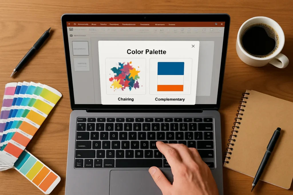
Understanding how colors relate to each other is also key. Complementary colors are opposite each other on the color wheel, like blue and orange. They create high contrast and can be very striking. Use them to make important elements pop. Analogous colors are next to each other on the color wheel, like blue, green, and teal. They create a harmonious and calm look, often used for backgrounds or less critical elements.
Finally, contrast is vital for readability. This means making sure there’s enough difference between your text color and your background color. Dark text on a light background, or vice versa, is easy to read. Low contrast makes your audience squint and lose interest. Always prioritize clear contrast to ensure your message is easily absorbed.
Best Color Palettes for Different Presentation Types
The best color palette isn’t one-size-fits-all. It depends on your audience, your message, and the overall purpose of your presentation. Here are some common types and their ideal color approaches:
Business and Corporate Presentations: For a professional and trustworthy feel, stick to neutral colors like grays, whites, and blacks. Then, add one or two accent colors, often blues or greens, to highlight key data or calls to action. These palettes convey seriousness and reliability without being dull.
Creative Industries: If you’re in a field like design, marketing, or art, you have more freedom. Bold, dynamic palettes with vibrant colors can showcase creativity and innovation. Don’t be afraid to experiment with unexpected combinations, but always ensure readability and a cohesive look.
Educational or Training Presentations: The goal here is clarity and focus. Calm and readable tones work best. Think soft blues, greens, and earthy neutrals. Avoid overly bright or distracting colors that might pull attention away from the learning material. The focus should be on easy absorption of information.
Sales and Marketing Presentations: These often require high contrast and persuasive colors to drive action. Bright, energetic colors like reds, oranges, or strong yellows can be used strategically to create excitement and highlight benefits. The aim is to capture attention and motivate your audience, so a more impactful palette is often suitable.
Common Mistakes to Avoid
Even with a good understanding of color theory, it’s easy to make mistakes that can hurt your presentation. Here are some common pitfalls to steer clear of:
Using Too Many Colors: This is perhaps the most common mistake. A rainbow of colors might seem fun, but it quickly becomes distracting and unprofessional. Too many colors compete for attention, making your slides look messy and your message unclear. Stick to a limited palette, ideally 2-3 main colors, plus an accent color.
Low Contrast Between Text and Background: We touched on this earlier, but it’s worth repeating. If your text color is too similar to your background color, your audience will struggle to read it. This leads to eye strain and disengagement. Always test your color combinations to ensure high readability, especially for those with visual impairments.
Overly Bright or Distracting Palettes: While some presentations benefit from bold colors, using too many bright, neon, or clashing colors can be overwhelming. They can make your audience uncomfortable and pull their focus away from your content. Aim for a balance that is visually appealing without being jarring.
Practical Tips to Choose the Right Palette
Now that you know what to avoid, let’s look at some practical tips to help you choose the perfect color palette for your presentations:
Limit Your Palette to 2–3 Main Colors: Simplicity is key. Choose one dominant color, one secondary color, and one accent color. This creates a clean, professional look that’s easy on the eyes and helps your key messages stand out.
Ensure Text-Background Readability: This is non-negotiable. Always make sure there’s a strong contrast between your text and background colors. If you’re using a dark background, use light text. If you have a light background, use dark text. Test it on different screens and lighting conditions.
Use Accent Colors to Highlight Key Points: Your accent color should be used sparingly to draw attention to the most important information. This could be a call to action, a key statistic, or a crucial heading. It acts like a visual exclamation mark.
Keep Consistency Across All Slides: Once you’ve chosen your palette, stick to it. Consistency builds trust and makes your presentation look polished and professional. Avoid introducing new colors halfway through your slides, as this can be jarring and confusing for your audience.
Examples of Impactful Color Schemes
Sometimes, seeing is believing. Here are a few tested color combinations that work well in presentations:
-
Blue + White + Orange: This is a classic professional combination. Blue (cool, trustworthy) forms the base, white provides clean contrast for text, and a vibrant orange (warm, energetic) acts as an accent. This palette is professional yet engaging, perfect for business or educational settings.
-
Black + Yellow: For high impact and strong visibility, especially in warnings or urgent messages, black and yellow are a powerful duo. The stark contrast makes text and graphics immediately noticeable. Use this sparingly for maximum effect, perhaps for a single slide highlighting a critical point.
-
Green + Gray: This combination offers a calm and balanced feel. Green (nature, growth, harmony) paired with a neutral gray creates a sophisticated and soothing palette. It’s excellent for presentations on sustainability, health, or any topic where a sense of balance and calm is desired.
How Autoppt Helps with Color and Design
Choosing the right colors can feel like a daunting task, especially when you have limited design experience or time. This is where smart tools like Autoppt come in. Autoppt is designed to simplify the presentation creation process, including making excellent color choices.
First, Autoppt offers a rich library of ready-made PPT templates. These aren’t just pretty designs; they are professionally crafted with balanced color palettes. This means you don’t have to guess which colors work well together. You can simply pick a template that fits your topic and trust that its color scheme is optimized for clarity and impact. This saves you a huge amount of time and ensures your presentation looks polished from the start.
Second, Autoppt features AI-powered slide generation. Imagine this: you provide your content, and Autoppt’s AI can generate slides that not only look great but also use optimized colors. The AI understands design principles, including color theory, to suggest or apply palettes that enhance readability and emotional connection. This removes the design guesswork and allows you to focus on your message, knowing that the visual elements are taken care of. For busy professionals, this means saving valuable time while still delivering high-quality, impactful presentations.
Conclusion
Colors are more than just decoration in a presentation; they are a powerful tool for communication. By understanding basic color theory, avoiding common mistakes, and applying practical tips, you can transform your presentations from ordinary to extraordinary. The right colors improve clarity, enhance emotional connection, and ultimately, make your message more persuasive and memorable.
And remember, you don’t have to be a design expert to create visually stunning slides. With smart tools like Autoppt, designing effective presentations is faster and easier than ever before. Its professional templates and AI-powered slide generation take the guesswork out of color choice, allowing you to focus on what truly matters: connecting with your audience and delivering your message with impact. Choose the right colors faster and make slides that truly connect with your audience.
Create worry-free presentations with AutoPPT . Turn your ideas into slides quickly—while keeping them 100% yours!
About AutoPPT: An easy use AI tool for students and professionals. Generate editable slides, customize designs, and focus on what matters—your unique ideas.

Autoppt: Generate presentations in 1 minute!
Start Free Trail Now