
Michael Anderson
Former journalist turned tech writer with a passion for helping professionals enhance productivity through AI.
Introduction
Have you ever sat through a presentation where every slide was packed with so much information that you didn’t know where to look first? You’re not alone. In today’s fast-paced world, attention spans are shorter than ever, and a cluttered slide can lose your audience in an instant. The good news? There’s a simple, effective technique to ensure your presentations are always clear, engaging, and impactful: it’s called the 5-Second Test.
This quick and easy method can transform your slides from overwhelming to outstanding, ensuring your message hits home every time. And with tools like Autoppt, crafting clean, professional presentations has never been simpler.
What Exactly Is the 5-Second Test?
The 5-Second Test is a user experience (UX) research method, originally designed to gauge the clarity and effectiveness of website designs. The concept is straightforward: show someone a design (in our case, a presentation slide) for just five seconds, then take it away and ask them what they remember, what the main point was, and what they understood.
In the world of presentations, this test is a powerful way to put yourself in your audience’s shoes. It forces you to consider whether your key message is immediately apparent or if it’s buried under a mountain of text and distracting visuals. If someone can’t grasp the core idea of your slide in five seconds, it’s a strong signal that your slide is too cluttered.
Why the 5-Second Test Matters for Your Presentations
In a typical presentation, your audience is constantly processing information. They’re listening to you speak, looking at your slides, and trying to connect the dots. If your slides demand too much mental effort to decipher, you risk disengaging your audience, losing their attention, and ultimately, failing to communicate your message effectively.
Think about it:
-
First Impressions Count: Your slides are often the first visual impression your audience gets of your content. A clear, well-designed slide immediately signals professionalism and respect for their time.
-
Clarity is King: Whether you’re pitching a business idea, teaching a complex subject, or sharing research findings, clarity is paramount. The 5-Second Test helps ensure your most important points are impossible to miss.
-
Keeps You Focused: Applying this test to your own slides helps you strip away unnecessary elements and concentrate on what truly matters for each slide.
How to Conduct the 5-Second Test on Your Own Slides
Ready to put your slides to the test? Here’s how to do it:
-
Find Your Testers: Ask a colleague, friend, or even a family member to help. Ideally, choose someone who hasn’t seen your presentation before.
-
Display the Slide: Show them one of your presentation slides for exactly five seconds. You can use a timer on your phone to be precise.
-
Hide the Slide: After five seconds, remove the slide from their view.
-
Ask Key Questions: Now, ask them these questions:
-
“What was the main idea or topic of that slide?”
-
“What details or information do you remember from it?”
-
“Was it easy to understand, or did anything confuse you?”
-
“What did you feel was the most important takeaway?”
-
-
Evaluate the Results:
-
Success: If your tester can accurately identify the main idea and remember key points without confusion, your slide is likely clear and effective.
-
Failure: If they struggle to recall the main idea, mention too many disparate details, or express confusion, it’s a clear sign that your slide is too cluttered and needs refinement.
-
Signs Your Slide Failed the Test:
-
“I remember a lot of text…” This usually means there was too much for the eye to process quickly.
-
“There were too many pictures/graphs.” Overloading visuals can be just as distracting as too much text.
-
“I couldn’t find the main point.” Your core message wasn’t prominent enough.
-
“It looked messy/busy.” Poor layout and organization are major culprits of clutter.
Why Clutter Hurts Your Presentation
Cluttered slides are more than just an aesthetic issue; they actively sabotage your communication efforts. Here’s how:
-
Information Overload: When a slide is crammed with text, images, and data, it creates cognitive overload for your audience. Their brains struggle to process everything at once, leading to mental fatigue.
-
Distraction from Your Message: Your audience should be listening to you and using your slides as a visual aid to reinforce your points, not reading every word on the screen. Cluttered slides shift their focus from you to the screen, often making them read ahead or get lost in the details.
-
Reduced Engagement: If your audience is struggling to understand your slides, they’re less likely to be engaged with your presentation as a whole. Confusion leads to disinterest.
-
Unprofessional Image: A messy, disorganized slide deck reflects poorly on you as a presenter. It can suggest a lack of preparation, attention to detail, or respect for your audience’s time.
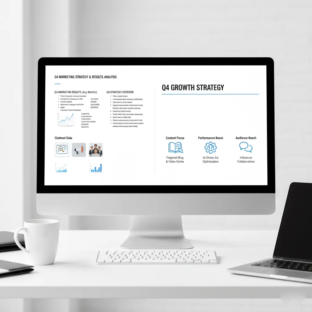
Here’s an example of what a cluttered slide might look like – imagine trying to absorb all this in 5 seconds!

Best Practices to Keep Slides Clear and Impactful
Now that you understand the problem, let’s explore the solutions. Here are some fundamental best practices for creating clear, uncluttered slides that pass the 5-Second Test with flying colors:
-
One Main Point Per Slide: This is perhaps the golden rule of presentation design. Each slide should convey a single, clear message. If you have multiple ideas, break them down into separate slides.
-
Limit Your Text – Use Bullet Points, Not Paragraphs: Your slides are not your speaker notes. Use concise bullet points to highlight key information. Aim for no more than 6-7 lines of text per slide, and keep each line brief. The audience should be able to glance at the slide and immediately grasp the essence of your point.
-
Use Visuals Wisely and Sparingly: Visuals can be incredibly powerful, but too many or poorly chosen images can create chaos. Use high-quality images, charts, or icons that directly support your main point. Ensure they are relevant and enhance understanding, rather than just decorating the slide. Avoid clip art from the 90s!
-
Embrace Whitespace: Whitespace (or negative space) is the empty area around your text and visuals. It’s crucial for readability and visual appeal. Don’t feel the need to fill every corner of your slide. Ample whitespace allows elements to breathe and guides the audience’s eye.
-
Choose Readable Fonts and Proper Sizes: Stick to clean, professional fonts. Avoid overly decorative or thin fonts that are difficult to read from a distance. Ensure your font size is large enough – generally, 24pt for body text and 36pt or larger for headings is a good starting point.
-
Maintain a Consistent, Clean Layout: Consistency is key. Use the same font styles, colors, and positioning for similar elements across your entire presentation. A consistent layout creates a professional look and helps your audience navigate your content effortlessly.
Here’s an example of a clear and effective slide that quickly conveys its message:
How Autoppt Can Help You Design Better Slides
Applying all these best practices can seem like a lot of work, especially when you’re under a tight deadline. This is where Autoppt comes in. Autoppt is an AI-powered presentation tool designed to help you create stunning, professional, and – most importantly – clutter-free presentations in minutes.
Here’s how Autoppt simplifies the process:
-
Professionally Designed Templates: Autoppt offers a vast library of clean, modern, and professional templates. These templates are meticulously crafted with optimal layouts, typography, and visual balance in mind, ensuring your slides look polished and pass the 5-Second Test by default.
-
AI-Powered Content Generation and Layout: Simply input your topic and key points, and Autoppt’s intelligent AI goes to work. It generates entire presentations, suggesting appropriate layouts, images, and even concise bullet points to prevent clutter. The AI is trained to prioritize clarity and impact, automatically ensuring proper whitespace and visual hierarchy.
-
Saves Time and Reduces Stress: For professionals, students, and anyone who needs to create presentations regularly, Autoppt is a game-changer. It eliminates the hours spent fiddling with design elements, allowing you to focus on your content and delivery, confident that your slides are perfectly balanced and easy to understand.
-
Ensures Consistency: Autoppt’s AI maintains consistent branding and design elements throughout your presentation, giving it a cohesive and professional look without any extra effort on your part.
With Autoppt, you get to skip the design headaches and jump straight to presenting confidently with slides that are guaranteed to make an impression, not cause confusion.
Conclusion
The 5-Second Test is more than just a quick check; it’s a mindset that prioritizes clarity, conciseness, and audience understanding above all else. By regularly applying this simple test to your presentation slides, you can ensure that your message is always front and center, never lost in a sea of visual noise.
Embrace the power of less. Strip away the unnecessary, focus on your core message, and create slides that are a pleasure to behold and effortlessly understood. If you’re looking to streamline this process and consistently produce clean, impactful presentations, give Autoppt a try. It’s the smart way to ensure your slides always pass the 5-Second Test, leaving a lasting and positive impression on your audience.
Create worry-free presentations with AutoPPT . Turn your ideas into slides quickly—while keeping them 100% yours!
About AutoPPT: An easy use AI tool for students and professionals. Generate editable slides, customize designs, and focus on what matters—your unique ideas.

Autoppt: Generate presentations in 1 minute!
Start Free Trail Now